
If you read my older guide on creating Basic Accessible Disclosure Widgets, then the aim of this guide is to take it up a notch, by building variations of a pattern that is a little more complex, the nav drawer. Nav drawers are very common, especially on complex web apps, as there are often multiple navigation elements or tools to access the many features these systems have.
As appears to often be the case, this guide has come about to me encountering several nav drawers, whilst testing, over the last couple of months.
So, what is a nav drawer? Put into simple terms, it's usually a side navigation that slides out into the visible part of the viewport when a user clicks the trigger control. Technically, nav drawers can also appear from the top or bottom of the viewport, but, we pushed down from the top in the "Basic" article, also, I'm probably over-selling it a little here, by saying that side drawers are a little more complex, they do come with additional challenges and considerations for us like-minded folks that will put accessibility first in everything we build, but they're not a "boss level" challenge, like some UI patterns. So, to make my claim of "complex" a little less of an overreach, we'll discuss and build some different variations, just to spice things up a little.
I don't know if I am using the correct terminology for these, I haven't researched them in any way, but we'll just go with my guessed naming conventions I'll explain what I mean:
- The standard push to the side drawer, this will either push some or all of the page content out of the viewport, or squish it down, that'll likely depend a lot on the viewport size when a user invokes the control
- The overlay drawer, this will simply overlay the main page, it will sit on top of the page and not affect it in any way, other than obscuring part of it
- The fixed icon drawer, this will always show an icon for each link or control within, in a narrow side panel, but should a user click the trigger, then drawer will slide into view and show the text labels next to those icons. Honestly, I'm less keen on these, I think CSS Tricks used this pattern, way back when? Sure, it's kinda OK if you're sighted, use a pointing device and have some idea what the icons mean, but, what is the point in hiding just the labels? everything has to still be in the focus order, so expanding/collapsing serves no purpose to blind screen reader users and in reality, the iconography isn't likely to be universally understood, so what the benefit actually is, I have no idea. Still, we'll build one, anyway as I like to think of my guides as a foundation for further exploration or discussion, as opposed to a "Thou must" thing.
I'm cheating a little, here. I'm building both the push to the side and the overlay styles in one. I will explain why later on.
As always (well where possible) we will start with minimum viable product, that is completely usable, without JS and then progressively enhance our mock page, where JS is available.
Minimum viable product
JS is going to do a little bit of the heavy lifting here, as we will need to wrangle the DOM and shuffle stuff about a little, if we weren't good accessibility troopers, we'd pretend this isn't a thing and not consider what would happen without JS, which would likely be the contents of our drawer would be completely hidden, or at best, a broken UI. Neither of those sounds like anything I'd be comforatble putting my name to or anything I'd want a user to have to deal or attempt to deal with. So, we'll start with two nav elements, one below the other, Primary and Secondary seem like decent enough names to use, our top nav will be Primary and our drawer will be Secondary, so what are we going to make? The below screenshot shows how I have set up the UI for when JS isn't available:
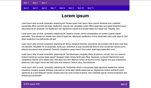
Nothing spectacular going on there, a nice clear simple layout, nothing that is important hidden for users who have accessed without JS, for whatever reason. Let's look at the HTML:
The HTML
<!DOCTYPE html>
<html lang="en" class="no-js">
  <head>
    <meta charset="UTF-8">
    <meta name="viewport" content="width=device-width, initial-scale=1.0">
    <title>Document</title>
  </head>
  <body>
    <header class="header">
      <a href="main" class="skip-link">Skip to content</a>
      <div class="nav__wrapper">
        <nav class="nav" aria-labelledby="primaryNavLabel">
          <h2 id="primaryNavLabel" style="display: none;">Primary</h2>
          <ul class="nav__list">
            <li class="nav__item"><a href="#" class="nav__link">Item 1</a></li>
            <li class="nav__item"><a href="#" class="nav__link">Item 2</a></li>
            <li class="nav__item nav__item--overflow"><a href="#" class="nav__link">Item 3</a></li>
          </ul>
        </nav>
        <nav class="nav__side" id="sideNav" aria-labelledby="sideNavLabel" aria-owns="drawer">
          <h2 id="sideNavLabel" style="display: none;">Secondary</h2>
          <button class="nav__trigger" id="trigger" aria-expanded="false" aria-controls="drawer" data-untouched>
          <span class="visually-hidden">Menu</span>
          <span class="nav__trigger-inner">
            <span class="nav__burger"></span>
          </span>
          </button>
        </nav>
      </div>
      <div class="nav__drawer" id="drawer">
        <ul class="nav__drawer-list">
          <li class="nav__drawer-item"><a href="#" class="nav__drawer-link">Item 4</a></li>
          <li class="nav__drawer-item"><a href="#" class="nav__drawer-link">Item 5</a></li>
          <li class="nav__drawer-item"><a href="#" class="nav__drawer-link">Item 6</a></li>
          <li class="nav__drawer-item"><a href="#" class="nav__drawer-link">Item 7</a></li>
          <li class="nav__drawer-item"><a href="#" class="nav__drawer-link">Item 8</a></li>
          <li class="nav__drawer-item"><a href="#" class="nav__drawer-link">Item 9</a></li>
          <li class="nav__drawer-item"><a href="#" class="nav__drawer-link">Item 10</a></li>
          <li class="nav__drawer-item"><a href="#" class="nav__drawer-link">Item 11</a></li>
        </ul>
      </div>
    </header>
    <div class="site">
      <main class="main" id="#main">
        <h1>Lorem ipsum</h1>
        <!-- Lorem ipsum removed for brevity -->
      </main>
    </div>
    <footer class="footer">
      <p>MTA drawer 2025</p>
      <a href="#">Item 12</a>
    </footer>
  </body>
</html>
A quick summary of the HTML
- We have a
no-jsclass on thehtmlelement, we will remove this later, with JS, so basically, if JS can remove it, it's loaded/available - As we have more than one
navelement, we need to give them names, so usingaria-labelledby="[Ref_of_hidden_text_node]", we give the top navigation the AccName of "Primary" and the lower navigation (will be a drawer) an AccName of "Secondary". These naming nodes are in the above HTML and both havedisplay: none;set, remember thataria-labelledbyignores that all methods of "hiding", by design, which I find to be super handy for situations just like this. I don't normally write styles in my HTML, due to separation of concerns and CSS specificity, etc, but this doesn't make me feel icky, as I don't want anybody to ever see that text - We have a
<button>which will act as the trigger for our drawer, we will of course only show this when JS is available - Our Drawer isn't a child of our Secondary
<nav>element, which means that relationship isn't programmatically determinible, the<button>is inside it, but the drawer isn't. If the button is inside it, then the thing it controls should be. We do usearia-controlson the<button>which technically creates that relationship, but only in a technical sense, not so much in a useful to AT sense, as screenreader support is virtually non-existent. Sure, we could have added the drawer inside the<nav>, which is where it should be, but due to the layout, everything got a little overly-complex when I initially started building this, as I was having to addposition: absolute;to the<button>so it appeared visually, in the<header>, which in itself, isn't a problem and I didn't want to do that, although, in retrospect, I should have.. As I was moving the entire drawer with JS, anyway I just found it easier to move it half-way to where I finally wanted it for no JS and then recreate that relationship with ARIA. So, what I did was I addedaria-owns="drawer"to the Secondary<nav>element, which allows me to move things around in the DOM, break relationships, but then put that relationship back with this nifty property. I initially added that property with JS, but only when I actually moved stuff around, but then I encountered a bit of layout complexity, so I took the path of least resistance and recreated the relationship irrespective of whether JS is vailable or not, as I severed it for both. - The entirety of our drawer is wrapped in a
<div class="nav__drawer" id="drawer">element, we'll grab this with JS, as we will need to move it to a more suitable place in the DOM - All of the standard disclosure stuff is the same as the Basic Disclosure Widgets guide, we have a
<button aria-expanded="false" aria-controls="sideNav">, that latter attribute points to the ID of the secondary<nav>element and we'll toggle thearia-expandedstate, when we need to.
The following screenshot shows that we have the exact relationship we wanted, after using a little ARIA:
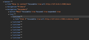
Just a little note on the above screenshot:
As I stated, I used aria-owns to recreate the relationship, as I had opted to move stuff around in the DOM. Would it be a failure if that attribute were omitted? No, I wouldn't fail it as the <button> is in the <nav> and the <button> uses aria-controls="[ID_of_drawer]", so there is a "programmatic" relationship there, already. Is it the relationship we want? Hmm, both attributes seem to have spotty support, so at this stage, it probably isn't making a huge amount of difference, if any at all. As an example, using VoiceOver and Safari, should I expand the drawer and then tab through it, into the main content, then reverse back into it. the expectation would be something like "Link, item 11, navigation, Secondary", but that doesn't happen, I only get the "navigation, Secondary" info when I reverse all the way up to the button. Remember, this is Safari and VoiceOver, so that may not be representative of other browser/screen reader combos, we'll test them a little later.
The CSS
I'm going to omit the CSS, again, as everything gets to unwieldy, I'm also building this thing as I type, so I'm constantly adding or modifying the CSS. It will of course be available in the CodePen, at the end.
Let's progressively enhance it
First things, first, we need to remove the .no-js class from the <html> element and add a .has-js class. We don't technically need both, but it just makes it a smidge easier to style things, for both possibilities, I guess.
JS Swapping the JS class
Just add this in the HTML's <head> section, I believe it's better to add it after the title, encoding and links to other resources, such as CSS, fonts and whatever else you may link to in your <head>section, for performance reasons.
<script>
  document.querySelector('html').classList.remove('no-js');
  document.querySelector('html').classList.add('has-js');
</script>
Nothing spectacular, here
We're simply removing the class no-js and then adding a new one, has-js, this can only happen if the user, user-agent or whatver else hasn't blocked JS
Moving the entire drawer in the DOM
I gave this one a little thought, and for the drawer to push the page or squish it, it will be easier to have it on the same layer, so that rules out position: absolute; etc, as it would just slide over the top and we're going for a push effect. We could probably animate both the drawer and the main content, to give the same effect, without moving the drawer, but that seems like it might be a bit brittle. So the only way we can realistically achieve the effect I am going for is to move the drawer into the .site wrapper I added.
There is one consideration, here, our toggle will still be placed in the <header>, and the drawer is not and as I want my drawer to be on the right side of the viewport that could create a potential problem with focus order, which needs to be logical and intuitive. We need to ensure that when we move the drawer to the .site wrapper, that it precedes the .main content, which would then mean it appears on the left, by default. That would mean the control and the drawer are on opposite sides of the screen, without us doing someting about it. If we simply move the drawer to after the main content, then we would have introduced a failure, as our focus order would be illogical. When a user clicks a trigger to expand something, those newly disclosed interactive elements must be next in the page's sequential focus order or we'd need to manage a user's focus order for them. Don't worry, there is a much easier and nicer way.
So, our primary objactives are as follows:
- When the drawer is closed, nothing inside receives focus, it's properly hidden
- When the drawer is opened, a user can tab through the links within, directly from the trigger
<button>, when they reach the final link in the drawer, the next tab stop will be inside the main content - As we are pushing the main content to the side and not overlaying it, we don't need to worry about 2.4.7 Focus Visible or 2.4.11 Focus not Obscured (Minimum), as nothing we have done could obscure anything (this is the primary reason I personally prefer this pattern)
I'm adding a couple of screenshots with arrows indicating the focus path for those of you who learn better from pictures, I'll include both the closed and open drawer states:
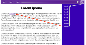
In the images I show the tab sequence I am going for, this is the only sequence that makes sense for this particular layout, in my view, as anything else would not be intuitive, so how did I achieve that? Let's look at some code, I'll start with the JS:
const drawer = document.querySelector(`#drawer`);
document.querySelector('.site').prepend(drawer);
Firstly I'm grabbing the entire drawer element and storing it in a variable or indeed a constant if you just cringed at me calling a
consta variableFinally, we want to
prepend()that stored element into the position that makes most sense, I'm adding it before the<main>content, inside the.sitecontainer, even though visually, it appears to the right of it, this is for a good reason:- Because I am adding it before the main content, that means I get the desired/expected focus order for free, had I added it after the main content, then I'd have needed to manually manage focus with more JS and why do that?
So, at this stage, everything would be flipped, right? Our drawer would be on the left and I'd already committed to putting it on the right side of the viewport. This is super easy to solve, with the following CSS:
@media screen and (min-width: 48em) {
  .site {
    display: flex;
  }

  .has-js .site {
    position: static;
    flex-direction: row-reverse;
  }

  .nav__drawer {
    position: static;
  }
}
I'll quickly explain the above:
- Firstly, I add a media query, as I always build things "mobile-first", the
48emvalue is 768px, this is just an example of a tablet size, although in the real world, I'd probably increase this value a bit - The first selector just sets the
flexlayout and that container only holds the<main>when there is no JS - In my second CSS declaration, this is where the magic happens, I'm only running this declartion if JS is available, with the
.has-jsclass, then I'm simply setting theflex-directiontorow-reverse, which visually flips the layout, but does not interfere with the focus order. Remember, we got the focus order for free by adding it before the<main>, so now I can animate my panel sliding in and out, preserving the correct focus order, whilst having it on the right of the page and that took a trivial amount of JS and CSS. Please do be aware sometimes reversing the layout of things in CSS it can cause illogical focus or reading orders, that's not the case here, though, but be sure to check anything you flip with a keyboard and also a screen reader/keboard combo. I also setposition: static;as I want the default flow, here and I actually usedposition: relative;for the "mobile" view
We need to make the drawer actually open and close, so a basic event listener will do that for us:
const trigger = document.querySelector('.nav__trigger');

trigger.addEventListener('click', () => {
  trigger.removeAttribute('data-untouched');
  trigger.getAttribute('aria-expanded') === 'false' ? trigger.setAttribute('aria-expanded', 'true') : trigger.setAttribute('aria-expanded', 'false');
});- We're getting a reference to our trigger
<button>, holding it in atriggerconst - Then we assign
addEventListenerforclickevents to thetrigger - When a user clicks the element, we remove a data attribute
data-untouched, this is just what I added to prevent the@keyframesanimation of the hamburger menu playing on page load (bit out of scope, but that's how I do it) - Finally, we have a ternary operator to flip the state of
aria-expandedon eachclickevent, each click just checks what the current value ofaria-expandedis and then applies the opposite state, eithertrueorfalse
I'll give the important parts of the CSS, here, as it's important to highlight that bit as it does the majority of the heavy lifting:
.no-js .nav__drawer {
  width: 100%;
}

.no-js .nav__drawer-list {
  display: flex;
  flex-wrap: wrap;
  gap: 1.25rem
}

.has-js .nav__drawer {
  display: none;
  min-height: 100%;
  width: 0;
  transition: display 500ms allow-discrete, width 500ms ease-in;
}

 .header:has(.nav__trigger[aria-expanded="true"]) + .site .nav__drawer {
  display: block;
  width: 20rem;

  @starting-style {
    width: 0;
  }
}
the above explained:
If there is no JS, then we display the drawer with
width: 100%;and as it's inside the<header>it will take up all of the availble width in thereOur second declaration sets
display: flex;when there is no JS nd allows the elements towrapwhen the viewport gets too narrow to accomodate all items within, we also add a smallgapOur third declaration sets the default properties for the drawer, we don't want it to show and we don't want any width, so we set
display: none;andwidth: 0;respectivelyIn our final declaration, we use a nifty selector to get at both the
<button>and the drawer, we couldn't use just a regular sibling selector+, like we would for most expando widgets, as these elements aren't siblings. In English, that selector just means:If the
.headerhas an item called.nav__trigger, with an attribute calledaria-expandedand that value istrueGet the
.header's sibling, the.site containerand then find the element inside there called.nav__drawerand do the following:- Set
display:toblock, setwidthto20rem, then I added the@starting-stylerule, to set the initial value of thewidth, I only used this as it's now possible to animatedisplay: block;if we use that rule and set the initial width of an element. I haven't used this too much, so I'm still learning
- Set
Those are the important bits, this just slides the drawer in and out, most of my other CSS is basic styling, focus and hover styles and the animation for the hamburger, etc.
So, this is kind of done, you have all of the HTML and JS that I have used, but we still have a quite glaring problem:
What about mobile?
Obviously it's best practice to build "mobile" first and I showed the desktop version first There was a reason for this, not because I didn't do it, but because I'm writing about how to build it and by talking about the problem I have created, I can then show you the solution.
So, we're pushing the entire contents to the side, which works great on a larger display, but at a viewport computed to 320px width, there is no space for the page contents. We could have written a media query to set the width of the drawer to be a maximum of 18rem (288px), as opposed to the 20rem (320px) we used, but then obviously every single word has to wrap and break, images and what not all get too squished and the whole thing generally looks a hot mess. The pattern we built is actually my favourite pattern, but it falls down on "mobile" and I know that, so we need a kind of hybrid approach:
- If the screen is "large enough" (some arbrtary breakpoint), we'll do the push to the side effect
- If the screen is "too small" to look decent when the
.mainis squished, we'll slide out on a new layer, above the top
So, if we slide a panel out, that covers the entire of the viewport we do of course run the risks associated with escaping the container with the Tab key or virtual cursor and failing 2.4.7, 2.4.11. Is it a modal? It certainly quacks like one, doesn't it? It covers the whole page, blocking interaction and exists on the top-most layer. But, it's exactly the same component on both "mobile" and desktop, so should we change the ARIA to be modal? I have to admit, I'm not 100% sure, here, if taken in isolation on a smaller viewport, then every instinct I have would say "modal", but taken with the larger screen layout and everything inbetween I have enough doubt to question myself. It's not for me to decide what is best, here, it's simple enough for me to do, but would I be doing it for the right reasons? I'd need disabled people's advice here, which unfortunately I cannot get, so, I'm not going to make it modal, I'll leave that as an unanswered question.
So, remember our main bits for pushing the main content out were in a CSS media query? These bits aren't, so they will, in essence apply to all viewports up until that first breakpoint:
.has-js .site {
  position: relative;
}

.has-js .nav__drawer {
  position: absolute;
  top: 0;
  right: 0;
}
In the above, we are simply setting the parent container .site, to position: relative;
We then set postion: absolute; to the drawer and we're pinning it to the top right corner of closest position: relative ancestor, which is of course the .site element, that we just set
Bonus?
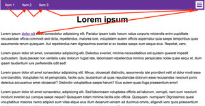
In my implementation I have three links in the Primary nav, then the <button> is adjacent to those. When the viewport is very small (less than 370px width) our links wrap and it looks a little unsightly. This is likely to be more of an issue on a real world site, as my link names are just "Item 1", "Item 2", etc, whereas real world sites may have links with longer names.
We could solve this solely with CSS, by stacking the links in a column, with flexbox, however, in my experience designers don't often like the stacked effect, so it is quite common to move a couple of links into the Secondary navigation.
I'm just moving one, purely as a demo, I'm not suggesting this is the best solution, as I'd personally just stack them, however, seldom do we have the clout to influence design changes, so we just roll with the current design.
let screenWidth = window.matchMedia('(width <= 48em)');
let smallViewport = screenWidth.matches;

screenWidth.onchange = (evt) => {
  if (evt.matches) {
    smallViewport = true;
  } else {
    smallViewport = false;
  }
  shuffleNav()
}

const shuffleNav = () => {
  const overflowItem = document.querySelector('.nav__item--overflow');
  if (smallViewport) {
      drawer.querySelector('.nav__drawer-list').prepend(overflowItem);
  } else {
      mainNav.appendChild(overflowItem);
  }
}

shuffleNav();- Set a couple of variables, the first uses
matchMedia()to get out our CSS breakpoint, which I'd earlier set at48em - The Second returns a
trueoffalsevalue,trueif the sceen width is less than48emandfalseotherwise - We need to monitor the
onchangeevent of that variable and update it accordingly, we also call a functionshuffleNav() - Inside
shuffleNav()we grab the item we want to move (you'd need to loop through the list items if you wanted to move more).nav__item--overflow, ifsmallViewportis true, weprepend()the list within the drawer with that item - Else we pop it back into the Primary nav
This is only going to be useful if the Primary and Secondary navigations are somewhat similar, so if the Secondary were a list of movies and the nav was called Movies, then moving the "About us" link into there wouldn't make any sense.
If I were building a site and I had full artistic licence, and encountered this problem, I'd solve it with CSS, but here I'm just showing how we may go about it if the design dictated a horizontal Primary nav that moved elements into the Secondary nav.
Another possible enhancement?
On very large screens we could do away with the button, completely, we could just always show the drawer as open. It makes sense to have a toggle up to a certain point, but I limit the width of my sites anyway, so the line length isn't too problematic for folk with reading disabilities, etc. Is there any point in hiding it when we have adequate void space around the page's <body>? I guess that would totally depend on what was inside the drawer, but let's assume the contents are as important as the primary navigation, categories in a store, topics on a blog, that kind of thing, then I don't think hiding the drawer when there is enough space to show it, benefits anybody.
A little media query can handle that, we wouldn't need any JS. We could just hide the <button> at a suitably large enough viewport and then add the display: none; property. As I typically limit the width of my sites to around 75rem (1200px) if they are "single column" type sites and a standard Full HD monitor has a viewport width of 1920px we end up in a situation where hiding the drawer becomes sort of perfunctory and ill-thought-out. We usually hide things in disclosures, etc, to make use of available screen real estate and to avoid overwhelming users with too much secondary information. If these links were important on this site, or indeed they were actions or settings of some form. Just a little media query for that:
 @media screen and (min-width: 75em) {
  .nav__trigger {
    display: none;
  }

  .has-js .nav__drawer {
    display: block;
    width: 20rem;
  }
}
Nothing really surprising, in the above snippet:
Our media query is 75em (1200px) and only within that media query do we do the following:
- Hide the
<button> - Force the drawer to be open, irrespective of the of
aria-expanded's value to do this, we simply setdisplay: block;andwidth: 20rem;, as we did earlier, when the drawer was open although we don't tie this to any state anymore, as the button does not exist to change anything
That's about it for the fist two drawer styles
Obviously I haven't gone over all of the CSS, but that is vailable on the Codepen's working example. We managed to use the push to the side style effectively, whilst not killing the accessibility, as is often the case. It wasn't complex, I found it easy to achieve, it did take a little thought, though, as initially I tried a slightly different approach and then realised there was a better way. Obviously a little thought is no effort whatsoever and it's the bare minimum disabled people should be able to expect when using our sites, alsthough, sadly, this is seldom the case.
Is our drawer perfect?
Is anything? Well, we did everything we needed to do, we have a solid and sensible focus order, we hide the drawer accessibly when it's collapsed, we toggle the state of aria-expanded when the <button> is clicked and the relationships make sense, although Safari and VoiceOver didn't do as I expected when I reversed back into the drawer's content, it didn't tell me I was in "navigation, Secondary", which is a little disappointing.
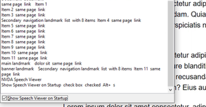
Running the same test with NVDA and Chrome (I have AssistivLabs, and this is my only option), I do in fact hear what I expected to hear when I reverse Tab into the drawer, I hear "Banner landmark, Secondary navigation landmark, list...", which is exactly what I expected to happen for VoiceOver and Safari. I don't have JAWS, so sadly I'm unable to test that, once I get to the end of this guide, I will test with TalkBack and Chrome on my phone, I'll also test on my iPad with VoiceOver and Safari, but I think we know what the outcome of that will be, don't we?
I'm reluctant to say how helpful the presence of this property is, it's certainly intended for this kind of use case, where our HTML has a severed realtionship and we need to programmitically add it back in. As our moving of the drawer wasn't too much of a wrangle, so even without it, it's possible that its presence may not make a huge difference? Obviously I cannot speak on behalf of screen reader users, so only they can answer that.
I have added a screenshot of NVDA's Speech Viewer, showing the output is what I said it is, just so you know I did actually test that.
I assume we're all familiar with that Schrödinger bloke? Well he was a physicist and did a thought-experiment called Schrödinger's Cat, which is something to do with quantum physics. Essentially, there's a cat in a box, along with some nasty stuff and at one point, due to quantum mechanics the cat has two states, it's both dead and alive, simultaneously. What has this got to do with nav drawers, I hear you ask?
Well, our next pattern is something that Schrödinger fella would be interested in, in fact, if he were still kicking about and was somehow involved in web dev or Accessibility, then I'm 99.99% certain he would have named this pattern Schrödinger's Nav.
This particular nav can be both expanded and collapsed, at the same time, it's what we in the physics community call a paradox, something that contradicts itself. I jest, I am not in the physics community and most of my quantum physics knowledge comes from Avengers movies, I just thought this was a light-hearted way to introduce the next nav drawer.
So, this drawer can be fully open, or "ajar", but never fully closed, so when it is closed, is it expanded, collapsed ot both? The drawer was popular quite some time ago, and appears to be making a bit of a comeback. When the drawer is as closed as it gets, it's still keyboard accessible, the focus order remains the same, it just does away with the text labels and just shows the icons. If you can see the icons and the iconography is good enough for you to understand their meaning, cool, this may be kind of useful, I guess. I mean it saves a grand total of one click, but at what cost?
If a user uses a keyboard only, then they can focus on the button, they can choose to open it fully or keep it "ajar", one would hope that there was a way of skipping over the items within, when it's "ajar", but seldom is that the case.
Now, if our user is blind, they cannot see the icons, but they can focus on them, they should of course be able to hear the AccName's of each item, irrespective of whether the drawer is open a little bit, or a lot. The very purpose of that button may well be very confusing and this is why I made the Schrödinger reference. We know that people with disabilities face barriers across many aspects of life, we know some of these barriers are on websites and we can summise that sometimes these users will have no choice other to to accept something simply does not work for them. I do not know how often this happens, but I guess it can be a lot. So the button for this drawer will have absolutely no effect whatsoever for a blind screen reader user, nothing will change, apart from the aria-expanded state on the <button>, if it is present. Should we use aria-expanded on this element? Does it have an appropriate value, like aria-expanded="ajar" or aria-expanded="sort of"? No, it doesn't and the ARIA spec states "it can be applied to a <button> that controls visibility of a section of the page", amongst other similar uses. It would be difficult to say it is not visible when it is partly visible, wouldn't it? Like, it's still there, sighted users can still see it and unsighted users can still tab through it and hear the AccNames, so what would the purpose of the state be? I don't believe it has any purpose here, as I struggle to understand how it helps, as no matter how it is framed, collapsed is still expanded, both dead and alive.
I'm going to attempt to make this a little less confusing, before I get stuck in, I'm going to slightly modify the previous HTML. I'm putting this on a separate Codepen, initially I was going to provide a toggle, to switch between types, but then I just thought I'll do this one as a standalone. I'm not going to make the "mobile" version of this one, as it would have to be the same as the previous mobile version, as around 50 pixels in width would be required for an "ajar" drawer, which is a lot of space on a smaller viewport.
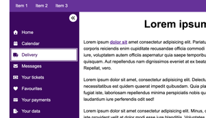
A couple of screenshots of what we are going for:

The HTML
<!DOCTYPE html>
<html lang="en">
  <head>
    <meta charset="UTF-8">
    <meta name="viewport" content="width=device-width, initial-scale=1.0">
    <title>Document</title>
  </head>
  <body>
    <header class="header">
      <a href="#main" class="skip-link">Skip to content</a>
      <nav class="nav" aria-labelledby="primaryNavLabel">
        <h2 id="primaryNavLabel" style="display: none;">Primary</h2>
        <ul class="nav__list">
          <li class="nav__item"><a href="#" class="nav__link">Item 1</a></li>
          <li class="nav__item"><a href="#" class="nav__link">Item 2</a></li>
          <li class="nav__item nav__item--overflow"><a href="#" class="nav__link">Item 3</a></li>
        </ul>
      </nav>
      <nav class="nav__side" id="sideNav" aria-labelledby="sideNavLabel" aria-owns="drawer">
        <h2 id="sideNavLabel" style="display: none;">Secondary</h2>
        <button class="nav__trigger" id="trigger" aria-controls="drawer" aria-pressed="false" data-untouched>
          <span class="visually-hidden">Show labels</span>
        </button>
        <ul class="nav__drawer-list">
          <li class="nav__drawer-item">
            <a href="#" class="nav__drawer-link">
              <i class="fa fa-solid fa-house"></i><span>Home</span>
            </a>
          </li>
          <li class="nav__drawer-item">
            <a href="#" class="nav__drawer-link">
              <i class="fa fa-solid fa-calendar"></i><span>Calendar</span>
            </a>
          </li>
          <li class="nav__drawer-item">
            <a href="#" class="nav__drawer-link">
              <i class="fa fa-solid fa-truck"></i><span>Delivery</span>
            </a>
          </li>
          <li class="nav__drawer-item">
            <a href="#" class="nav__drawer-link">
              <i class="fa fa-solid fa-envelope"></i><span>Messages</span>
            </a>
          </li>
          <li class="nav__drawer-item">
            <a href="#" class="nav__drawer-link">
              <i class="fa fa-solid fa-ticket"></i><span>Your tickets</span>
            </a>
          </li>
          <li class="nav__drawer-item">
            <a href="#" class="nav__drawer-link">
              <i class="fa fa-solid fa-heart"></i><span>Favourites</span>
            </a>
          </li>
          <li class="nav__drawer-item">
            <a href="#" class="nav__drawer-link">
              <i class="fa fa-solid fa-credit-card"></i><span>Your payments</span>
            </a>
          </li>
          <li class="nav__drawer-item">
            <a href="#" class="nav__drawer-link">
              <i class="fa fa-solid fa-file-export"></i><span>Your data</span>
            </a>
          </li>
        </ul>
      </nav>
    </header>
    <div class="site">
      <main class="main" id="main">
        <h1>Lorem ipsum</h1>
        <!-- Lorem ipsum removed for brevity -->
      </main>
    </div>
    <footer class="footer">
      <p>MTA drawer 2025</p>
      <a href="#">Item 12</a>
    </footer>
  </body>
</html>
I've made some relatively minor changes to the above:
- I have removed
aria-ownscompletely for this pattern, I explain why at the end - I have removed
aria-expanded, as it no longer makes sense as we can never have technically collapsed, just sort-of collapsed. - I have added
aria-pressed="false", which is a better fit, here, it indicates a state and on its own it is non-descriptive, it is explicit with the current state, it is either pressed or it is not (trueorfalse), but it does not imply what either state does, it leaves that to author's to provide a good AccName - I removed the
.nav__drawerwrapper and the.nav__wrapperelements, as we don't need those extra<div>'s here - I have changed the AccName from "Menu" to "Display labels", as that along with the state offers an indication of the control's purpose. I would recommend exploring a better name than that, initially I thought "Show labels", but I quickly remembered that is the exact voice command to show AccNames with VoiceControl on MacOS, which could potentially cause an issue, if the microphone doesn't pick up the initial "click" keyword?
- I removed the
<span>element I used to create the hamburger icon, because whilst that icon has a strong affordance, I think an arrow of sorts will be a better fit, here
This gives us our base HTML, so, is this better? Well, it's a thought-experiment and we're attempting to make this somewhat odd pattern as accessible as we can, but, it seems a little better. We no longer have that situation where a screen reader user will encounter a <button> that "expands", and they then discover that nothing has changed for them, in which case, they would likely be left wondering whether they were excluded from accessing whatever it was that "expanded", due to poor code or whatever.
My AccName likely isn't perfect, but it does provide information that at least indicates the <button> changes something visually, as "display" obviously means "show" and that may be just enough for users to understand this control changes something visually, and there is not in fact, something inaccessible to them, somewhere. I have no doubt this could be improved upon, but I'd want to get that improved AccName from the people who it affects and that would mostly be screen reader users and voice input users, so please do feel free to have those discussions to improve that should you be involved in creating this pattern.
This time, I'm going to make it slide in from the right, just because I did left last time.
The important CSS
.has-js .site {
  display: flex;
  flex-direction: row;
}

.has-js .nav__side {
  position: relative;
  padding-top: 3.75rem;
  background-color: var(--color-primary-dark);
}

.has-js .nav__drawer {
  min-height: 100%;
  width: 3.5rem;
  transition: width 500ms ease-in;
  overflow-x: hidden;
}

.nav__trigger[aria-pressed="true"] + .nav__drawer {
  width: 20rem;
}
The above, explained:
- As with before, we use the flexbox layout, although this time, we don't set the
flex-direction;torow-reverse, instead we simply userow;. This is because I want this pattern to slide in from the right - I wanted to have my open/close
<button>to stay on the right edge of the drawer, so it would follow that right edge when it opens fully, so I set theposition:torelative;in the full CSS, I set the .nav__triggertoposition: absolute, and add bothrightandtopvalues to achive that effect - I set the
widthof the drawer to3.5rem, which seemed "ajar" enough to have decent sized icons, my target size has aheightandwidthof2.5rem(40px), which isn't quite Level AAA (44px), but it's not far off and certainly better than Level AA's requirement (24px). I hide the overflow on the horizontal axis (overflow-x:), as I don't hide the text labels, I leave them in place and just prevent them from being squished or escaping their container, to have them sort of swipe into view - Finally, when the button is clicked and the value of
aria-pressedis"true", I then set thewidthto20rem, I do have an animation on this, which runs for.5s, as that is typical of a drawer effect. remember that this is a component in isolation, I haven't added anyreduce-motionmedia queries in this example, but this is something you should do. Here on MTA, we have some quite granular controls for User Preferences, disabling motion completely is one of them
A sprinkle of JS
I'm just doing the bare minimum, here:
const drawer = document.querySelector(`.nav__side`);
document.querySelector('.site').prepend(drawer);

trigger.addEventListener('click', () => {
  trigger.removeAttribute('data-untouched');
  trigger.getAttribute('aria-pressed') === 'false' ? trigger.setAttribute('aria-pressed', 'true') : trigger.setAttribute('aria-pressed', 'false');
});- This time, I get a reference to the whole
.nav__sideelement, as I need to move the whole thing - I
prepend()to exactly the same place as before, the.sitewrapper - I add an
eventListener()to thetriggerand use a ternary operator to toggle the value ofaria-pressed
Is This drawer perfect?
Firstly, let me state that i'm not overly keen on this pattern, arguably, it does have a place on the web or perhaps more specifically in apps with several tools, but that would depend on the site, etc. From a sighted user's persective, I'd only find this useful on a site I visited often, as over time, I'd probably learn what the icons meant, but even then, simply expanding a panel has never seemed like "effort" to me, so I do struggle to understand what the actual benefit is here. As I work in accessibility, I understand how websites can be problematic, I know that additional complexity can introduce barriers or cause confusion and honestly, for me, a non-disabled person having to click one button to show the navigation items isn't a problem at all, so if this pattern is confusing to some disabled people, then it's benefit isn't for everyone and I'd happily click one button every time I visited a site if it meant that the site was easier to use for people with disabilities. I do not know how confusing this pattern is in the real world, maybe less than I assume, maybe more?
I have seen a variation of this pattern where hovering or focusing over the icons when the drawer is "ajar" displayed a small tooltip with the actual text label inside. This is quite like Adobe apps, such as photoshop, etc and I can see how that would be somewhat useful for at-a-glance stuff, changing tools and what not. How useful is it on a website? probably useful to some? The one I tested was done well, again, though, I just prefer drawers that fully close, in real life (furniture) and on the web, maybe I'm just old, I dunno. The addition of the tooltips on both hover and focus did make it that little better for some users, I guess, as an example, a keyboard-only user would see the text labels, screen magnifier users would see the text labels on hover so there are some improvements. It still wasn't good enough to completely do away with the confusing trigger, as voice input users won't be hovering and whilst they can issue commands such as "Press tab" to focus on elements, sequentially, I'm sure they'd much rather just say "Click, home", etc, and they'd need to see the labels for that. Sure, they can get their software to "Show labels", or they can fully open the drawer, but it feels like these users have an additional step over all others. How much of an issue that is will of course be something we could learn from those users.
I feel like I have deviated from "convention" a little, my drawer definitely expands, yet I haven't used aria-expanded, I opted for aria-pressed, instead. Some folk may say "This is wrong and the gods of ARIA will banish thee to an eternity of <div> soup (which somedays, i think they already have), but that's cool, because having conversations about these things is great, we all learn from one another. I believe I have made the right call, as collapsed is both dead and alive, simultaneously and my mate Schrödinger would agree, if he were in a position to do so.
The reason I moved the whole drawer and <button> with JS, this time was focus order. Had I put the trigger in the top left of the page, which way would a user expect focus to initially go, horizontal through the Primary nav, or vertical through the "ajar" or "fully" open drawer? Had it been vertical, then a user would have to Tab through the entirety of the drawer to reach the Primary nav and as it is Primary (most important), it makes sense that this should come first. But, if the focus order went Trigger > primary nav Item 1 > item 2... then into the drawer, then we have an illogical focus order, as the controlling element and the controlled panel have unrelated items between them. Part of this was caused by positioning the drawer on the left, which is something to consider, so pulling the trigger down with the nav seemed like the only logical solution.
My skip link skips both the Primary and Secondary navs, that is by design, they are Primary and Secondary, but many sites will call for a more decoupled drawer, in which case it would introduce a challenge. You'd need two skip links "Skip to tools" and "Skip to main" or something, that in itself isn't complex, assuming everybody is happy with them both at the top and the drawer's contents come before the first bit of main content, otherwise the Skip Link may need positioning closer to the drawer and aesthetically, that may be quite displeasing to some, especially as the "ajar" drawer is very narrow.
We covered quite a bit:
- We built a drawer that pushes the main content to the side or squishes it, which only really works on larger viewports
- We built a drawer that overlays the content, we just used this for "mobile", which is likely the only solution for smaller viewports
- We made an always open drawer on larger viewports, this one cannot be collapsed, without changing the viewport size
- Then we made Schrödinger's nav, which I find a little odd, in that when it is collapsed it's still actually expanded, too, when it's expanded some folk won't understand what has happened.
- We positioned our drawers to both the left and right, just to mix it up a bit and show that both need some thought regarding focus order and of course what the Skip Link will actually skip
- I guess the bit we (Ok, I) did that may be seen as a little controversial by some is I swapped out
aria-expandedforaria-pressedon Schrödinger's nav. This wasn't me solutioneering, that was me interpreting the ARIA spec as the former means it's either visible or it's hidden, it doesn't mention it's both and technically, it's always visible, even when collapsed - I also reastblished a relationship with
aria-owns,which in many cases won't actually be necessary, depending on each nav's purpose, but I did it for mine as an example of how it works, just not on Apple devices, but Apple be Apple-ing I guess
I feel that the combination of push to the side for larger viewports and overlay for smaller is better for websites is the better pattern, for accessibility purposes. If we had a complex web app, maybe Schrödinger's nav has a place there, but as always, I can't speak for disabled people, so their input is the only input that matters, but it's not difficult to see how it could be confusing to some.
The Codepens
Example 1 (includes the push aside and overlay for mobile effect):
Example 2 (Schrödinger's nav)
The results of mobile testing aria-owns
Talkback and Chrome (Samsung Galaxy phone)
I encountered problems when testing with TalkBack for the Schrödinger's Nav pattern, initially I had used the aria-owns property, which oddly caused an irregular focus order. The links within the drawer received focus before the trigger, which was not reflected in the DOM order.
Additionally I had an issue where when only the icons are displayed, and I "focused" on them, the "focus" indicator pushed the icons off the screen, making them disappear. The reason why this was happening was because the virtual focus indicator seemingly attempts to centre an element to view it all, this sent me down a rabbit hole that I didn't enjoy.
The first example of the regular push to the side nav was actually OK. Although TalkBack didn't announce landmarks, despite me having High verbosity settings, but this is actually often/always the case, at least on my Samsung phone.
I was able to solve the disappearing icon issue, here.
VoiceOver and Safari (iPad)
Quite surprisingly everything was announced perfectly on VoiceOver iPadOS, with Safari, when I swiped back into the nav, on the first pattern.
The second pattern was giving me the same issues as on TalkBack.
I didn't solve the disappearing icon issue, here. I spent ages trying to resolve it, and ran out of time. I don't particularly recommend this pattern, anyway, so I'll leave that unresolved.
The problem
As part of my debugging process I commented all CSS out, to determine whether this was a CSS related bug and it turned out the behaviour did not change, on both Android and iPadOS. That meant it could only possibly be the HTML (JS had only moved an element and I was certain everything was fine there), during my debugging, I removed the aria-owns property and suddlenly my reading/focus sequence followed the DOM order. This is quite interesting, as whilst I thought I was creating a relationship that I initially severed, I actually made things much worse for touch device users.
It worked exactly as expected in NVDA and Chrome, I wanted to know how VoiceOver would fare with Chrome, just to determine where the problem lies, and it's actually Safari, as opposed to VoiceOver, as Chrome was fine and reported landmarks, correctly. This knowledge doesn't really help in any way, as Chrome and VoiceOver isn't a "recommended" pairing, and I have no power to fix Safari on MacOS.
The solution
The solution here is simply not to use aria-owns, especially for the Schrödinger's Nav pattern as it caused some unintended side effects. It shouldn't do this, but here we are. Given the problems it has caused and the time I spent debugging and testing, where I came away knowing what caused the issue, but not why, I'd avoid using this property altogether on Schrödinger's Nav and probably avoid it on the regular pattern, just to be safe. The small bit of value it adds, simply isn't worth the mess it causes on touchscreen devices. We need to always strike a balance and if something breaks for one set of users, then it's not worth considering. Without using it, I would amend the first pattern, I'd want to make sure both the <button> and the drawer contents are in the <nav> together, instead of using ARIA to reinstate the relationship. Whilst it may have been useful to desktop users, that small benefit isn't worth it for the issues it causes touchscreen users, in my opinion, I want things I build to just work for everybody.