
So, as the page title says we're going to discuss the differences between both aria-owns and aria-controls, they're completely different attributes, with completely different purposes so before we dive a little deeper, let's just try to understand where the confusion may be coming from.
As developers trying to build components that can be accessed by users of assistive technologies, sometimes we need to reach for some ARIA, where HTML alone cannot effectively pass all of the necessary information to the accessibility tree. Obviously the best strategy here is to try to avoid or limit the use of ARIA and use good old HTML where we can, but of course, that's not always possible.
So, sometimes we need to use ARIA to create relationships between nodes, be they static nodes or interactive nodes and we may consider doing this for a variety of reasons. A couple of examples could be:
- A button controls the display properties of another node that is not related in the DOM or that relationship would not be communicated to assistive technologies as they're siblings or cousins twice removed or something
- We don't have access to the full HTML and we're having to patch up something that is not being correctly communicated to assistive tech
- Some odd layout means we have content that interrupts the intended parent-child relationship of something
- We're having to battle with some hipster micro-service and whatever dark arts are behind those, this may mean we don't have full access to all of the HTML, as this element lives in some server elsewhere (i'm just acting smart, I have no idea what these things do, really)
When we need to create those relationships, we need to reach for the right attribute, as randomly grabbing the one that sounds like it might be a good fit, based upon its name alone could in fact just make things worse, in which case, it's likely that the "No ARIA is better than bad ARIA" statement comes into play.
They both have the word 'aria' in them.
I won't just leave it there, there are some other similarities:
- They're both 'properties', ARIA properties typically add additional information to a node or collection of nodes and the intent is that that information can be used when the browser builds the accessibility tree, which is then consumed by some assistive technologies.
- A 'Property' is not a 'State', states communicate the current, errm, state of a node or widget, such as checked, expanded, selected, pressed and so forth. All of those aforementioned states would naturally be prefixed with 'aria-', much like the properties, but just because they start with the same few characters, that doesn't make them the same, we're going a little off track here, but it's useful information and you can read more about the disambiguation of States and Properties here.
- They both create a relationship that may not otherwise be achievable with HTML alone or our access to it, but just like in real life, there is more than one type of relationship.
- They both have a value that points to at least one ID of another element in the DOM
There may well be other similarities, but none that I know of, I'm sure smarter folk than me could furnish you with more, but we'll just roll with what we have, as this article isn't about the similarities, it's about the differences and that's the important distinction.
I have thus far never been in a situation where I have added aria-owns to anything, ever, I'm sure there are valid use cases for it, as the folks that create this stuff tend to do so for the greater good and perhaps I've just been fortunate enough to have full access to the HTML, in most cases.
I do tend to use aria-controls though and I use that in basic disclosure patterns, so a button which when interacted with will reveal some previously hidden content. We'll start with this property, as more often than not, this may be the one you actually need.
ARIA Controls
This property is often used on an interactive element and that interactive element controls another element via creating a relationship through its value, which must be a valid ID in the DOM, as an example, let's look at the following mobile nav example:
<button aria-controls="navList" aria-expanded="false">Menu</button>
<ul id="navList">
  <li><a href="/somewhere.html">Somewhere</a></li>
  <!-- Other items -->
</ul>
The above code example is pretty common, I've omitted wrapping that in a <nav> element as whilst that does create a relationship between all of the elements within, it does not create a controlling relationship on the button and the target element, in this case, the target element would be our list which would have its visibility/display/exposure toggled when a click event occurred on the button.
This property creates a relationship, which I guess in layman's terms means "interacting with me will do something to the target element". These elements do not even need to be close by in the DOM, perhaps your navigation is a side drawer or something and its position in the DOM is not close to the trigger, that relationship is still exposed to the accessibility tree. Of course, when we have such an element, it is typically much better to have the target element somewhat adjacent to the triggering element, as otherwise we'd need to faff around with focus management and reading order, as the newly disclosed content must either be next in the sequential focus order or focus must move to the first interactive element within our target node (assuming it has one), so without managing that focus, we could make discoverability of our newly disclosed content difficult for our users, which is obviously something we must avoid.
Does ARIA Controls have good support?
It is exposed by browsers, in the accessibility tree, but then whether a screen reader for example does anything with that, is a different matter altogether. The A11y Supports website is great for getting a quick overview of these things, but as far as I am aware this is maintained by just one person, Michael and despite the fantastic work Michael does for the community, he is only one person, dedicating a chunk of his free time to this cause, so naturally he cannot possibly keep up with every every change to the ARIA spec, every browser and assistive technology update and of course updates to operating systems etc. There is usually a callout element on the page, which informs you when the attribute was last tested and this may be useful for deciding if you want to rely on Micahel's resource or not. I do believe he would love help from the community, so if you have a full suite of assistive tech and some free time, I'm sure Michael and the community at large would be delighted.
In the table for ARIA Controls on the A11y Support site, it looks like only JAWS does anything with the property but still, that relationship is exposed to the accessibility tree, so should assistive technology vendors decide to implement that as per the intent in the spec, then we already have it. Here's a screenshot of the accessibility inspector in Chrome's DevTools, showing that the property is at least exposed to the accessibility tree:
The same information is also available on both Safari and Firefox, both on the latest version of MacOS (13.4.1) and all three browsers are up to date. I've not checked exposure of this on mobile devices or other operating systems, so this is less than comprehensive on my behalf.
Arguably, this property is optional, due to the fact that screen readers don't do a great deal with it and assuming that your trigger and target element are adjacent in the DOM (or have no other content between them), then at the time of writing, I don't believe anybody is going to fail your expanding widget for omitting it, but that being said, I do use it and if I have to fail a disclosure widget for another reason, my code example will include the property as a best practice and I do this as I read a lot of articles from industry experts and when they include it in similar examples, as long as I understand why, I also include it too.
This property is of course not restricted to just mobile navigations, it is also used on accordions, typeahead type searches, custom select inputs and much more. The ARIA 1.2 spec provides the details about the property.
ARIA Owns
This is perhaps a little more complex to understand, which I guess is where the confusion comes in, as this is the property I see misused most often.
In HTML we have nesting, we can wrap an element or elements within others (assuming it is per the spec of course), this creates a tree-like structure, as developers we would typically make our code easier to understand and read by indenting nested elements in our code editor. The DevTools in the browser also help us by displaying indention, even when we compress our HTML.
When we nest elements we have an "owning element" and at least one "owned element", more commonly we refer to these as parents and children, respectively and items at the same level will naturally be siblings. The easiest example I can think of to demonstrate this is a list, for anybody not familiar with HTML, that would be structured like so:
<ul>
  <li>Item 1</li>
  <li>Item 2</li>
</ul>
In our very basic example above, ignoring the fact that the list would definitely have a parent and it would likely have siblings, what we have is a <ul> element that is the parent element (the owning element) and two <li> items which are the children elements (the owned elements) and by extension, both those child elements are siblings.
Why are you telling me this? I know this
The reason I went back to basics above is not to make the assumption that somebody reading this has no prior knowledge of HTML, some readers won't be developers but some will likely understand HTML if they are a tester and some may not. That isn't the primary reason though, the primary reason is actually the relevance it has to aria-owns and I personally find it useful to be able to make the distinction on the fly, so when I'm reading other folks' code, in the DOM and I see aria-owns used, I immediately know whether it was used incorrectly.
OK so what does it do?
Essentially, when we add the aria-owns property to a node and then reference the ID of another, we are in essence telling the accessibility tree that the node with aria-owns on, is the parent of the target node (The referred to ID).
But it looks fine in the DOM
It will look exactly the same in the DOM, as ARIA isn't really for the DOM, it doesn't manipulate it or add functionality etc, so maybe this is less evident as we could be looking in the wrong place? let's take our earlier example of a mobile nav and swap the aria-controls property for the aria-owns property, this is available in the following code example:
<button aria-owns="navList" aria-expanded="false">Menu</button>
<ul id="navList">
  <li><a href="/somewhere.html">Somewhere</a></li>
  <!-- Other items -->
</ul>
In just code, that perhaps looks quite harmless to many and could perhaps be missed quite easily. Let's see how it looks in the DOM, I'm going to duplicate it and add aria-controls back on the first, I'll change text labels and IDs of course, but I want to this for my comparison:
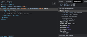
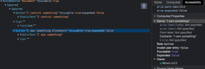
Firstly let's look at our original, I have just changed the name of the button text in this one:
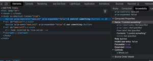
We won't go into any detail here, as we did earlier, so let's look into the aria-owns example:
What did you notice there? Perhaps the first thing you noticed in the screenshot or indeed a browser if you followed along that way is that the Controls property in the accessibility pane has been replaced with the Owns property, which is of course to be expected. Did you notice the accessible name of our button was appended? Top marks if you did, it's being appended with the text from within, as we only have one link in our mock mobile menu, it's simply being appended with the word "elsewhere", so the name of our control becomes "I own something elsewhere", which was perhaps a little unexpected to some of us?
So what is going on?
Well the first thing that is happening is because I did not actually make this navigation interactive, the list itself is always exposed to the accessibility tree. Should I have toggled the visibility of the list with a little CSS and JS, that name would not have been appended, whilst the list was accessibly hidden.
So, Safari and VoiceOver on MacOS/iOS do not support this property at all, so if you are testing with VoiceOver on Mac, you won't hear anything out of the ordinary in Safari, as it is ignored. Oddly, VoiceOver does not ignore it with other browsers on a Mac, so I can at least stay on this device as I'm only attempting to explain the differences.
But, what if we use Firefox or even commit an accessibility faux pas and try it with Chrome with VoiceOver? In both instances the property is communicated, the name is read out on Chrome the same as the accessibility pane indicated it would: "I own something Elsewhere", which is obviously not great at all and would be even worse if there were lots of links in that list.
Firefox and VoiceOver actually gives us a little more information, which may just be the kicker in realising how bad this actually is: "I own something, bullet, elsewhere, collapsed button group" Yuck, right?
Note: I don't usually test VoiceOver in Chrome, but I just wanted to demonstrate how it is exposed on browsers other than Safari.
Ok that's bad, why does it actually do that?
Essentially, by using aria-owns, you're modifying the structure of the accessibility tree to be different than the DOM, by telling the accessibility tree "Put all this stuff inside that button". This is similar to what happens when folks wrap a whole card in a link, it gets read out, along with its contents. It's ultimately telling the accessibility tree to interpret your button as this:
 <button aria-owns="navList2" aria-expanded="false">
   I own something
   <ul id="navList2">
    <li><a href="/elsewhere.html">Elsewhere</a></li>
    <!-- Other items -->
  </ul>
</button>
Which is obviously not what we would type out in a code editor, as we'd have lots of linters, validators, accessibility tools and people shouting at as, perhaps all at the same time. We would never put a list in a button, as it's not permitted in HTML (block level elements in inline block elements, nope) and we would not nest interactive elements, would we?
As we wouldn't nest interactive elements in our actual HTML, why would we want to do this for the accessibility tree? I can't think of a reason to do this as having a list in a button makes no sense, neither does having links inside buttons.
If I just add a few more links into that list, what we get sounds even more awful:
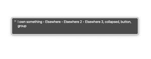
The output of the above VoiceOver text viewer sounds pretty bad, again this is in Firefox and the output is as follows: "I own something, bullet, elsewhere, bullet, elsewhere 2, bullet, elsewhere 3, collapsed, button, group". In the wild, that list would have way more than three links, each of which would append to the accessible name and whilst that list won't always be exposed to the accessibility tree (assuming it hides correctly) the thing is, it's not always hidden. The moment you interact with that button and the list is exposed to the accessibility tree, everything is read out, the trigger's name, role and value and all of the contents of that list, which I doubt any screen reader user would thank you for.
I concede to not being very thorough here, I haven't tested this on NVDA or JAWS and that's not due to me being lazy, I'm not testing support as such, I'm, just explaining how it works or how it is supposed to work. We have accordions on this site, you can find one here on the guides page, if you open the DevTools in anything other than Safari and change the aria-controls property on the button to aria-owns, then pop on your screen reader and expand the accordion, try that across a couple of browsers and see if you get the mess that I got in Firefox and VoiceOver.
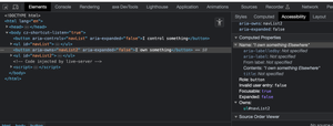
We can actually get this information if we open the full accessibility tree in the DevTools:
We can actually easily find out what aria-owns does to the element in the accessibility tree, in the screenshot, the button with the aria-controls property has the list as a sibling, which is what we want for this type of relationship, but the button with aria-owns has the list nested within the button, which is definitely not what we want.
Are there any use cases for ARIA Owns?
Of course, there are likely many. The folks that work on ARIA are smart, they work hard to get this stuff into the spec and ultimately browsers and assistive tech and that will all be based upon gaps in HTML and much of this information would be based upon what users of assistive technologies have reported to them. So, they don't just create attributes for the sake of creating them, so there are likely lots of valid use cases for this property.
I somewhat struggled to think of a potentially viable use case, but I guess (take this with a pinch of salt), if you had a drawer-type navigation, which wasn't adjacent to the trigger element and you needed it to be exposed as being in the same <nav> landmark as the trigger, maybe that would be a use case for it? I guess that would look something like this (please don't copy this code):
<nav aria-owns="drawer">
  <button id="menu" aria-expanded="true" aria-controls="drawer">Menu</button>
</nav>
<main>
  <h1>lorem ipsum</h1>
  <p>Lorem ipsum, dolor sit amore</p>
</main>
<footer>
  <!-- footer stuff -->
</footer>
<div id="drawer">
  <a href="/detination.html">The end</a>
</div>
That did appear to have the desired behaviour in both Chrome and Firefox, using VoiceOver, in that using the virtual cursor, I accessed the content of the drawer, before the main landmark and everything sounded as expected.
Essentially what I did here was referenced the ID of the drawer on the <nav>. If we were to construct this from scratch we'd obviously want both the button and the drawer in <nav> element, but we're just pretending that for some hypothetical reason, the drawer is placed at the bottom of the DOM. The ARIA 1.2 spec for ARIA owns states that "If an element has both aria-owns and DOM children then the order of the child elements with respect to the parent/child relationship is the DOM children first, then the elements referenced in aria-owns", which means we don't need to build up the list of IDs in the same we would for aria-labelledby's accessible name, so we just use the one ID (in this example) that is the one for our drawer, we don't need the ID of the actual child button, as we get that for free. So the trigger would come first in the reading order and then the actual drawer's contents, as this behaviour is the expected behaviour.
You may notice I also used aria-controls, but I obviously did not use it on the same element, I used it on the button, as that is of course the controlling element.
I have created this code example as a demonstration, there is no substitute for placing things correctly in the DOM and whilst in my limited testing, the DOM was read in the intended order using cursor keys, the focus order remained in the same order as the DOM order, so that would be an issue if we didn't manage focus correctly.
Also, this property is not supported with VoiceOver and Safari, so anything we would have achieved for other combos, would simply not work for most Mac or all iOS screen reader users (as all browsers on iOS are Safari, right?).
I struggled to think of a use case, as I personally have not had to use this myself and trying to keep my example on topic, with a navigation disclosure, this was the best example I could come up with. The best solution for the above is simply putting the whole drawer in the <nav> and using CSS to position the drawer, absolutely to its next position: relative; parent, which would likely be the <body> element or a suitable wrapping <div> if that's your bag.
Hopefully it's now clearer what the difference between these two ARIA properties are. When we want to create a relationship that indicates an element (usually an interactive element) controls something else in some way, we should use aria-controls, but on those rare occasions where it is not possible to create or adapt a DOM hierarchy that correctly creates the Owning Element and Owned Element (parent child) relationship, then the intent of of aria-owns would be more suitable, but given it's not supported in the main browser/screen reader combo for users of Macs and not supported on iPads or iPhones at all, it would require some additional JS to get this working and it may just be worth considering using a modal instead.
Also, if you need to explain why an accordion or other trigger for a disclosure widget shouldn't have aria-owns as an attribute, to a developer that felt the need to just lob it on there, for good measure, hopefully there is something in here that will make that task easier for you.