
We're going to take a deep dive into colour contrast here, where we will look into all three WCAG 2.2 success criteria (SC) that apply at Level AA:
We're looking at all three together as whilst Contrast (Minimum) and Non-text Contrast have no overlap, Use of Color can seemingly have a bit of overlap and perhaps cause a little confusion, I've definitely misunderstood and failed something against Non-text Contrast, when it should have been Use of Color, I mean, nobody ever pulled me up on it, it still failed WCAG, just not the SC I reported it against. Accuracy is paramount to reporting issues, there are definitely times where somebody will bitterly spend a considerable bit of time finding a way to discredit you, when it would have just been much quicker to fix the issue and we don't exist to get into arguments, we just want to make the web work for as many people as possible, so it's best to avoid giving folk ammo to discredit us.
In this guide there will be a lot of "This meets the requirement" type language, this isn't me advocating for something that just meets a specific requirement, but I have to state when something passes and when it doesn't. So, just to be clear that just scraping through the contrast checker for a specific thing is seldom a wise strategy. I'm going to include some "Best practice" type advice too, but as always, they won't be the definitive "Best practices" they'll just be much better than the bare minimum, and, as always, that's because there are often multiple ways of achieving something accessibly, but mostly because what works well for some users may not work as well for others.
WCAG thresholds
Before we start to discuss the individual SCs, we'll just take a moment to understand what WCAG means when it sets a threshold value. It's important to know and understand this as it performs part of the tests.
Some WCAG SCs may appear intentionally vague or the tests section in the Understanding Document may appear incomplete, this, I believe, is because websites can contain an unlimited number of technologies, components and patterns, some of which may not even have existed at the time the standard was last updated and as WCAG is "Technology agnostic" it covers a broad range of implementations and technologies.
The thresholds we are going to look at here are absolute, there is no confusion or ambiguity over the minimum values we are provided with, so from a testing perspective that makes life easier for us, as conformity is pretty easy to determine, so let's just summarise some of these values:
- When WCAG says the minimum contrast for a specific element is 3:1, it does not mean 2.99:1, or less. It means that the absolute minimum contrast is in fact 3:1 and anything below that is a fail, no ifs, no buts, it's a fail. Sure, it is likely that the human eye may not be able to distinguish the difference between 2.99:1 and 3:1 as the difference in lightness is so small. But there has to be a minimum value and the values for contrast at Level AA are either 3:1 or 4.5:1 so 2.99 and below and 4.49 and below fail those minimum value tests, respectively. Even if you were somehow able to use a tool that gave you a contrast of 4.49999999:1, that's still a fail. It can sometimes feel a bit pedantic to fail things that are so close to a threshold, but where a threshold exists, we have no discretion, it's binary, pass or fail and if it does not pass, we have to report it
- Text size requirements. Again, WCAG gives us some minimum values here and there is no wiggle room, no discretion, we can't just pass something because it's so close the difference may be negligible to most humans, but those minimum values exist. So where WCAG says text that is sized at least 18.66px*, you guessed it, it doesn't mean 18.65px, it means at least 18.66px and no less
- Bold font requirements. This may be a little trickier to determine due to the vast number of fonts and styles available on the web. Some "Bold" fonts may actually be much thinner than some "Regular" fonts, so it's quite a difficult metric to understand as how it looks visually can often be misleading. We can at least get the values from a page's CSS though and sometimes be prepared to think "Huh, how is that bold?". In this case, we only really have a single source of the truth and if the CSS says it's bold, then we can't fail it, but we can of course write it as an advisory, weakness, suggestion or whatever else you call your "Passes WCAG, but is naff" issues. CSS will either provide a named font-weight of "bold" or "bolder" or a numerical value of at least 700, as in CSS 700 equates "Bold", so anything that is 700 or higher satisfies the font weight requirement.
*I'm using pixels instead of points, I explain why, in the next section
In the Understanding Docs, which I linked to for each SC, at the start, often there will be reference to "Adjacent color(s)", which typically means the background of the the element in question, although, it can mean any feature that delineates the element from the internal or external background, such as borders and shadows, etc.
Text sizes
WCAG uses points for text sizing or pt in CSS, and in the understanding document they give us minimum thresholds in points, and then approximate the pixel values. This quote is taken from the understanding document for Contrast Minimum: "The ratio between sizes in points and CSS pixels is 1pt = 1.333px, therefore 14pt and 18pt are equivalent to approximately 18.5px and 24px". I'm unsure why they do not give the exact value for pixels, I mean 1.333 * 14 = 18.662 and not 18.5, so that is something to be aware of. Personally, I use 2 decimal places, so for me, 18.66px. Again, it would feel a bit pedantic to say "Hey, this text is only 18.65px and it needs to be 18.66px", but I have never personally encountered that. It's also worth pointing out that in WCAG a pixel is a unit of measurement, there are 96 pixels in an inch (a CSS inch). These are commonly known as CSS pixels on the web. These are not the same as hardware pixels, the hundreds of thousands or even millions of individual dots that form a display, MDN calls them Device pixels, so it is important not to think "Ahh, but 18.65px will be rounded up on my display", as there is a difference between CSS pixels and hardware pixels. We just care about the unit of measurement, we have no control over the users' displays. There may be several hardware pixels being used to display a single CSS pixel, high PPI (pixels per inch) such as Retina, 4K, 5K & 8K, etc displays do not map 1:1 from CSS pixels to hardware pixels.
The next section is going to be a bit of a primer which is aimed at folks that may not be too comfortable with the DevTools and getting CSS values, so if you wish to avoid the waffle and you know this stuff, you may wanna skip that bit.
Finding the correct size and weight values
CSS has tonnes of units for most aspects of the interface, we're not consigned to just using pixels, we can use "em", "rem", "vw", "mm", "cm", "inches", "px", "%" and loads more just for height and width alone, colours may use Hex, RGB, HSL and more.
For anyone not overly familiar with CSS, this may be useful to know as ultimately we want be able to determine values that are presented in a unit that makes it easier for us to determine whether the element in question passes of fails.
I do the bulk of my testing in the DevTools, I read a lot of CSS, HTML and ARIA, I look at values and I find all sorts of interesting stuff. I do also use assistive tech and semi-automated checkers, but I just do that later in my process, as that's what works for me, it's just the way I do it. Some folks will perhaps not open the DevTools unless they are running Axe, not everybody knows CSS, HTML and ARIA, so perhaps there is less of an emphasis on reading code and stuff for some folk? So, for these folks, this next tip may be useful to know, if you didn't already.
I primarily use Chrome (I know) during my initial reading the code phase, I'm a creature of habit I guess, and also it is the most popular browser. So I read the code in Chrome and then do more functional testing with AT, and a range of browsers and devices, etc. I tell you this as some of my jargon may appear Chrome-centric, so I apologise in advance if that's the case.
So, let's say we find some font that looks a little thin, low-ish contrast and it's not that large, whatever the reason, it's enough to make us suspicious enough to look into it. Generally, I'd open the DevTools (see, Chrome-centric) and take a look at the CSS in the Elements Panel, and I would locate the element in question to look at the values in the Styles pane.
I pondered how far I should go into the DevTools, Inspector, Developer Tools or whatever you call them in other browsers. I do not have a disability that effects my motility or sight, so I am able to visually locate something and then right click it, when I do this it opens the DevTools pretty much exactly where I want it. I'll be honest, I have no idea how to achieve the same with a keyboard, I don't think that exact behaviour is possible? I know I can open the DevTools with a keyboard, but when I use the keyboard shortcuts to do this it always opens on the <body> element which means you may have to trawl through <div> soup that is comparable in depth to the Mariana Trench, which, if that is the only way, is clearly rubbish. Using the search function in the DevTools may help, but for that you would of course need to know what the elements was called, so it would need a text label, this can be done with the regular "Find" shortcut CMD and F (Mac) or CTRL and F (Windows). Given that I have no control over how the DevTools opens or where it highlights a relevant node and I cannot find a way to replicate mouse behaviour on keyboard, I'm just going to skip over that bit, as I don't want to say "Right click on this button, choose 'inspect' and now look at the highlighted node in the DevTools", as that is obviously just catering for users that don't have a disability that prevents them from doing that. I will assume that everybody knows how to open the DevTools or Inspector, though.
Take our Home page, let's say for some reason we wanted to get the colour and size of the part of the heading that is purple "Make Things Accessible". Here's a screen shot of our Home page and the DevTools open:

In the DevTools there is a lighter highlighted line indicating this is the node I have selected. Forget that our text is obviously accessible, we just want to check some values. In the adjacent panel the Styles Pane is selected and displayed. At the top of the Styles Pane there is information about the font-size of that text, which uses a class and an element child selector, like so: .main__title--home span, that gets us the <span> that contains the text "Make Things Accessible" and that text has the following CSS: font-size: 4.5rem; on my screen (it may be different on yours, depending on screen size or zoom level, etc). What is a rem, is it important? Nope, it's a relative unit, it could mean absolutely anything, if I so wanted to I could make 1px = 1rem or 1rem to be 200px, both of which would be a bit silly and make things more difficult to work with. So, as testers, we're not concerned with rems and to a lesser extent ems, etc. We are concerned only with absoloute units, such as px and perhaps pts. But for our purpose, we just want to check the pixel values and font-weight.
The primary reason I will die on the hill of px, is because that is what the Computed Values are presented in, I don't want to do math, converting stuff, I'm happy with working with pixels and that works best for me.
If, in the CSS panel we click the "Computed" tab (it's called this in Chrome, Safari and Firefox), we then get the values we want.
In the above screen shot I've placed a series of arrows and boxes which outline key controls or information points, which in essence is Elements > the DOM node ( a <span>) > the Computed pane and finally the CSS properties and values for both font-size and font-weight. We have the values 72px for the font's size and 900 for the font's weight. Obviously both these values far exceed the minimum requirement for not only Level AA, but also Level AAA (we do try). But now we know the actual size and weight of the text that is presented in useful units, we know anything above 700 for weight is considered "Bold" and we also know 72px is larger than 24px, so we know this would only require a 3:1 contrast ratio against the background. If we wanted to check the contrast of that text, we could use Color Contrast Analyser (CCA) and get the text colour #7E2F9D and the background colour #F4F4F4 and CCA will tell us that the contrast is 6.9:1 in light mode. If you are following along in Dark Mode (I don't know why I'm not) the text colour #C2A7D7 and background colour #252525 gives us a contrast ratio of 7.2:1. Both of which easily exceed the requirements for Level AAA (4.5:1), due the the font size and weight.
Finding contrast values
There are dozens of ways to find the contrast of an element and its background, sometimes I'll use WebAIM's Contrast Checker and others I'll use TPGi's Color Contrast Analyser, the latter being the better, in my opinion as you don't have to go digging around in the CSS and potentially converting colour formats to Hex so you can paste the values in to WebAIM or similar. The other obvious benefit is you can just select the picker and drag it anywhere across your desktops, but again, it's unlikely there is a keyboard alternative that offers that level of precision (I haven't checked), so whatever tool, browser extension or website you use, just use that if you are comfortable with it.
Persitent states
Just in case you weren't aware, it is possible to force states on elements, which may make it easier to test contrast in a specific state, when I say force state, I mean "focus" and "hover" states. To do this you would need to locate the interactive element in the DevTools and highlight that element in the Elements pane (the HTML).
Once we have the element, by whichever way works for you, in Chrome and Firefox we need to look at the Styles pane and locate a tab called ":hov" which will expand and display some states. In Safari, we would again need to locate the Styles pane, but then ensure the "Pseudo" button was selected and this would display the same states as Chrome and Firefox.
I'm going to provide two screenshots, one in Chrome and one in Safari (Firefox is pretty much the same as Chrome) and I will add a series of arrows to indicate which options to choose. I'm using our Home page for this and you may notice that I have only checked the :focus-visible pseudo selector for this, this is because we use :focus-visible for our focus styles, so they only show on keyboard as opposed to when a user clicks that element with a mouse. We use slightly different styles for mouse interaction. You may need to select :focus or even both :focus and :focus-visible depending on the site you are looking at. There is also a :focus-within selector, which on rare occasions may be useful to check, however, this will typically be for a parent element of the element in question, and I don't tend to find this used as the sole focus indicator often at all, if ever, but it's important to know it is there, just in case. these are checkboxes, so you can of course select multiple.

The steps in the Chrome/Firefox Devtools are like so: Locate and select element in Elements pane > select ":hov" in the Styles pane > select :focus and/or :focus-visible in the pseudo states panel > the element that is highlighted should now have a decorative pip on in the Elements pane, indicating that a state has been forced upon it.

The steps in the Safari Web Inspector are like so: Locate and select element in Elements pane > select "Pseudo" in the Styles pane > select :focus and/or :focus-visible in the pseudo states panel > the element that is highlighted should now have a decorative pip on in the Elements pane, indicating that a state has been forced upon it.
All of the examples I am going to create will be actual examples using HTML and CSS, where possible (with the exception of images and charts). I'm going down this route, as opposed to using screenshots just so you can inspect the code or use tools you are familiar with or even learn how to use new ones. You may even wish to determine which semi-automated checkers pick up some issues and which don't. Obviously many of these elements will fail WCAG, many will have absolute (px) font sizes, they'll mostly be inline styles (yuck) and they'll generally be rubbish, but in order to tell you what is bad, I gotta give you the bad stuff, I guess. The interactive elements will be redundant, a button won't do anything, a link won't go anywhere and an input won't do anything with the text you may errm, input, unless there is an instruction to do something to cause a change in state, etc.
In addition, I'm excluding the actual examples from our theme changer, which I apologise for. The reason I am doing this is not because it is beyond me, or not because it isn't worth it, it's simply because it will take quite a lot of time. As an example, most of the elements I create will be against a pure white (#FFF) background. I then have to find both passing and failing colours for 3:1 and 4.5:1, this bit is easy. But, then what I would need to do, is flip the background to pure black and then try to find colours that have exactaly the same contrast ratio against the black, as the light theme's examples did against the white, so my text makes sense. If I couldn't find those exact matches, then everywhere I had mentioned a specific contrast ratio, the colour of the background and the colour of the element I would have to manipulate the DOM with JavaScript or use CSS media queries to change or display different text nodes that had the values in, etc. This would be a bit much, so again, I'm sorry, but the examples will all be in light mode.
Inactive user interface component
What is an "inactive user interface component"?, well, if it has the HTML "disabled" attribute then that is definitely inactive. Just adding aria-disabled="true" isn't the same as the disabled attribute, as it would still receive focus and a keyboard-only user may get a little confused. I interpret this to mean either using the disabled attribute, or rolling your own, so I would expect it to:
- Not do anything at all or accept any form of input
- Cannot receive focus (
tabindex="-1") - Has
aria-disabled="true"set
As with most accessibility topics, there's an Adrian Roselli article that discusses why disabling controls is mostly bad practice. So, if you're building or designing a page, then typically you want to try other options before disabling inputs or buttons, but that's not the purpose of this article, but you should read Adrian's article, as Adrian is very wise.
We're starting with this one as it is perhaps the least complex of the three, there is not a great deal to reveal here as this particular SC applies only to text and images of text.
Summary
Text and informational images of text must at least meet the minimum contrast ratios for their size, except for the following:
- Incidental text, photos that contain irrelevant text, graphics where the text isn't relevant to the image's subject, or decorative text
- Logos, yup, your company logo doesn't have to pass any contrast requirements
- Text that forms part of an inactive user interface component
Text that meets one of the following two criteria for "large text" must have a contrast ratio of at least 3:1:
- Text that is both of a size of at least 18.66px and has a font weight of bold
- Text that has a font size of at least 24px (any font-weight is permitted)
Text that is not "Large text", we'll call it "Regular text" must have a minimum contrast of 4.5:1, regular text is either:
- All text below 18.66px, irresprective of weight
- All text between 18.66px and 24px that has a font weight lower than bold or 700
Summary explained
Size and weight of text and images of text
The good thing with these is when we are testing actual text we can find out the values, most tools will tell you that they pass or fail at given size and/or weight combinations. Where this does get a bit tricky is testing the size and/or weight of images of text. The DevTools can't help us here as it is an image and that means we can't find out a great deal of information, as images are just pixels and carry no useful informatiun we can access through CSS. Text, on the other hand has a lot of other wizardy going on under the hood. As an example, a browser parses code and will lay out text accordingly, it will know to present text on the screen and it knows knows to send text to the accessibility tree (unless of course it is somehow hidden), it knows to "paint" the characters in whatever styles are set, be that from a custom stylesheet or if there isn't an author defined stylesheet set, the browser will use its own styles. As text has various properties we can inspect, we can determine the size and weight, easily.
So, what do we do when we discover an image of text that has a contrast of 3.5:1, as an example and we suspect it either lacks sufficient weight or size? Good question. Well the first thing we should do is determine if this image of text actually needs to be an image or could it just be actual text? If we could achieve the exact same result (or close enough, but accessible) by using actual text as opposed to an image then we simply fail it against SC 1.4.5 Images of Text (AA). If it is something that cannot be recreated with web technologies, such as a photograph of an historical document, or whatever, and the the purpose of the image is to show the actual document, then we need to find out whether there is a suitable text alternative close by. If there is not an actual text alternative which at the very least includes a verbatim transcript, then this of course, is a problem. If the document was in old cursive, faded handwriting and the pages were yellowed with age, or whatever, and it was clear that the contrast was low, I'd be expecting and requesting that a text alternative be present close by and this would be text that can be accessed by everybody, not just alt text and if that weren't the case, I would fail it against SC 1.1.1 Non-text Content (A). if it had alt text, I would mention this as a good point, but would emphasise it does not provide a suitable alternative to many users as it would still lack the required contrast and only screen reader users would actually get the alt text, in most circumstances. But remember, this only applies if the content is informational, if the purpose of the image was just to show how historical documents yellow over time, then it's not actually important what it says, as the subject is manky paper, not the written words.
Those two SC's will pretty much cover most instances where we have reason to believe that the text has an inadequate weight and/or size for its given contrast ratio. I've never personally had to measure a font on the screen using ruler browser extensions or opening it up in Photoshop, fingers crossed that remains the case and I don't want to jinx myself by explaining how I would go about it, either.
It's also worth noting that images of text do have a scaling issue. It's well documented that zooming an image will cause pixelation and distortion as raster images simply don't zoom well. The point I am making here, though, is, let's say we have a small piece of instructional text, inside an image, the sole purpose of said image is to provide this instruction (obviously an instruction should be actual text). We determine that the contrast is likely fine due to it being visually evident that the font size and weight are about 20px and bold. We're likely looking on a monitor or laptop, right? What about if we test under SC 1.4.10 Reflow (A) conditions (1280px browser width * 400% zoom), when that image scales down to fit a "smaller viewport", is that text now still sufficiently large enough to be "Large text"? If the image fitting on the viewport of a "mobile" screen seems very small, then it would likely fail Contrast (Minimum), as there is no exception for viewport size. So, basically, what I am trying to say, is that testing the size and weight of text in an image is awkward, there are lots of reasons why images of text are bad practice, and several success criteria it would need to satisfy before you started attempting to count pixels and stuff.
Incidental text
This basically means text that really doesn't matter, it doesn't add any information or value to the image or in the case of a photograph, it's just there, we have no control over text in a high street background, when the subject of the photo is a person shopping. In this case as long as the image had decent alt text that stated who was in the image, what they were doing (shopping?) and where they were (Oxford St, London), that would be sufficient, it's irrelevant that there's low contrast text in a shop window, in the background.
Logos
Company logos do not need to have adequate contrast against their background for the purposes of WCAG so if it has ultra low contrast, you don't have a WCAG issue, you may have a branding/design issue, but that's none of my business.
Inactive user interface component
User interface components that are either "disabled" or are functionally equivalent to "disabled" are also excluded from meeting contrast, but remember where we discussed this, earlier? It may not always be the best approach.
Text contrast examples
Let's take a look at some examples I have rustled up:
| ID | Element | Pass/fail |
|---|---|---|
| CM1 | Font-weight is normal, font-size is 18px, contrast is: 4.45:1 | Fail |
| CM2 | Font-weight is normal, font-size is 18px, contrast is: 4.6:1 | Pass |
| CM3 | Font-weight is bold, font-size is 18px, contrast is: 3.05:1 | Fail |
| CM4 | Font-weight is bold, font-size is 18.66px, contrast is: 3.05:1 | Pass |
| CM5 | Font-weight is normal, font-size is 23.99px, contrast is: 3.05:1 | Fail |
| CM6 | Font-weight is normal, font-size is 24px, contrast is: 3.05:1 | Pass |
| CM7 | font-size 18px, font-weight is normal, contrast is: 3.05:1 | Fail |
| CM8 | font-size 18px, font-weight is normal, contrast is: 2.95:1 | Pass |
| CM9 |  Contrast is 1.8:1, the size, weight and contrast don't matter here Contrast is 1.8:1, the size, weight and contrast don't matter here | Pass |
| CM10 | Placeholder contrast is 4.45:1 | Fail |
| CM11 | Placeholder contrast is 4.6:1 | Pass |
| CM12 |  Image text has a 4.27:1 contrast against the background, the font-size is 18px | fail |
| CM13 |  Image text has a 4.5:1 contrast against the background, the font-size is 18px | Pass |
Text Contrast summary
I've chosen colours that are either close to passing or close to failing for good reason, some folks may discover this article one day and think "Wow, I can't tell the difference". This of course matters a lot when selecting colours to use, as oftentimes just doing enough to pass a particular requirement is not accessible to everybody. It can be quite easy to think "WCAG says this is accessible", but that's not actually what WCAG says, it may say something is "conformant" in that it passes a particular SC, but accessibility is obviously about people and just scraping the minimum will certainly make using your site easier for more people, but not as many people as it could. So, please do consider this when selecting colour palettes and what not.
- In the table of examples, for those accessing the site visually, you may have noticed that CM1 and CM2 barely look any different (well, they don't to me) and that is the case for CM3 and CM4, but as I have previously explained, this will mostly come down to your monitor. On my larger external display the difference in size is barely noticeable, however, it does appear more noticeable if I drag the window over to my MacBook, presumably as it is a higher resolution and perhaps a brighter display. These are things to consider, if we are working in web development or design, etc, chances are we have relatively decent kit, especially if it is supplied to us, but outside of tech, folk are using lower resolution screens and less high-tech devices, so this will need considering, too.
- CM10 and CM11 use placeholder text, again, they are similar colours, and in this instance, it is not just the placeholder that is supplying the visible label, as that is bad and we all know that, right? But, placeholder text can of course be problematic, as both instances are quite dark and both float around the conformant notch, folk can actually be tricked by this, as the fields look pre-populated, if one of our users has both a vision disability and a cognitive disability, and an input like this was amongst several other inputs, it does have the potential to confuse them or cause them to receive a submission error, etc. I would personally avoid placeholder text, although, sometimes, we don't really get a choice. Hopefully, now we are armed with the knowledge that placeholder text must pass contrast requirements, which can result in the input looking pre-filled, maybe we can use this information to explain to those who can facilitate the change why it's often not a great idea.
Scraping the minimum
Quite often when we request that text contrast is increased on a UI and the fix is made we retest the site/app and the contrast is something like 4.52:1. Yes this passes, but that doesn't make it "accessible", some folks will genuinely still struggle to read that comfortably and as always, WCAG is the floor, not the ceiling. So, it really is better to not just begrudgingly move the contrast needle just past the "compliant" notch. I wouldn't suggest putting peddle to the metal and doing pure black on white (contrast 21:1), as some folk have disabilities that make that too difficult to read or cause them migraines, etc. There is possibly a "Goldlocks Zone" for contrast and whilst I don't know if there is an agreed range, based upon actual user testing, I personally look at the Level AAA contrast requirement 1.4.6 Contrast (Enhanced) as a decent guideline, which requires a 7:1 contrast ratio and a 4.5 contrast ratio for "regular" text and "large" text, respectively. But, again, as us humans are so diverse, there is not going to be a range that works for absolutely everyone, because disabilities are diverse, too.
Common gotcha
Often when somebody seemingly begrudgingly fixes something and the new contrast barely scrapes the minimum, it tends to do so on the primary background colour. It's pretty much nailed on that somewhere on the site, if not today, then in the future, somebody will add a container for some text that uses a slightly different background, to add emphasis, draw attention to it or to make it look "nice", only now that text fails, so scraping the minimum wasn't really the smartest move. Had that text have had a 5:1 contrast ratio, that very light background likely wouldn't have caused the failure, but, what do us accessibility folks know, huh?
When I received a failure against contrast for our brand colours, I was annoyed. How dare those pesky accessibility folk request I make the colour darker, to help people actually see our stuff? How dare the law dictate which colours I can use? Well, I'll show those pesky kids, this just scrapes the 4.5:1 minimum, I win.
Dave the Designer, 2025
As our pretend designer only just scraped the minimum contrast requirement, they did so for a pure white background. But as is often the case, they then used that colour against a wispy grey background to draw attention to some text. The result is then 4.23:1 contrast 🤦
Non-text Contrast applies to, you guessed it, elements that provide information or users need to identify, that aren't text or images of text and the contrast ratio is at least 3:1 against the bac"adjacent pixels" which could be internal or external backgrounds or borders, etc. These could be:
Summary
- Icons that provide information or meaning, including icons or symbols that are the only way of identifying a button or control
- Borders that are required to identifly a component that is interactive
- Focus indicators on interactive elements
- Data visualisations (graphs and charts)
- Any other meaningful graphical elements that provide information or meaning
Summary explained
As the contrast requirement is 3:1 here, then of course 2.99:1 is still a fail. There is some nuance to this SC and it's important to understand what that is, just so you don't go failing something and then have somebody else try to discredit you for your misinterpretation, I'll explain some:
Icons
If an icon is used in place of a text label or to otherwise communicate information that is necessary for understanding a part of the UI, then contrast must pass the 3:1 minimum. Examples could be:
- A magnifying glass instead of the word "Search" on a search input, then that icon becomes the defacto label for that control and it must have a minimum contrast of 3:1
- The three bars that create the hamburger icon for navigation menus are often the only way of identifying the purpose of that button, therefore they too must have a minimum contrast of 3:1
- A checkmark to indicate a step in a process is complete
- An error icon to indicate something is not complete or has not been enetered in the correct format
- Information icons to indicate it is a control that may present the user with more information
- Stylistic characters, such as asterisks, arrows and other ASCII characters that are used in place of an actual graphic
Borders
If a border is the only way of identifying a control, then that border must have a minimum contrast of 3:1, some examples could be:
- An input that has a background colour that matches that of the page background and is empty, the border would be the only way to identify where to click so it must have a minimum contrast of 3:1, you should of course also be able to click the
<label>but, that isn't always the case, either - Drop zones, if a part of the UI has some draggable elements that can only be dragged to specific places, then the borders of these drop zones need to make it clear the element can be dragged to these positions
- Graphical items that have a low contrast, such as custom-made emoji, yellow/gold stars on a rating system, warning signs, 'away' chat indicator, etc. many of these would typically be yellow and if the page were white, then we would have an issue, so they must have a border to delineate them from the page background (notice how I said "custom" when referring to emoji? Typically when the user agent or opwerating system styles something, it's not a WCAG failure, but, just because it doesn't fail, it doesn't mean we can't do better and we should)
Focus indicators
If when an element has a visible focus indicator that either adds or subtracts a graphical feature to an element when it receives focus, then that visual element (additional pixels?) must have a minimum 3:1 contrast, some examples are:
- Focus rings created by outlines, box-shadows or borders, etc
- Adding or animating shapes, such as triangles, and crosses, etc
- Adding or removing the underline on a link
- Adding or removing any other other graphical elements to indicate the change in state from focussed to unfocussed and vice-versa
- Changing the shape or size of the focussed control
Something that doesn't apply to this particular success criterion is colour inversion, so simply put, if we had white link text that was surronuded with a green background in its unfocussed state and when it received focus the background changes to white and the text green, then all that has happened is the colours of existing pixels have swapped, so this isn't the SC that we would look at here. "Existing pixels" is perhaps a bit of a rubbish term, those pixels already exist, they're part of the hardware on your screen, so to explain it better, we're not adding or removing some visual feature or modifying the existing styles with anything other than colour, we determined the element has 2 aspects, the text and its background, the colours just inverted, no additional shape or decoration became part of the element. We'll actually look at this later, so please bear with, if my explanation isn't the best.
Data visualisations
Where data is represented by charts, graphs and other visualisations and those visualisations are necessary for the understanding of that data, then these too are required to have the 3:1 minimum contrast.
- Segments of a pie or donut chart, if each segement lacks an adequately contrasting border against the page or other slices' backgrounds, then these segments must have a 3:1 contrast against that background and adjacent slices
- Bars on bar charts
- Trend lines and data points on line charts and scatter plots, etc
In essence, all parts of the chart that are necessary for the understanding and interpretation of the data must have a minimum contrast of 3:1, unless of course it's text, then Contrast (Minimum) applies
Meaningful graphical elements
This essentially covers anything else that I never covered as I couldn't think of enough similar things to group them with.
- A track to indicate a slider can be moved in specific directions and or where the track may start and stop
- Connector lines that join things together to indicate they are somehow related, think an organisational chart or process diagram, etc
- Anything that indicates state, a current page indicator (if there is one), a shape that indicates a disclosure can be collapsed/expanded or opened/closed, etc
- Step inicators, incomplete steps often appear as a wispy grey in most of the CSS/JS frameworks, but how does a low-vision user determine how many steps are remaining if they can't see the barely visible light grey incomplete steps? These require perceivable contrast, as otherwise they are not providing comparable information to all users
- Toggle switch tracks
- Checked radio buttons or checkboxes
- The underlines for links (Yes, we can change the colour of those, but when we do, make sure contrast is still good)
- Important parts of infographics
- Pips for carousels
In essence, if it is there to communicate meaning or it is operable and it isn't text, it's more than likely this SC it would need to pass, although we haven't got to Use of Colour, just yet, so bear with.
Exceptions
There are exceptions here, of course. Again, inactive user interface components, elements that have been styled by the user agent (browser), decorative elements (elements that are solely there for design and aesthetics), buttons actually don't need to have a border or background that has a 3:1 contrast against their background, as the text or icon is the "important" part for WCAG testing, I'm not a great fan of this particular bit, I think the button should either have a background or border that has a 3:1 contrast ratio as it certainly helps with identifying them. Remember, just because we don't have to make a certain part of something meet contrast requirements, it doesn't mean we shouldn't, because the goal is always to make websites and apps as accessible as we can, right?
Non-text Contrast examples
It's impossible to cover everything here, but I've created a large number of examples:
| ID | Element | Pass/fail |
|---|---|---|
| NT1 | The icon consists of a white phone shape and a violet coloured background. The phone shape's contrast is 2.1:1 against the background. | Fail |
| NT2 | The icon has a phone shape which is black and a violet coloured background. The phone shape's contrast is 9.9:1 against its background | Pass |
| NT3 | The border on the input has a contrast ratio of 2.8:1 against the page background | Fail |
| NT4 | The border on the input has a contrast ratio of 3.05:1 against the page background | Pass |
| NT5 | The button's background has a contrast of 1.11:1 against the page background (the text is fine and doesn't matter for this SC) | Pass |
| NT6 | The button's background has a contrast of 8.4: against both the text and page background | Pass |
| NT7 | The button's icon has a contrast of 2.94:1 against its background | Fail |
| NT8 | The button's icon has a contrast of 3.06:1 against its background | Pass |
| NT9 | We do not have a focus indicator ring, border, underline, etc | Pass |
| NT10 | The focus ring on the input has a contrast ratio of 5.9:1 against the page background | Pass |
| NT11 | The focus ring on the button has a contrast ratio of 2.8:1 against the page background | Fail |
| NT12 | The focus ring on the button has a contrast ratio of 5.9:1 against the page background | Pass |
| NT13 | Just a link inline with a paragraph of text The text decoration (the underline) is the only way to identify this is a link (body text and link colour are the same), the decoration's colour has a contrast of 2.92:1 | Fail |
| NT14 | Just another link inline with a paragraph of text The text decoration (the underline) is the only way to identify this is a link (body text and link colour are the same), the decoration's colour has a contrast of 3.15:1 | Pass |
| NT15 |  The trendline in the above chart has a contrast of 2.81:1 | Fail |
| NT16 | 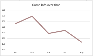 The trendline in the above chart has a contrast of 3:22:1 | Pass |
Non-text Contrast summary
Perhaps there is quite a bit to unpack, here? maybe if you are relatively new, there are a couple of surprises?
- Looking at NT1 and NT2, it is the graphical part of the image (In our case, the phone handset shape) that needs to meet the minimum contrast requirement, if and only if that is the only way of understanding something. Let's assume we have a poorly formatted phone number, in regular text (not using the
<a>element), a continuous string of numerical-only digits that have no spaces or other delimitters and the NT1 icon is adjacent to it. Many folk would be able to work out the poor design and think "oh, this is a phone number", as they can make out the icon, but, what if our user struggles with lower contrast? They will likely struggle with this and it of course fails. In hindsight, I should have used a different icon, as realistically, the icon for a phone or email, etc may not be the sole way of identifying that the text is a method of contact, as an example, if it were in a footer, under a heading "Get in Touch" or whatever, many people would be familiar enough with phone numbers to determine this is in fact a phone number. That doesn't make it accessible, of course, so use a higher contrast like NT2 with alt text and format your number correctly. - NT3 and NT4 show inputs where the only way of identifyling them is the border, that border whether a full or partial border must pass the 3:1 contrast requirement against the background. NT3 fails and NT4 passes, although to me, I can't tell the difference. I'm intentionally using thin borders, in reality, where I get artistic licence, I'd use a thicker border and higher contrast.
- NT5 and NT6 show buttons with text contents, both actually pass, the text is irrelevant for this SC (although it does pass 1.4.3 Contrast (Minimum)). The "hit area" or the actual button's boundary does not have to pass against the page background, so despite NT5 having a very low contrast background, it still passes. My examples are not great, but not entirely an edge case, oftentimes the text inside the button will be a bit descriptive or the surrounding text will offer that additional context. Maybe a question here, such as "How was your experience?", with the buttons sitting on a line below is sufficient to understand they are buttons for the majority of users? Still, I would certainly advocate for buttons more like NT6 where it is clear it is a button. I haven't included checkboxes, radio buttons or toggles, etc, but as they are non-text elements and do not contain text, their borders, checked icons, thumbs, tracks and other parts that are needed to understand the component, its state and how to operate it will of course require a minimum 3:1 contrast.
- NT7 and NT8, much like NT1 and NT2 show a failing icon and a passing icon, although this time in buttons, respectively. In all fairness, there is little between these and none are great, we'd obviously want to make that contrast much higher so folks can actually see the icon and make a guess about its purpose.
- NT9 and NT10 are inputs that both pass. This may come as a surprise to some, as I have removed all focus indicators from the NT9 input. The caret (the blinking line) is actually sufficient to pass this SC, which I think is a little tragic, as it's not exactly prominent and if I never added horizontal padding to the input, then that thin blinking line would be butted right up to the input's left border, making it even more difficult to identify. A nice focus ring and/or other prominent design elements can help our users clearly determine where focus is, like NT10
- NT11 and NT12 are buttons, it's the focus indicator we're interested in, here. We are adding something to the buttons when they receive focus, in this case, a focus ring, so as we are adding something, this is the SC that we need. NT11 fails due to having sub 3:1 contrast and NT12 passes with a very good contrast.
- NT13 and NT14 have link text that is the same colour as the body text (yuck), they are, however, underlined, which is something, I guess. I have changed the colour of the underline using CSS, as that underline is "Non-text" then it needs to have at least a 3:1 contrast against its background. NT13 does not, but NT14 does, so only NT14 passes and NT13 does not. But, make your links pop out, make it clear thay are links, use a different colour and other styling aspects to help users easily identify them.
- Finally, we have NT15 and NT16, both are images of charts. I went for trendlines for this one, although it would apply to charts with multiple data points, such as bar charts, pie charts and all the other types of chart. The actual bars, slices, lines or whatever, must have a minimum contrast of 3:1 against their background for this SC. There are some flaky exceptions where items are labelled, but then those labels would need to pass 1.4.3 Contrast (Minimum), so if someone doesn't like meeting contrast requirements, just remind them their labels must pass and for smaller text, they will require a higher contrast than this SC requires. Obviously if the purpose of a chart is to get "at-a-glance" data, as opposed to wading through a big data dump of a table, then, having contrast that is decent would go a long way to making that data glanceable (I actually thought I was making up a new word, there, turns out it's an actual word already).
This isn't a comprehensive list of graphical elements, if you have read the understanding docs, you will notice they mention some elements that I don't, such as rating stars (contrast against background), text-based symbols and other elements. I have omitted some as they will be discussed, later and others are self-explanatory.
"Color is not the only way of distinguishing information". This one is particularly interesting, as unlike Contrast (Minimum) and Non-text Contrast, this can apply to both "graphical" elements and text, so initially it appears there is a lot of overlap with this one, but once you gain a decent understanding of it, it doesn't seem to overlap as much, if it all. I like to view this particular SC in a way that firstly, the element I am interested in has to pass one of the other two contrast SCs first, then, this one comes into play if and only if the colour is being used to convey something, such as a state, or differentiating between its colour and a related or close by element's colour, etc.
Summary
Colour alone must not be used as the only way of conveying information. Colour (hue) is not lightness, so having a contrast of 3:1 from the element we are comparing against or this element's former state actually passes, as a contrast ratio of 3:1 uses lightness to calculate the contrast.
- Text that changes colour to indicate a state, such as errors in a form field, green for good or amber for away, etc
- Links if the only visual difference between the link text and the surrounding text is a change of colour
- Chart elements, if the difference in data points is using colour alone
- Focus states if "existing pixels" are the only visual change to differentiate state
- Legends if those legends use colour alone to match data points or cells to the legend's information or values
- RAG (red, amber, yellow) colour coding to indicate bad, normal, good, etc
Summary explained
It's important to remember that for any of the examples given, they are only under consideration if only colour is used or the contrast is less than 3:1. This is one of those requirements where often we should be looking at best practices to get something that is actually accessible as some folk will struggle with the 3:1 difference, so other visual cues should definitely be used. As with all aspects of accessibility, if I wear my "developer" hat I can easily ensure that all elements have both good contrast and other visual cues, but, when I wear my "auditor" hat, sometimes I just don't have the clout to get best practices implemented, still, we have to keep trying to push the best practices forward.
Other success criterion can come into play with this one, as an example 1.3.3 Sensory Characteristics (A), would be my go to if there were instructions on the page that said "Form errors are marked in red" or "click the green button".
On this one I feel it's a little better to just jump to the examples, as opposed to breaking down the items in the summary list:
Use of Color examples
| ID | Element | Pass/fail |
|---|---|---|
| UC1 | For this explanation, assume the first input is untouched and the second is in an error state. Text contrast is 14.93:1 against its background on the first input, when the input is in error the text colour changes to a dark red, that red colour has a 5.19:1 contrast against the background. The contrast difference between initial text and error text is 2.87:1 | Fail |
| UC2 | For this explanation, the only colour I have changed is the red, which now has a contrast difference of 3.12:1 against the first input's text label. | Pass |
| UC3 | Name cannot be blank Use of Color does not apply, as there is an error message, which is not using colour alone to convey any information. | Pass |
| UC4 | Use of Color does not apply, as there is an error icon, which is not using colour alone to convey any information. | Pass |
| UC5 | The button's text in its unfocussed state has a contrast of 8.4:1 against its background and the text within, when focussed the button's text has 4.63:1 contrast against the button's background, the difference between the two purple backgrounds of the button is 1.81:1 between focussed and unfocussed states | Fail |
| UC6 | The button's text in its unfocussed state has a contrast of 8.4:1 against its background and the text within, when focussed the button's text has 4.61:1 (as the text changes colour, too) contrast against the button's background, the difference between the two purple backgrounds of the button is 3.06:1 between focussed and unfocussed states, and the change in contrast for the text is 12.63:1 | Pass |
| UC7 | The button's text in its unfocussed state has a contrast of 8.4:1 against its background and the text within, when focussed the button's background and text swap colours, so the contrast calculation actually remains unchanged. | Pass |
| UC8 |  The contrast between the two darker shades is 1.3:1, the lighter shade against the background is 2.2:1 and all other combinations have a contrast that exceeds 3:1 | Fail |
| UC9 |  The colours are the same as the previous example, this time the chart has been expoloded, borders added to segments and all of each segment's labels are present within their respective segments | Pass |
| UC10 | Just some text that contains a link in it. The link is not underlined nor does it have any other stylistic feature that makes it visually different than the body text, other than a change in colour. The link text has a contrast of 5.39:1 against the background, the contrast difference between the link text and body text is 2.76:1. | Fail |
| UC11 | Just some text that contains a link in it. The link is not underlined nor does it have any other stylistic feature that makes it visually different than the body text, other than a change in colour. The link text has a contrast of 4.77:1 against the background, the contrast difference between the link text and body text is 3.13:1. | Pass |
| UC12 | Just some text that contains a link in it. The link is not underlined nor does it have any other stylistic feature that makes it visually different than the body text, not even a change in colour. The link text has a contrast of 14.93:1 against the background, as does the body text. | Pass |
Use of Color summary
- UC1, UC2 and UC3 each show two input fields, we just have to pretend that they are in fact the same input, at later stages in a workflow. The first in each table row would be how the input is initially presented to the user, then the second would be to indicate the field is in error, as a user never input their name or whatever. UC1 and UC2 would of course fail other SC's without additional context, particularly SC 3.3.1 Error identification, however, if there were a message at the top of the form that said "Error: you have empty an empty input field", then this SC has been swerved, as the error is indeed presented in text (although that's a rubbish cop out). This would likely only swerve that requirement if there were just one empty field, unless the message had a list that explicitly named errored fields. Biut, we're just pretending, here, UC1 fails Use of Color as the change in lightness is not at least 3:1, UC1 and UC2 are both rubbish anyway and UC3 actually has helpful error text, which helps users identify errored fields, so Use of Color cannot apply, as colour is irrelevant, the error text is doing the heavy lifting, here
- UC4 shows 2 inputs, using the same pattern as the previous examples, one is assumed to be untouched and the other is in error. As there is an icon displayed here, for the errored field, Use of Color does not apply, so the fact the change in contrast of the text is sub 3:1 is irrelevant. This of course could fail other SCs, depending on whether additional context was provided elsewhere on the form
- UC5, UC6 and UC7 show buttons which have a focussed state. Unlike the buttons in the Non-text Contrast examples, we are not adding or removing any shapes or other stylistic features, the only things that ever change are the buttons' backgrounds and in two of the examples the colour of the text. As we are simply changing colours, then Non-text Contrast does not apply, but Use of Color does and that is because we are relying upon colour alone to convey information or state, the latter being what we are conveying here, the focussed state. UC5 fails as there is not a change in lightness that is at least 3:1, this makes sense, as some users may not be able to perceive that change in lightness, it could look the same. UC6 easily passes,and we could either calculate the colour change of the text or the background to determine this, both do not have to pass, just one does, but remember, the text must always have a contrast ratio of 4.5:1 (for this size and weight). Whilst this easily passes it is not without issue depending on other factors, consider several buttons of varying colours, close by, how would a user know it was the focussed one, when there is nothing prominent, such as a focus ring? Could it just be another different coloured button in a row of otherwise randomly coloured buttons? UC7 is much better, in my opinion, as it uses true colour inversion, the text and its backgrounds swap colours. If the text passed Contrast (Minimum) in its unfocussed state, then it cannot fail Contrast (Minimum) or Use of Color in its focussed state. Hold on, though, you may have noticed I added a border for the focussed state? Actually, I didn't that border was always there, we just couldn't see it when the button was unfocussed and that's because it is exactly the same colour as the unfocussed button's background. We do still run the risk of having a group of buttons and it not being obvious which one is focussed, but less so than UC6. What I tend to favour is to use the colour inversion for mouse hover and focus, but in addition for keyboard focus, I will also add a ring, if you wanted to view this in action, just open our Settings dialog (The cog icon in the header), I'm not a designer, I don't care about trends in interface design, but I do care about people being able to actually use sites I build and I think these focus indicators are pretty fine looking and I know that I have provided very strong affordances for our users, but design decisions are actually much easier, when you care about the people actually using your more than making on Awwards' homepage (I won't link that)
- UC8 and UC9 are my crude pie charts, they're pretty rubbish, but they'll be fine for this explanation. UC8 has a legend and that legend contains the three shades of blue that make up our chart. Whilst the percentages are outside of the slices, it's not totally clear which percentage relates to which legend element, this is because the contrast between the two larger slices is very low, remember, a chart is for data at a glance (or glancability, a word I erroneously though I had invented) and it must be clear to our users which segment relates to which data point or slice, etc. The question here is, are we using colour alone to convey information There is an argument that size means we are using more than just colour, however, as the two similarly sized slices lack adequate contrast and are connected, this wouldn't apply here (in my humble opinion), as a user that had trouble distinguishing poor contrast would likely not be able to see where one element started and the other stopped, etc. UC9 is much better, albeit it looks a mess, ideally we'd have the labels connected on the outside or at least smarten it up. The colour isn't relevant here, as the labels make it unambiguous which slice corresponds to which data point. There is no legend, here, that's not to say legends are bad, they can be great when all users are considered and they are done correctly, but due to the limit on the number of different elements that all have a minimum contrast of 3:1 against all others (is it three or four? I've forgotten), we'd quickly run out of colours we could use, so we would have to use patterns, etc or indeed strong labels. The labels would likely not work so well on a chart with multiple data points, as in some instances, users wouldn't be able to see those data points at all. We're not going to take a deep dive, as it's a whole other subject, but Sarah Fossheim has done lots of excellent work you can read their articles for the Dataviz category, here
- UC10, UC11 and UC12 each contain a link within a small body of text. Each link omits an underline (obviously that's a very bad practice) and none have any other styles that make them visually distinguishable from the surrounding text. UC10 fails as the difference in contrast between the body text and link text is below 3:1. UC11 passes as that contrast is greater than 3:1. Interestingly, the link and body text in UC12 are identical so this does not fail Use of Color, as colour is not being used to communicate anything, in fact, there is no visual affordance whatsoever that this is a link. It is likely that the only users that would have no trouble identifying it was a link would be those using keyboards (it still has a focus indicator) and screen reader users, it will still be announced as a link to them. Does it fail anything, I hear you ask? I don't think so, I believe it is just a loophole in WCAG, but it is certainly at odds with the "spirit of WCAG", particularly the Distinguishable guideline. So, feel free to yell about it in your report, but just don't say it fails this, as somebody may call you out on it. Obviously in the real world we should be underining our links, if they're important enough to be there, then they should be styled in a way that everybody can identify them. That's not to say all links have to be underlined, some look button-esque and that can be OK, I never undeerlined the links in our primary navigation and that too is OK, for several reasons, placement, spacing, not close to static text, the link text is clearly a page name using popular naming conventions and they also have strong hover and focus indicators. For links within blocks of text (inline links) if they're not underlined at the very least, then they're pretty likely bad, right? I should also mention that my tables only have "Pass" & "Fail" options, technically UC12 doesn't pass Use of Color, it's just not in scope, I'm aware i have also done this a couple of other times, my bad, sorry.
That was some read, huh? Sorry, there's quite a bit to unpack and I could have provided way more examples than I did, as discussing all three Level AA colour and contrast criteria in one guide was quite an ambitious task, I guess.
So, hopefully we have learned something and we can use this going forward? Just to recap:
- Unless a bona fide exception, text must always pass the required contrast for its size and weight. This includes during states, such as hover and focus (Only the starting and end points if there is an animation or transition), it also includes placeholders and text within a control that is not actually disabled. Regular text will always require at least a 4.5:1 contrast ratio and large text a minimum of 3:1 and this is always against the text's background. Remember, these are minimum values, not goals, hopefully my exaples showed that just scraping the minimum isn't a great strategy?
- Where images of text are used, we should probably determine if it fails any other success criteria, first. It's likely that it will, but there are are certainly cases where it won't and then this is where we would need to check the contrast and potentially go down the "how big is this text in pixels?" rabbit hole, which as auditors, we want to avoid, as that's far to tedious to get our points across
- Non-text elements only applies to elements that are not text and convey some form of meaning, be that regular information, a difference in state (additional pixels), an element is interactive or anything else necessary to prompt an action from the user. This success criterion covers a huge range of graphical elements, if it is a part of a website that is there solely to communicate something to the user (not decorative) and that information it communicates is necessary for the operation or understanding of the site, page or task, then it's going likely going to be in scope and must pass the 3:1 minimum if it is. Again, there are numerous ways to style something to make it stand out, it does not have to be just colour, we want it to be obvious, we have a tonne of CSS at our disposal and strong visual affordances get the clicks and hits, whereas poor affordances get the higher bounce rates. If a site is patently inaccessible due to poor design, disabled people may just nope right out of it and take their business elsewhere
- Use of Color, this one only applies when colour is used and it is the only visual indicator that communicates information, state or aims to provoke a response from the user. I didn't really know how to explain it best, so I went with "existing pixels" (I know all the pixels are in use) and what I meant by this, is the pixels that form the text, shapes or other graphical elements against their existing background, if the change in contrast of only those existing pixels communicates something necessary for the understanding or operation of the site, then they will need to meet that 3:1 change in contrast (lightness). This could also apply to the background, as if that is what changes to indicate state or something, then that is what we must test. Again, 3:1 isn't going to cut it for everyone, so push for other visually distinguishable elements, make it obvious to all
None of this is intended to dissuade designers and developers from using colour, quite the opposite, colour is an important tool, more so when used responsibly. Feel free to use colour wherever you want, just ensuring that contrast is adequate, and provide additional affordances where they make sense. Consider people and be creative in how to use colour without excluding people. Contrast matters, because all users matter, design for people and not dodgy web trend sites that loads of people wouldn't be able to use, anyway.