
The DiscoverUni widget is an Office for Students (OfS) mandated component Higher Education Institutes in the UK must display on course pages.
Essentially the DiscoverUni widget is an iFrame embed, it may appear on course specific pages and within the embed it provides information such as:
- The percentage of students that passed the course
- The percentage of students that thought were happy with the course delivery
- The percentage of students that were in related employment within a certain amount of time after completing the course
The first thing to take note of is the domain for DiscoverUni, which is a .gov.uk domain, so as this domain is reserved for government and is part of the Office for Students, then it really is on them to make it accessible centrally rather than the responsibility lying with individual universities. Also, as the content is in an iFrame, it can be super difficult to fix the accessibility issues with DOM manipulation, as it exists on another site, but then why would a couple of hundred institutions be required to patch it up with JS, when it could simply be fixed at source and fixed once?
Public Sector Accessibility Regulations coverage
The reason we decided to look at this widget and document our testing and fix approach is because this has been regularly flagged by the monitoring body under the Public Sector Bodies (Websites and Mobile Applications) (No.2) Accessibility Regulations 2018.
The issue here is the competing requirements to present accessible websites while also being required to incorporate the DiscoverUni widget onto course pages.
The initial expectation is that the DiscoverUni widget is out of scope for universities' responsibilities under the 3rd party content exemption as it is neither funded nor developed by the universities and they have no control to deliver technical fixes to it but must keep it on their website.
If GDS do advise that universities are responsible despite lack of ownership or control, we would recommend universities consider disproportionate burden claims after having flagged the issue with OfS and documenting the response.
The rest of the guide detailing the problems with the Discover Uni widget including technical details. We hope the guide will provide a consistent answer on this topic which universities can link to from their accessibility statements.
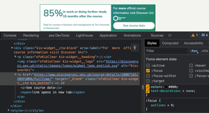
Well, to give you an example, here is a screenshot of the widget in question, taken from our own site:

This iFrame is not static, on the page I am viewing, there is a transition occurring where the contents fade out and a new statistic is displayed, there are 3 separate statistics, each presented in their own slide and the animation is infinite.
First, let's outline the bits that do not fail WCAG
I'm somewhat uncomfortable outing other developers in public, so I want to provide a balanced review, so In order to be fair, we'll look at some of the stuff that does at least comply, on this widget before we get down to the issues.
2.4.1 Bypass Blocks (A)
First thing's first, it's an iFrame so we check for a title attribute on the iFrame and by inspecting the code, I can confirm the title of "Unistats KIS Widget" is present. Is that a good title? Not really, I have no idea what "KIS" means I searched it up and I'm still none the wiser, also what if there were more than one of these iFrames on the page, but displaying different statistics? Would they both have that same Generic title? probably. I'd recommend as a best practice the title be more descriptive, if there was more than one present on a page and they had identical titles, I'd fail it against 1.3.1 Info and Relationships (A), as they would be non-unique.
1.4.3 Contrast (Minimum) (AA)
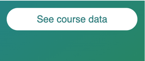
The text within (yes, it is text and not an image) has the colour of green (#307E7E) and a background colour of white (#FFF), which gives us a contrast ratio of 4.76:1 and this passes for both small text and large text.
The static section that contains the CTA (Call to action) link does have a gradient background, with white text, so I check that again and both colours used in the gradient do pass, albeit only just with a ratio of 4.51:1
1.4.10 Reflow (AA)
Often iFrames cause whole page horizontal scroll on smaller screens or when zoomed on larger screens, as often they have fixed widths, there's no issue with that here, the item stacks into a column so it does not cause an issue where a user would be required to scroll in 2 directions.
1.1.1 Non-text Content (A)
There is a very small DiscoverUni logo, which does have the alt text of "DiscoverUni", this could be slightly improved by appending the word "logo" to the alt text.
1.4.6 Resize Text (AA)
I check to see if the iFrames text resizes along with the rest of the page, as sometimes scaling is blocked and/or absolute units such as pixels are used. This text does scale with the page so this is also useful for users.
2.4.3 Focus Order (A)
Many iFrames contain interactive content such as buttons or links, these can sometimes create an irregular focus order, particularly when the frame content changes over time, as often I find that the non-visible content is not accessibly hidden, it often just has 0 opacity, so is still able to receive focus. On this particular implementation, there is only 1 link and it is in a static part of the iFrame, so we don't have an issue with that here.
2.4.4 Link Purpose in Context (A)
There is a link in the iFrame with the visible label "see course data" and given the surrounding text and page content, this does make sense, there is one issue with the visually hidden text within though, which I have written as an Advisory in the WCAG failures.
Now let's look at the WCAG failures
Whilst there are some positives, as outlined above, unfortunately there are some issues which should not be present, especially as it was created by/for a public sector organisation.
2.2.2 Pause, Stop, Hide (A)
The most obvious issue is the slide transition effect, the content changes between 3 different slides at an interval of approximately 3 or 4 seconds. This animation is infinite, in that it just loops continuously. There is no mechanism to pause, stop or hide this transition. This can be distracting for users, particularly some users that may have difficulty with focusing or those that can become easily distracted.
Recommendation
I'd ordinarily recommend a pause or stop button for this. As long as that button could restart the animation should a user wish to, this would be adequate. As the transition is quite fast: 3 or 4 seconds, some users may not get sufficient time to read a slide, by providing a pause or stop button, these users can at least take the time they need to read the slide, without having to wait for it to loop back through.
This is a pretty straightforward fix, I'll provide a quick code sample below:
<div role="group" aria-labelledby="slideTitle">
  <h1 class="visually-hidden" id="slideTitle">Course statistics</h1>
  <button aria-pressed="false">
    <span class="visually-hidden">Pause</span>
  </button>
  <!-- The slides -->
</div>- I'd probably add a pseudo element with a pause symbol inside the button, so there was an understandable visible label.
- Don't change the accessible name of the button when clicked, just toggle the value of
aria-pressed, as changing the name along with aria-pressed would be confusing and we needaria-pressedto indicate the state of the button (it would be fine to change the symbol to a play icon though, in fact, I think that makes the most sense) - I made the assumption the developers understand how to visually hide things, but still expose them in the accessible name calculation, with a visually-hidden class. If this is new to you, you can read up about hiding content here.
- I'd add the button and the slides in a group, with an accessible name, which would be calculated from the visually hidden heading, just so the control and slides were grouped to help with understanding the relationship
- I have not provided any CSS, but I would ensure the icon button has good contrast against the background
- I would make sure that the icon button has a good focus indicator, which is perceivable against adjacent colours
- I'd ensure the icon button was of a reasonable size
- I'd ensure the icon button was the first interactive element within the iFrame, that way a user can tab to it and turn it off straight away, should they need to
- Functionally, I would likely just toggle a data-attribute on to the animated part of the frame, perhaps data-paused="true" when the pause button is pressed & then when that attribute/value pair is present on the slide, I would simply prevent the animation in CSS
In this instance, our final result does not use this method, it would fix that issue, but it wouldn't solve what is arguably the most severe issue, so carry on reading.
2.4.7 Focus Visible (AA)
Tabbing to the link within the iFrame I can see there is no visible focus indicator present, so a user would not know where focus is. Inspecting the styles for the element I can identify the issue here when I add the :focus state in the Devtools, it has :focus {outline: 0;} set and no other form of visible focus indicator, in essence, they have removed the browser's default focus indicator, which would have been better than nothing.
Recommendation
Intentionally not supplying a focus indicator after removing the browser's default indicator is a bad choice. This is an easy fix, I'm going to make the assumption that the colours are predetermined by the team that created the widget and each institution cannot change them (I did find another implementation on another university and the colours were the same, so I'm confident colours are not customisable). Here's the current CSS for the link (I'm just going to pop all styles into 1 selector, for simplicity's sake):
.kis-widget__cta {
  position: relative;
  width: 100%;
  font-weight: normal;
  background-color: white;
  border-radius: 60px;
  color: #307e7e;
  font-size: 1rem !important;
  line-height: 1.2rem;
  text-align: center;
  margin-left: auto;
  margin-right: auto;
  padding-top: 9px;
  padding-bottom: 9px;
  z-index: 25;
  text-decoration: none;
  position: relative;
  font-family: Nunito Sans, sans-serif;
}
That's pretty much it, now let's fix it. I'll use my own CSS just to simplify the above:
 /* Just reset margin and box sizing */
  * {
    box-sizing: border-box;
    margin: 0;
  }

  /* Created a background element, using existing colours */
  .container-background {
    height: 10rem;
    width: 15rem;
    background: linear-gradient(145deg, rgba(36, 131, 132, 1), rgba(39, 134, 93, 1));
    padding: .75rem;
  }

  /* Simplified the CSS - although I don't have to deal with specificity here */
  .kis-widget__cta {
    display: flex;
    justify-content: center;
    align-items: center;
    border-radius: 60px;
    padding: .5625rem 0;
    font-size: 1rem;
    line-height: 1.2rem;
    font-weight: normal;
    font-family: Nunito Sans, sans-serif;
    color: #307e7e;
    background-color: #FFF;
    text-decoration: none;
  }

  /* This is from the existing styles, definitely not mine */
  .kis-widget__cta:focus {
    outline: 0;
  }

  /* Hide the the appended text within, visually */
  .kis-widget__cta span {
    position: absolute;
    height: 1px;
    width: 1px;
    overflow: hidden;
    white-space: nowrap;
    clip: rect(0 0 0 0);
    clip-path: inset(50%);
  }

  /* Added a focus style for keyboard users, just using an outline and underline */
  .kis-widget__cta:focus-visible {
    outline: 2px solid #fff;
    outline-offset: 2px;
    text-decoration: underline;
    text-decoration-thickness: 2px;
    text-underline-offset: 2px;
}- I recreated a small background container using the existing gradient
- I recreated the visually hiding of the appended text within the button (more on that later)
- I added the outline back, with a 2px solid white border
- I added a 2px thick underline, with a 2px offset
Just to visualise what I have done, I will show 2 screenshots, the first is the link in the unfocused state, the second is the link whilst focused:
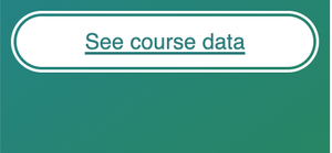
With just a few lines of CSS it is now clear this link has keyboard focus as the outline and underline do help a user to perceive the visual change. It could of course be improved further, I'd probably change the colour of the background and ensure the text changed to maintain an acceptable contrast, but that's my own personal preference.
1.3.1 Info and Relationships (A)
Within the source code I can identify several instances of aria-label being present on a <div> elements, which have no implicit or explicit role. Simply put, aria-label is not allowed on a <div>, <span> or several other generic elements, unless they have a role explicitly added. This is a misunderstanding of ARIA, the <div> elements here are simply wrapping elements, used for layout, they have "contents" contained in another node, the contents would be read anyway without adding aria-labels unnecessarily to unsupported nodes. I would have previously filed this under 4.1.1 Parsing (A), but as that is no longer a failure and this is not an interactive element so it cannot be 4.1.2 Name, Role, Value (A), 1.3.1 is the new Parsing for static content. The issue here is some screen readers will read the aria-label and then read the content, thus creating unnecessary verbosity.
Recommendation
The solution is super simple here: Remove the aria-labels, they are not required at all.
Advisory
The current widget has visually hidden text that informs a screen reader user that the CTA link opens in a new tab, surely this information is useful to everybody? A voice user may see this if they instruct their software to "Show labels", but typically, only a screen reader user will benefit from this and accessibility is not just for screen reader users, it's for all people with disabilities. Even non-disabled people would benefit from knowing a link opens in a new tab.
Generally speaking, we should leave that choice up to users, there's multiple ways a user can open a link in a new tab:
- Cmd or Ctrl along with click or Enter
- Middle mouse button
- Right click and "Open in new Tab"
If we use target="_blank", we remove that choice for everybody, so everybody has to open in a new tab and they may not want to or it can become disorienting.
Recommendation
For best practice, do not force users to view the linked page in a new tab, simply remove "target="_blank", along with the visually hidden text, as that would no longer make sense.
At the very least, the hidden instruction should be presented visually, in a way that makes sense to sighted users, there is a somewhat ubiquitous icon for this, but giving users the choice is a much better approach.
1.3.2 Meaningful Sequence (A)
The issue here is caused by the transition when a user of a screen reader is navigating with cursor keys, they can get into the iFrame to read the text within, the screen reader starts to read the text and then the slide they were on has display: none; applied, which can then alter the meaning and order of the information, in unexpected ways.
Using VoiceOver and Safari on MacOS (latest versions at the time of writing), when I use the VO key and cursors to get into the iFrame, it does start to read the statistic, however, as soon as the transition occurs, the virtual cursor position is then ejected from the iFrame and placed on the text node immediately above it.
This effects the sequence of reading, in that it would be difficult to hear the statistics in a sequence that made sense, as every time a transition occurred, the information they hear is interrupted by them being ejected out of the iFrame.
Using NVDA (2023.2) and Firefox (latest version, at the time of writing) on Windows 10 Education (20H2), I am not ejected from the iFrame when the transition occurs, however, what does happen is the screen reader starts to read the statistic (the percentage), then the transition occurs and then the slide changes, so it reads the text of the next statistic, as that is what is now present in the DOM. So to simplify what is happening, the process is as follows:
- Cursor into iFrame
- NVDA reads the percentage of the first statistic, the currently visible statistic
- The slide transition occurs
- NVDA reads the text of the 2nd slide (the new slide that is now visible)
This results in inaccurate information being presented to the user as they are hearing a combination of 2 statistics which could be misleading and therefore, alters the meaning of the text.
As the stats are both mandatory and help users in making informed decisions, it's absolutely vital that they are communicated to screen reader users in a comparable way and the current implementation is likely both incredibly confusing and frustrating for screen reader users as the sequence or meaning is different than what is supplied visually.
This would not be remedied by a pause button, as the sequence or meaning would still be incorrect. Consider a screen reader user entering the frame, they discover the first item, which I previously recommended to be a pause button. They pause the slides and then proceed to listen to the text, where they will hear a full statistic, but then what about the next statistic? the user would need to move back to the pause button and click it again to play the transition, they'd move into the slide to read the statistic, only the transition occurs and they are either ejected or hear a mismatch of 2 slides.
In this implementation, there is no announcement that anything has changed, I'd be averse to recommend that on the basis that it would get pretty noisy, pretty quickly.
There are no controls for a user to manually move to the next or previous slide, like those that would be present in a carousel, so that is not an option for our users, also, it would be overkill to create a full-blown carousel for what is in affect just a few small sentences.
Recommendation 1
Looking at the HTML and the actual widget, it's clear that the only content that actually changes (or needs to change) is the actual statistic and the source for that statistic.
Personally, I believe this slide transition effect is overkill for a few small sentences and is the root of the majority of the accessibility issues.
The pros
The first solution I thought of was to hide the actual slides from assistive technologies and use a visually hidden node to provide exactly the same information and this would be positioned before the slides in the DOM. There are both pros and cons to this approach:
As the slides would no longer be exposed to assistive technologies, as we would use aria-hidden, a user would not be able to cursor into them, so their virtual cursor could not be hijacked. As we would be providing the exact same text on a visually hidden node that is outside of the transition, a transition could not alter the order or meaning of the statistic.
The cons
Obviously there are sighted screen reader users, some of whom use a mouse, if they are using their mouse to have their screen reader read out content on the page, should they click on the iFrame, then they will not hear the statistic as we have removed it from the accessibility tree. We could get a little clever with CSS to overlay the slide with our visually hidden text, so when the click occurs, it would read out our 3 statistics, but I still feel this could be a little confusing. We could get smart with JS and detect a mouse click event to switch the aria-hidden between the visible and hidden nodes, but I don't feel the juice is worth the squeeze here, it's a few small sentences, why hide any?
We'd still need a pause button, if that pause button is focusable a screen reader user may become a little confused when they encounter a button that seemingly has no purpose, especially where I earlier discussed it, along with the slides into a group, which would now only contain the button in the accessibility tree.
An example could be something like so (button and group not present):
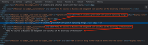
<iframe>
  <ul class="visually-hidden">
    <li>74% of students agreed staff were good at explaining things - Data for courses in Business and management (non-specific) at The University of Westminster</li>
    <li>73% of students were satisfied overall with their course - Data for courses in Business and management (non-specific) at The University of Westminster</li>
    <li>85% in work or doing further study 15 months after the course - Data for courses in Business and management at The University of Westminster</li>
  </ul>
  <div class="ofsKisClear kis-widget__lead" aria-hidden="true">
    <!-- The content that changes -->
  </div>
  <!-- The CTA content -->
</iframe>
This may have been a good solution, had there been no button, but as we need the button to pause/resume the animation, I discounted this approach in that it would be solving the main issue, but introducing another. I would not want to hide the pause button from assistive technologies or prevent it being focusable, as this will cause problems for voice users, sighted screen reader users and others.
Recommendation 2
I feel that this widget is somewhat over-engineered and has an animation for animation's sake and no other valid reason. The aim of the iFrame is to provide a small number of statistics to users, each statistic is a small sentence and may have a different source than the previous statistic. Does this really need to be animated, can't we just show the whole thing? I'm no designer, but this does not feel like a challenge to me.
The widget never takes up the full screen width, so we can utilise some of that extra space. I will concede that I don't know how many stats could be provided, I'm basing this off there always being just a few stats, maybe there are implementations out there with many more?
Let's have a stab at it and see how we can improve this, here's the HTML:
<article class="uniStat__container">
    <div class="uniStat__stat-wrapper">
      <ul class="uniStat__list">
        <li class="uniStat__item">
          <span class="uniStat__percent">73%</span> <span>of students were satisfied overall with their course. <a href="#source1" aria-describedby="source1"><span class="uniStat__reference">[1]</s></a></span>
        </li>
        <li class="uniStat__item">
          <span class="uniStat__percent">74%</span> <span>of students agreed staff were good at explaining things. <a href="#source1" aria-describedby="source1"><span class="uniStat__reference">[1]</span></a></span>
        </li>
        <li class="uniStat__item">
          <span class="uniStat__percent">85%</span><span> in work or doing further study 15 months after the course. <a href="#source2" aria-describedby="source2"><span class="uniStat__reference">[2]</span></a></span>
        </li>
      </ul>
      <div class="uniStats__sources">
        <p class="uniStats__source" id="source1">[1] Data for courses in Business and management at The University of Westminster</p>
        <p class="uniStats__source" id="source2">[2] Data for courses in Business and management (non-specific) at The University of Westminster</p>
      </div>
    </div>
    <div class="uniStat__cta-wrapper">
      <div>
        <p class="uniStat__cta-text">For <strong>more</strong> official course information visit DiscoverUni</p>
        <img class="uniStat__cta-img" src="https://discoveruni.gov.uk/static/images/logos/widget_logo_english.svg" alt="Discover Uni logo">
      </div>
      <div>
        <a class="uniStat__cta-link" href="https://www.discoveruni.gov.uk/course-details/10007165/U09FUBMA/FullTime/">See course data</a>
      </div>
    </div>
  </article>
And here's the CSS:
*,
*::before,
*::after {
  box-sizing: border-box;
  margin: 0;
  padding: 0;
  font-family: Nunito Sans, sans-serif;
}

body {
  padding: 1rem;
}

.visually-hidden {
  position: absolute;
  height: 1px;
  width: 1px;
  overflow: hidden;
  white-space: nowrap;
  clip: rect(0 0 0 0);
  clip-path: inset(50%);
}

.uniStat__container {
  display: flex;
  flex-direction: column;
  border: 2px solid #4EA27D;
  border-bottom: none;
  max-width: 25rem;
}

.uniStat__stat-wrapper {
  padding: 1rem;
}

.uniStat__list {
  list-style: none;
  color: #307e7e;
}

.uniStat__item {
  display: flex;
  align-items: center;
}

.uniStat__item:not(:last-child) {
  margin-bottom: 1rem;
}

.uniStat__item a {
  position: relative;
  text-decoration-thickness: 2px;
  text-decoration-color: #307e7e;
}

.uniStat__item a::before {
  content: "";
  position: absolute;
  inset: -4px;
  cursor: pointer;
}

.uniStat__item a:focus-visible {
  outline: 2px solid #307e7e;
  outline-offset: 2px;
}

.uniStat__reference {
  padding: .25rem;
  letter-spacing: 1px;
  color: #307e7e;
}

.uniStat__percent {
  padding-right: .75rem;
  font-size: 3rem;
  padding-top: .5rem;
}

.uniStats__sources {
  margin-top: .75rem;
  padding-top: .75rem;
  border-top: 1px solid #4EA27D;
}

.uniStats__source {
  line-height: 1.5;
  font-size: .875rem;
  color: #307e7e;
}

.uniStat__cta-wrapper {
  display: flex;
  flex-direction: column;
  gap: .5rem;
  background: linear-gradient(145deg, rgba(36, 131, 132, 1), rgba(39, 134, 93, 1));
  padding: .75rem;
  color: #FFF;
}

.uniStat__cta-text {
  line-height: 1.5;
  font-size: 1rem;
}

.uniStat__cta-img {
  padding-top: .5rem;
}

.uniStat__cta-link {
  display: flex;
  justify-content: center;
  align-items: center;
  border-radius: 60px;
  padding: .5625rem 1rem;
  font-size: 1rem;
  line-height: 1.2rem;
  font-weight: normal;
  color: #307e7e;
  background-color: #FFF;
  text-decoration: none;
}

.uniStat__cta-link:focus-visible {
  outline: 2px solid #fff;
  outline-offset: 2px;
  text-decoration: underline;
  text-decoration-thickness: 2px;
  text-underline-offset: 2px;
}

.uniStat__cta-link svg {
 margin-left: .75rem;
}

@media screen and (min-width: 48em) {
  .uniStat__container {
    max-width: 40rem;
  }

  .uniStat__cta-wrapper {
    flex-direction: row;
    justify-content: space-between;
    align-items: center;
    gap: 1rem;
  }

  .uniStat__cta-img {
    padding-top: 0;
  }
}
I'm not going to explain every line of CSS and HTML here, like I usually would, mainly because there's a bit too much to explain in full, I will of course explain what I have done and my decision-making process:
The HTML
- I added the 3 slides into a list, so for users of screen readers, they know how many stats are present (if their screen reader reads out lists without bullets, that is)
- I display all 3 stats, always, no transitions here
- I moved the call to action panel to the bottom of the frame, so make better use of the horizontal width and prevent the sentences of text becoming a little too squished
- I removed all of the unnecessary ARIA
- I added a more descriptive
titleto the iFrame - I added a link at the end of each stat that references a footnote, there are 2 sources in the footnotes and they are correctly linked
- I was reluctant to add links, I just wanted to create an
aria-describedbyreference on the<li>element, as I mistakenly thought that would work, but it isn't actually announced, so given that I just wanted the description to be announced by a screen reader, I was pretty much constrained to using an interactive element and only an<a>would be appropriate here. Now, as the<a>hasaria-describedby, a screen reader user can at least hear the description without clicking on the link - I added the word "logo" to the logo's alt text, just to make it a little clearer
- I added removed the
target="_blank"and the visually hidden text, as user choice is always key, so it is best to open in the same tab by default
The CSS
- I styled the percentage the same, it may look different on CodePen, as I didn't install the font
- I centred the text vertically, against the percentage, as this looks much cleaner to me
- I styled the footnote links using the same green as the text, but ensured I added a more prominent underline
- I used a
::beforepseudo element to increase the click/tap area of the links to the footnotes, as they were tiny, I actually opted out of using the<sup>element as it doesn't make any difference to users and I didn't want it to be a tiny superscript link anyway - I built it mobile first, using the same existing breakpoint as the original (768px)
- I made the iFrame a little wider, as there was plenty of free space across several implementations I looked at
- I added the same focus style as we created earlier, for the CTA link
- I display the CTA panel as a column on smaller screens, where the link is full width at the bottom
- On larger screens, I display the CTA panel as a row, where the link is on the right, with plenty of breathing space
- I also used relative units where necessary and added a decent focus indicator to the footnote links
Overview
As I stated, I am not a designer, but I have tried my best to present this widget by keeping as true as possible to the existing design. Of course, I had to make some necessary design changes here and there and I also made a couple of design enhancements, where it improved readability, maybe an actual designer would have a different approach, but that's cool, because firstly the task was to fix the accessibility and secondly, because my "design" isn't the broken "design".
Accessibility-wise, there are no errors present here, at all. Sure, it is in an iFrame, which isn't perfect, but obviously we could not change that. We now have a nice static list, which contains our 3 stats, the 2 footnotes are sitting below the list and have visual identifiers. The footnotes can also be reached with the links for the stats, but it's likely nobody will need to do that, as there is an aria-describedby on each link.
Overall, I'm quite happy with my approach here, it feels cleaner, clearer and I know that folk aren't going to have their virtual cursor snatched from them by a transition of content.
I haven't tested this in all browsers, I used Chrome, Firefox and Safari on a Mac, everything is up to date and I used Chrome on Windows, the browser is up to date (at the time of writing). I also only used VoiceOver and NVDA. So, my solution will probably be fine, but there may be some minor display issues, I haven't tested on Android or iOS, not because I'm lazy, but just because I don't work for the government department that created this.
The result
Obviously I can't not show the result, so here's the CodePen:
See the Pen uniStat widget by LDAWG-a11y (@LDAWG-a11y) on CodePen.
Maybe some folks don't want to delve into the CodePen, so here's 2 images, one at mobile (320px) view and one at a larger view (960px)


Windows High Contrast Mode
I didn't need to add any media queries for WHCM, but I did check it over and everything looks OK. Obviously background colours are not visible, but that's a choice Microsoft made, based upon user needs, so I haven't forced them back on, as that would be counter-intuitive.
We've covered quite a bit here and hopefully it's clear that sometimes it's not worth over-complicating things with transitions and all that jazz, especially when there is hardly any content in the first place. There could be situations out there where there are more stats to display and my solution isn't the best, I haven't read the regulation that requires this widget to be displayed, but surely a wrapping the iFrame in a disclosure widget would be allowed, that would also give users a nice way to skip the iFrame altogether.