
Identify a journey through representative sample of content e.g. Home page menus, sample page with form, sample page with video.
Go to the first page in your test.
Run the Microsoft Accessibility Insights tool. Both Edge and Chrome extensions available. The checker will either explain how you can find the information or check for it within the extension for you. This will check:
Language of page
Next to check would be the Language of the page the HTML is written for (Language). We can identify the primary language of the document in the opening html element. The two-letter code "en" specifies English as the primary language of the document. By pressing F12, this opens the developer tab, the first line should contain the following information < html lang="en">
Presence of alt text
Check that all visual elements (e.g. pictures, charts and images etc) have meaningful text alternatives for non-visual users (Non-text content)Colour contrast
Record the results on the Accessibility Audit Template (link) which includes sample entries to show you what is required e.g. screenshot, WCAG number and how to fix.
Firstly, starting at the top of the page, looking at the title of the tab, does this makes sense and is it easy to distinguish from other open tabs? Is the page title in use the same as the page you are on and does it reflect the organisation responsible? (Page titled). Using just the tab key can you move through the page and interact with every element that you could click on with a mouse or pointer for example links, buttons and menus? (Keyboard). When tabbing through are there any options to skip to content so you do not have to tab lots of times to get to the page main section (Bypass Blocks). When using the tab button does it move down the page in a logical order - typically top to bottom and left to right or does the page move somewhere other than expected (Meaningful Sequence, Focus Order). Can you clearly see where you are tabbing (through a border around each selected element) (Focus Visible)? Does the page wrap when you have got to the bottom (automatically return to the first interactive element)? Did you get stuck anywhere e.g. embedded Twitter feeds (No Keyboard Trap).
Next check how the page works when you zoom in, set the zoom to 400+% (COMMAND and + (Mac), and CTRL and + (Windows)) and make sure you can still tab around and use all the options as you would expect and that everything still fits on the screen without the need for left to right scrolling (Reflow).
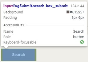
As you are moving around the page, please make sure that you look at any buttons or links and that they are correctly described and have an appropriate role, so buttons are actually classed as buttons and links are classed as links (Name, Role, Value) and have appropriate descriptions (Label in name) - see image below of inspect element result for a button**.To check this press (COMMAND and Option and C (Mac) and CTRL and SHIFT and C (Windows):**
Does the page have any input fields on it? Can you use these correctly and do they make sense when using a screen reader? (Labels or Instructions). Check that all headings and labels, so all headings (e.g. H1, H2 and H3 etc.) and labels (e.g. input fields on any forms) clearly describe the purpose of the contents or groupings on the screen elements without any ambiguity in their understanding (Heading and Labels). When you move through these fields, enter some incorrect text to create an error, does your focus move to the error when using a screen reader and is this clearly displayed and described? (Error Identification). If entering the text to a query box, or dropdown combo box and it does not error, does the change of information load any new page or does the page allow that option to sit there so you can tab to the next field (On Input). When you are moving through these elements, or buttons do they have meaningful description information via a screen reader or other reader (Label in Name).
Next there are a few single options to check for.
Firstly, look at the links on the page to make sure you understand what would happen if you clicked on the link (e.g. is the destination clear?). Does the link make sense on its own? The purpose of a link must be determined from the text of the link itself or the context surrounding this link (Link Purpose).
Lastly, if there is any media content on the page make sure there are captions (Captions) for any video and that any captioned text displays in time with the video. If audio only, then a transcript of that text is available to download (Audio only and video only). If there are parts of the video only visually convey meaning, then Audio description would need to be added for non-visual users along with any transcript download (Audio Descriptions and media alternatives).
Below are the minimum WCAG points that we believe should be checked on a first sweep by users that have not done much testing before:
Perceivable
1.1.1 Non text Content (A) - Accessibility Insights
“Non-text content” means anything on the site that isn't text; generally images, videos, audio, charts, maps, and other content that requires interpretation but would not be read aloud by a screen reader looking for text.
1.2.1 Audio-only and video-only (A) - [Manual Test]
When video content, with no audio, is presented to someone who is blind, they cannot see it. Likewise, when audio-only content is presented to someone who is deaf or has a severe hearing impairment, they cannot hear it. These people are excluded from this type of content within the site or application.
1.2.2 Captions (A) - [Manual Test]
Captions are a text form of audio information in video and animations. This includes the words that are spoken, who is speaking when it is not evident, and important sounds like music, laughter, and noises. Captions must be synchronized with the visual content to contextualize them.
1.2.3 Audio descriptions and media alternatives (A) - [Manual Test]
“Descriptive audio” means that your video has additional audio content that describes aspects of the video that are purely visual and not accessible to blind or visually-impaired people. Usually, there's a second audio track that contains the description
1.3.1 Info and Relationships (A) - [Use Accessibility Insights, Manual/Headings Map Chrome plugin, Manual Test with screen reader]
"Information, structure, and relationships conveyed through presentation can be programmatically determined or are available in text." This intends to communicate the relationship of elements on a page by more than just visual cues.
1.3.2 Meaningful Sequence (A) - Use Accessibility Insights (tab stops check)
A sequence is meaningful if the order of content in the sequence cannot be changed without affecting its meaning. For example, if a page contains two independent articles, the relative order of the articles may not affect their meaning, as long as they are not interleaved.
Or you can create content that can be presented in different ways (for example simpler layout) without losing information or structure.
1.4.3 Contrast minimum (AA) - Use Accessibility Insights
The visual presentation of text and images of text has a contrast ratio of at least 4.5:1, except for the following:
- Large Text 3:1
In WCAG 2, contrast is a measure of the difference in perceived "luminance" or brightness between two colours (the phrase "colour contrast" is never used in WCAG). This brightness difference is expressed as a ratio ranging from 1:1 (e.g. white on white) to 21:1 (Black on White).
1.4.10 Reflow (AA) - [Manual Test]
In web design, supporting reflow refers to the process of fitting content to match the user's viewport. The viewport is the visible area of the page, which may change depending on the user's web browser, device, and zoom preferences.
Operable
2.1.1 Keyboard (A) - Use Accessibility Insights (tab stops check)
Make all functionality available for a keyboard.
2.1.2 No Keyboard Trap (A) - Use Accessibility Insights (tab stops check)
To ensure keyboard accessibility keyboard traps mustn't be present on a web page. Keyboard traps occur when a keyboard user cannot move focus away from an interactive element. Traps can occur in input boxes, drop-down menus, or even on hyperlinks. This forces the keyboard user to be stuck inside the input box or forces them to activate a hyperlink without having the option to go past the link.
2.4.1 Bypass Blocks (A) - [Manual Test]
Bypass blocks are mechanisms that skip over repeated material on a webpage. They are important for users who navigate with a keyboard because they allow users to skip over repeated sections and go to the content they are looking for immediately.
2.4.2 Page Titled (A) - [Manual Test]
Page titles should be descriptive and should introduce the context of the webpage. A descriptive title allows all users to know the purpose of the webpage they are visiting.
2.4.3 Focus Order (A) - Use Accessibility Insights (tab stops check)
The navigation order of focusable elements MUST be logical and intuitive. Note 1: Focusable elements include links, form inputs and controls, buttons, and any element with a tabindex value of 0 or greater. Note 2: The default reading order is determined by the order of the focusable elements in the DOM.
2.4.4 Link Purpose (A) - [Manual Test]
The text in the link is intended to describe the purpose of the link. In cases where the link takes one to a document or a web application, the name of the document or web application would be sufficient to describe the purpose of the link
2.4.6 Headings and Labels (AA) - Manual/Headings Map Chrome plugin
Headers visually and structurally organize the webpage. Having a correct heading structure allows assistive technology users to navigate via headers and helps them go directly to the content that is most relevant to their search.
2.4.7 Focus Visible (AA) - Manual test
Keyboard focus will primarily allow sighted users to know which element from the webpage has focus. If keyboard focus is not present or is difficult to visually see, it becomes a barrier to a user and makes it difficult to access information through a keyboard.
2.5.3 Label in Name (A) - Manual test with screen reader.
The label identifies the control to all users. It is generally visible on screen text. Examples of labels are the label element on a form Field control or the text of a link. The label is often used as the name e.g. First Name, Surname etc.
Understandable
3.1.1 Language of Page (A) - Accessibility Insights
Specifying the main language of page content within the code enables browsers to present the font characters accurately and also supports assistive technologies that translate text to synthetic speech to use the correct pronunciation. This allows users of all abilities to better understand the material presented.
3.2.1 On Focus (A) - Manual test with screen reader
This point is to ensure that functionality is predictable as visitors navigate their way through a page. Any component that is able to trigger an event when it receives focus must not change the context. Examples of changing context when a component receives focus include, but are not limited to:
- forms submitted automatically when a component receives focus;
- new windows launched when a component receives focus;
- focus is changed to another component when that component receives focus;
3.2.2 On Input (A) - Manual test with screen reader
Ensure no element changes on input.
Here are some examples of the kinds of things to look out for:
- Forms must not auto-submit when all fields are filled – this prevents your users from checking and editing what they have written.
- Focus must not automatically jump to the next input field in a form once the current field is complete.
- Using a control (like selecting yes or no) must not automatically perform the action (for example, selecting to subscribe to a newsletter in a check box must not automatically subscribe your user, they should be able to click a submit button to confirm their decision).
3.3.1 Error Identification (A) - Manual test with screen reader
If an input error is automatically detected, the item that is in error should be identified and the error is described to the user in text.
3.3.2 Labels or Instructions (A) - Manual test with screen reader
The intent of this Success Criterion is to have content authors present instructions or labels that identify the controls in a form so that users know what input data is expected. In the case of radio buttons, checkboxes, comboboxes, or similar controls that provide users with options, each option must have an appropriate label so that users know what they are actually selecting. Instructions or labels may also specify data formats for data entry fields, especially if they are out of the customary formats or if there are specific rules for correct input.
Robust
4.1.2 Name, Role, Value (A) - Accessibility Insights
For all user interface components (including but not limited to: form elements, links and components generated by scripts), the name and role can be programmatically determined; states, properties, and values that can be set by the user can be programmatically set; and notification of changes to these items is available to user agents, including assistive technologies.