
Often tabbed interfaces are just called tabs and they are an interface design pattern that we will all be familiar with, as some websites use this pattern, but all desktop operating systems do and some mobile apps.
Called tabs or a tabbed interface because of its resemblance to the little tabs you put on the files that would typically be in a file cabinet or binder. Each tab's position is usually slightly offset for quicker visual identification of a specific file.
On a computer, they are usually represented by a series of "tabs" (either horizontal or vertical) and each has a corresponding panel. There would always be one panel visible and the others would remain hidden until their corresponding tab is clicked. There are implementations where multiple can be open, but let's pretend there isn't.
These UI elements are probably usable to the majority of users when built correctly and styled with strong visual affordances, in that they're commonplace on your Mac or PC for many of the system settings and file directories. They're even present on the operating systems of your phone or tablet. That's not me saying they are a good pattern to use, that's for your users with disabilities to inform you of that, it's their opinion what counts, not mine.
The problem with tabs
Tabs seem to make more sense on larger viewports, typically desktops, laptops and some tablets (each at regular zoom levels). But just because something works well on larger viewports at regular zoom levels that doesn't guarantee it will work as well on a smaller viewport or when the viewport is zoomed enough to trigger the "mobile view". What we tend to find across the web is something that doesn't really work at smaller viewports. I guess this is a classic case of "Desktop first, mobile worst", in that the experience can differ quite dramatically between the viewport sizes.
The most obvious issue is always going to be the lack of screen real estate, on a smaller viewport you simply cannot fit your horizontal tabs across the screen width if you have more than a few single-word tabs, but even then, the layout will likely break if a user sets their default text size to "Large" or "Largest" etc. What you then end up with is 2 or more rows of "tabs", so activating a tab on the top row will display the tabpanel immediately after the bottom row, which maybe looks a little odd.
Vertical tabs to the rescue?
Errm, possibly not. Again you end up in that situation where the only time the visible tabpanel immediately follows the active tab is if you activated the last tab, which some users may find a little confusing and cause them to have to think about what is going on and how these somewhat distant elements are related.
Don't make me think
I am of course making some assumptions here that users find the pattern a little confusing and thus far I am just referring to users who can see the interface, as it's the visuals we are focusing on right now.
Just a quick run through what is needed:
- A wrapping element with
role="tablist", this will hold the individual tabs, obviously there should be more than onetabpresent in atablist - The current
tabwill needaria-selected="true"to indicate it is the currently activetab, for screen reader users - Each
tabhavingaria-controls="[IDRef of the associated tabpanel]", to create a programmatic relationship between eachtaband its correspondingtabpanel - The panel should have a role of tabpanel and an accessible name, using aria-labelledby=[IDRef of the controlling button]", is a common approach
- An interaction model which uses arrow navigation between tabs, only allowing one
tabto be focusable with the tab key and then using arrows to focus on adjacent tabs, if using a button or link, thentabindex="-1"would be required for removing the non-active tabs out of the tab sequence - For each of the tabpanels that are not visible, hide the
tabpaneland its contents from both the accessibility tree and the focus order, so they can only be accessed when thetabpanelis visible
Just a few alternatives for you to look at, Don't worry, I'm not just going to copy anybody's work or paraphrase what has already been said, this is just going to be an alternative, nothing more.
- If you are unaware of the excellent Inclusive Components book by Heydon Pickering, you should definitely give that a read, the chapter for Tabbed Interfaces is obviously related to what we are doing here. Heydon's approach is obviously solid, a progressively enhanced table of contents that becomes tabs when JavaScript is available
- There is also the Deque tabby-accordion things, which make so much sense visually, the
tabpanelalways displays directly below its correspondingtab, but unfortunately, thattabpanelis inside thetablist, which isn't valid ARIA - Finally, Andy Bell has an interesting solution, one I had not seen before until recently, where the
tablistitself is scrollable, horizontally, so they still appear as tabs on smaller viewports. Just one little niggle on this one, I could not get the last tab to be fully in view using a keyboard alone, but other than that, these are are really neat solution
OK, so what is our approach?
Well, we're just going to go with tabs on larger viewports and accordions on smaller viewports, but we will of course do this properly, in that there will be no incorrect roles present on either widget, all properties will be correct and each widget will have the correct interaction model. We'll also start from a nice progressively enhanced version and only do the magic where JS is available.
If this isn't the solution for you, I recommend exploring those linked above.
I'm going to explain this step-by-step, which if you're already comfortable with JS will likely be far too much waffling from me, but maybe some folks are just starting out with it, so you can skip past those bits.
An MVP for when there is no JS
Let's start with the good stuff, the HTML, we want this to be our minimum viable product (MVP), this should be accessible if or when JS doesn't load or the user chooses not to allow it. Given that tabs usually show the the first panel on page load, we could do something similar, we could use the <details><summary> element and force the first one to be open on page load. There are still some browser inconsistencies, as Scott O'Hara points out here and Adrian Roselli points out here.
Is it appropriate for us to use this element? Hmm, well it has some quirks across browsers, but no show-stopping issues, so we'll do so tentatively. Ultimately let your users' needs guide your decisions, not some random guy on the internet.
<div class="widget__wrapper">
  <details open>
    <summary>Widget 1</summary>
    <div>
      <p>
        Widget 1 contents: Lorem ipsum dolor sit amet consectetur adipisicing
        elit. Porro quasi ab, error fugiat at, maiores enim impedit cumque
        quidem similique et laborum aliquam modi assumenda officiis est!
        Sapiente, non neque! <a href="">Test 1</a>
      </p>
    </div>
  </details>
  <details>
    <summary>Widget 2</summary>
    <div>
      <p>
        Widget 2 contents: Lorem ipsum dolor sit amet consectetur, adipisicing
        elit. Numquam molestias nostrum repudiandae, quaerat alias iste placeat
        at a, sequi deserunt iure praesentium velit repellendus ipsum culpa
        ratione soluta eius magni quasi fugiat repellat necessitatibus fugit.
        <a href="">Test 2</a>
      </p>
    </div>
  </details>
  <details>
    <summary>Widget 3</summary>
    <div>
      <p>
        Widget 3 contents: Lorem ipsum dolor sit amet consectetur, adipisicing
        elit. Est illo hic vitae tenetur omnis laborum itaque vero adipisci
        doloremque optio ullam, vel similique aliquam quo! <a href="">Test 3</a>
      </p>
    </div>
  </details>
</div>
So, we have three <details> & <summary> elements and the first has the open attribute, to have some visual similarity with the tabbed interface. Notice I have a wrapping <div> inside each <details> which is a sibling of the <summary> element? As you may have multiple paragraphs or even other stuff inside your <details> it makes sense to wrap it all in something, making it easier to grab those contents with JS, assuming we mark it up correctly the <summary> is the first child, we the know that <div> will be the last child and it will hold the entirety of the collapsible content.
Also, I have wrapped them all in a <div class="widget__wrapper"> because we'll need that for DOM manipulation and also I called it that because it's neither tabs or accordions all of the time, so due to my lack of creativity, we'll just call this element a widget.
Cool, JS is available, let's do the magic
What I am going to do is just show each step's code on its own as opposed to making the code block longer and longer at each step, thus making the page overly long. I will of course provide completed files at the end.
Setting up our main variables
First we'll initialise our global variables and then we'll build a string from the contents of the <details> and <summary elements, so we can use this as our base HTML. Once that is all sorted, we'll remove everything from our wrapper and insert our new string as HTML and then reference the global variables we need from that new HTML.
Explainer 1
First we want to reference our
<div class="widget__wrapper">element and assign it to the `widgetWrapper` variable
* We initialise two variables in the global scope, that we need later `baseHTML` (which we're setting to an empty string) and also `open`, which we will set to `0`
* We're going to switch the widget type based upon a media query, so we use the `matchMedia` method and store that in our `mq` variable, I've set the breakpoint's `(max-width: 767px)`, for this example
* Then we create an array `navKeys`, which holds all of the codes for the key presses we want for these widgets, that the browser doesn't provide
* We loop through all of our<details>elements that are present in the `widgetWrapper`, getting the index with the `idx` variable and each element with the `el` variable. As we iterate through we build a HTML string using a template literal (backticks), and use the addition assignment operator `+=`, so we concatenate that string on each iteration, this is saved to our `baseHTML` variableWithin that loop we add some classes and IDs, the latter of which we generate from the a string and
idxvariable+ 1, so each ID is unique. Both the buttons and the panels need IDs to create programmatic relationships and accessible names for the panels, respectivelyWe also add a data attribute to each button and panel, this holds a number we get from our
idxvariable and here we are starting that number from0, those data attributes for buttons and panels aredata-btn-idxanddata-panel-idx, respectivelyWe set the contents of each button within this string to be the text that was in the
<summary>element, we know that this was the first child of a<details>element and we just want its text, so we do this with${el.firstElementChild.textContent}As we wrapped the collapsible contents of each
<details>element in a<div>earlier, we know that this<div>is the last child of each<details>element and will contain the HTML we need, so we add the correct HTML inside each panel per loop iteration with${el.lastElementChild.innerHTML}Both accordions and tabs have
aria-controlson the trigger which creates the programmatic relationship between the trigger and its corresponding panel, via an ID reference. Tabpanels have an accessible name and accordions can optionally have one, so we will usearia-labelledbyand reference its controlling button element's ID, so each panels' accessible name becomes that of its controlling button. I have added these common attributes here, as they will never changeOutside of the loop we modify our
baseHTMLvariable with a wrapper<div class="widget__controls-wrapper">, unfortunately tabs and accordions have a different structure and we need this additional wrapper, for the tabs. We add the contents from our loop${baseHTML}, within that new wrapperNow that we have our
baseHTMLstring that contains all of the HTML and contents we need for our initial HTML we can remove all of the HTML from thewidgetWrapperby settingwidgetWrapper.innerHTML= '', which removes its contents.Now we want to insert that
baseHTMLstring at the beginning of thewidgetWrapperelement, withinsertAdjacentHTML('afterbegin', baseHTML)Now we have out
baseHTMLin the DOM, we can assign them to variables, which we will use throughout this project- We assign the
<div class="widget__controls-wrapper">element, withwidgetControlsWrapper - We create an
Array.from()a collection of the new buttons which is assigned towidgetBtns - We create an
Array.from()a collection of the new panels which is assigned towidgetPanels
- We assign the
const widgetWrapper = document.querySelector('.widget__wrapper');
let baseHTML = '',
  open = 0;
const mq = window.matchMedia('(max-width: 767px)');
const navKeys = [
  'ArrowUp',
  'ArrowRight',
  'ArrowDown',
  'ArrowLeft',
  'Home',
  'End',
];

widgetWrapper.querySelectorAll('details').forEach((el, idx) => {
  baseHTML += `<h3 class="widget__heading">
    <button class="widget__btn" id="btn-${
      idx + 1
    }" data-btn-idx="${idx}" aria-controls="panel-${idx + 1}">${
    el.firstElementChild.textContent
  }</button></h3>
    <div class="widget__panel" id="panel-${
      idx + 1
    }" data-panel-idx="${idx}" aria-labelledby="btn-${idx + 1}">${
    el.lastElementChild.innerHTML
  }</div>`;
});
baseHTML = `<div class="widget__controls-wrapper">${baseHTML}</div>`;

widgetWrapper.innerHTML = '';
widgetWrapper.insertAdjacentHTML('afterbegin', baseHTML);
const widgetControlsWrapper = widgetWrapper.querySelector(
  '.widget__controls-wrapper'
);
const widgetBtns = Array.from(widgetWrapper.querySelectorAll('.widget__btn'));
const widgetPanels = Array.from(
  widgetWrapper.querySelectorAll('.widget__panel')
);
Adding a function to create accordions
We'll create our accordions first as they are what will display on smaller viewports and mobile first tends to be the best way of building sites, so we create a createAccordions() function.
Explainer 2
We're just looping through the
widgetBtnsarray, getting a reference to the button and its index on each loop iteration, withbtnandidx, respectivelyOn page load we want the first panel to be open, but users can resize the window or zoom in or out after the page has loaded, which may trigger the media query change. We need to plan ahead a little here, we don't want a situation where our user has focused on something and should they trigger the media query change by zooming or resizing and then their focus gets lost
- So, what we will do is write a condition which checks to see if the
idxis equal to theopenvariable we declared earlier, if it is: setaria-expanded="true", else set:aria-expanded="false" - We're setting a data attribute on each parent
<h3>element calleddata-expanded, this is just a handy hook for the CSS so we can use the sibling selector to hide or show the correct accordion panel and its value must always be in sync with the value of its child button'saria-expanded
- So, what we will do is write a condition which checks to see if the
Tabs and accordions are quite different, so we have a heap of roles and properties to remove, also we need to reposition the actual panels in the DOM each time the media query changes. That's because an accordion panel opens below each trigger element, whereas tabs are contained in a
tablistand the panels need to be outside of this- We remove each of the unnecessary attributes that should not be present on an accordion, we do this with
removeAttributeand then set the attribute name in the parentheses and quotes - We remove the attributes that should not be present on each accordions' panel
- We get each button's parent and remove the role from that
- We move the panels directly below their
<h3>in the HTML source order, by matching the value of the panels'aria-labelledbyattribute with the buttons' IDs, we then use theafter()method to hoist these up into their correct position - We are also adding a
role=regionto each panel, so now our accordions' panels have a role with an accessible name (which we added in thebaseHTMLstring witharia-labelledby) - We remove both the
tabindexandhiddenattributes, as we don't want these for accordions
- We remove each of the unnecessary attributes that should not be present on an accordion, we do this with
const createAccordions = () => {
  widgetControlsWrapper.removeAttribute('role');
  widgetBtns.forEach((btn, idx) => {
    idx === open
      ? btn.setAttribute('aria-expanded', 'true')
      : btn.setAttribute('aria-expanded', 'false');
    idx === open
      ? btn.parentElement.setAttribute('data-expanded', 'true')
      : btn.parentElement.setAttribute('data-expanded', 'false');
    btn.parentElement.removeAttribute('role');
    btn.removeAttribute('tabindex');
    btn.removeAttribute('role');
    btn.removeAttribute('aria-setsize');
    btn.removeAttribute('aria-posinset');
    btn.removeAttribute('aria-selected');
    btn.parentElement.after(
      widgetWrapper.querySelector(`[aria-labelledby="${btn.id}"]`)
    );
  });

  widgetPanels.forEach(panel => {
    panel.setAttribute('role', 'region');
    panel.removeAttribute('tabindex');
    panel.removeAttribute('hidden');
  });
};
Adding a function to create tabs
We'll now create a createTabs() function which will add all of the necessary roles and properties to our tabbed interface, as well as removing any artefacts of the accordions pattern.
Explainer 3
- First we're going to add
role="tablist"to thewidgetControlsWrapper, as the actual tabs need to be inside an element with this role - Now we're going to loop through the buttons again, we can't have the buttons' parent headings exposed as headings so we'll just neuter their semantics with
role="presentation" - We add
role="tab"to each<button> - As we're not using list elements, we don't get the enumeration they can provide to screen readers, so we can add that back by using
aria-setsizeby getting thelengthof thewidgetBtnsarray. This tells us how many buttons are in ourtablistand then we can get the current position of each tab from within that array by simply using theidxvariable and adding+1per loop iteration, as the array is zero-based and humans start counting from 1 - If the
idxis equal to ouropenvariable we set:aria-selected="true"else we set the remaining tabs toaria-selected="false" - If the
idxis not equal toopen, settabindex="-1", this removes the non-active tabs from the focus order - Then we remove all of the unnecessary
aria-expandedattributes from the<button>elements and thedata-expandedattributes from their parent headings
Finally, we'll add the required roles and properties to the panels:
- We loop through our
widgetPanelsarray, getting each element with thepanelvariable and the index with theidxvariable - We set
role="tabpanel"on each panel - If the
idxis equal to ouropenvariable we set:tabindex="0", else we set thehiddenattribute. This makes the active panel keyboard focusable, we're doing this as a user will be cycling through tabs with horizontal arrow keys, so pressing Tab whilst focusing on atabshould take them to the correspondingtabpanel. If you can guarantee the first element within thetabpanelis focusable, this would be unnecessary, but we'll assume we cannot know that in advance, as we may have content creators using a CMS and the panels could contain anything. - Then outside of that loop we get our
widgetPanelsarray,reverse()it and then move the panelsafter()thewidgetControlsWrapperelement, so now they are in the correct position and we reversed that array so they appear in the correct order in the DOM
So now we have two functions that generate the correct HTML and ARIA, one that creates accordions and one that creates tabs.
const createTabs = () => {
  widgetControlsWrapper.setAttribute('role', 'tablist');
  widgetBtns.forEach((btn, idx) => {
    btn.parentElement.setAttribute('role', 'presentation');
    btn.setAttribute('role', 'tab');
    btn.setAttribute('aria-setsize', widgetBtns.length);
    btn.setAttribute('aria-posinset', idx + 1);
    idx === open
      ? btn.setAttribute('aria-selected', 'true')
      : btn.setAttribute('aria-selected', 'false');
    if (idx !== open) btn.setAttribute('tabindex', '-1');
    btn.removeAttribute('aria-expanded');
    btn.parentElement.removeAttribute('data-expanded');
  });

  widgetPanels.forEach((panel, idx) => {
    panel.setAttribute('role', 'tabpanel');
    idx === open
      ? panel.setAttribute('tabindex', '0')
      : panel.setAttribute('hidden', '');
  });
  widgetPanels.reverse().forEach(el => widgetControlsWrapper.after(el));
};
Just a tiny bit of CSS, for now
Just so we can actually see these working, we'll hide the accordion panels when data-expanded="false" is present on the button's parent heading with display: none; and we'll also belt and brace the hidden attribute for tabpanels with the same CSS.
Just so our tabs are displayed horizontally, we'll set display: flex; and gap: 2px; to the tablist container.
[role='tablist'] {
  display: flex;
  gap: 2px;
}

[hidden],
[data-expanded='false'] + .widget__panel {
  display: none;
}
Adding events to display the correct widget
Now we need to determine which widget to display, initially we need to do this on page load so we are providing the user with the widget that best fits their viewport.
Explainer 4
- We add an
addEventListener()to thewindow, listening to the event'DOMContentLoaded'when that event is complete, we check if the current media querymatchesourmqvariable, if it does callcreateAccordions()if not callcreateTabs() - We use a similar
addEventListener()as above, this time we set it on themqvariable and listen for a'change'event, which just means the current media query has changed
If you have been following along in a code editor, should you load the page or resize it, you will notice that we now display the correct element per media query. It looks pretty awful right now, but if you open up the DevTools, everything looks sweet in there and everything is updated correctly. Next, we need to make these widgets functional to mouse and keyboard events.
window.addEventListener('DOMContentLoaded', evt => {
  mq.matches ? createAccordions() : createTabs();
});

mq.addEventListener('change', evt => {
  mq.matches ? createAccordions() : createTabs();
});
Adding click functionality to the widgets
Accordions are naturally easier to manage as we just need a click event, which will handle both mouse clicks and keyboard presses to expand or collapse their corresponding panel. We need to tackle the tabs in a slightly different way, we're going for tabs with automatic activation, which means as a user cycles through the tabs with arrow keys, each time they focus on a new tab it becomes the selected tab and its corresponding tabpanel is displayed. Tabs also need to add a click event, as we need this to work for mouse and touchscreen input too.
Now we will create a function handleClickOnBtns() which will listen for clicks on our <button> elements, the first thing we need to do is make sure that the 'click' event was on an item that has the class which is present on our buttons, as we only want this code to run if it was our buttons that were clicked, otherwise it will run if somebody adds elements with certain roles to any of the panels, best to be safe, right?
Explainer 5
- We check if the
<button>hasaria-expanded="false", if it does toggle that value to"true",else set it to"false"we are using anelse ifhere, as this way we're also checking for the presence ofaria-expanded, as this is unique to the accordions in our example. If we just used anelsewhich doesn't allow a condition, the event would addaria-expandedto tabs and we don't want that - We also toggle the
data-attributeon the parent<h3>so its value is always in sync with the button'saria-expandedvalue
Now let's add the functionality for tabs, at this stage it will only be for mouse & touchscreen users, as we'll handle keyboard interaction in a separate function
We create a new if statement in our handleClicksOnButtons() function which requires the target have the attribute role, as this is one of the attributes that is only present on the tabs.
We call an as yet undeclared function named setActiveTab() where we will pass in the clicked <button>, we want to reuse that function for arrow keys too, so we just call it here, in that function we will also set the non-active tabs too
We also need a way to call the handleClickOnBtns() function on a 'click' event, so we use an addEventListener() and listen for a 'click' event within the widgetWrapper and if there is one, it will call this function.
function handleClickOnBtns(evt) {
  if (evt.target.classList.contains('widget__btn')) {
    if (evt.target.getAttribute('aria-expanded') === 'false') {
      evt.target.setAttribute('aria-expanded', 'true');
      evt.target.parentElement.setAttribute('data-expanded', 'true');
    } else if (evt.target.getAttribute('aria-expanded') === 'true') {
      evt.target.setAttribute('aria-expanded', 'false');
      evt.target.parentElement.setAttribute('data-expanded', 'false');
    }
    if (evt.target.hasAttribute('role')) {
      setActiveTab(evt.target);
    }
  }
}

widgetWrapper.addEventListener('click', handleClickOnBtns);
Setting active and non-active tabs
So we need a function to handle setting the active tab and displaying its corresponding panel, whilst setting all other tabs to be non-active and their corresponding panels to hidden, we will do this in a setActiveTab() function, which will accept the current tab a user has clicked or selected.
Explainer 6
We passed in the
targetelement (the clicked<button>) in the previous step's call to this functionWe loop through all of the tabs and check to see which one matches the
<button>passed to this function, by matching thetabis equal to theactiveTab, which we passed in- We set
aria-selected="true"on that<button> - We remove the
tabindexattribute, as we don't needtabindex="0"on an actual<button>, as it's already focusable - We get the exact panel that
<button>controls by searching in thewidgetWrapperand finding an element that hasaria-labelledbywhere the value matches the ID of the selected<button>and we addtabindex="0"to that panel, so it's focusable - We also remove the
hiddenattribute from the panel, because this needs to be thetabpanelthat is displayed, we use the samequerySelectoras above
- We set
In our loop we checked for the active tab in our
ifcondition so the remaining tabs are the non-active tabs, so we target them with theelseblock, we're pretty much reversing what we did for the activetab- For every
<button>that reaches this condition we setaria-selected="false" - We add
tabindex="-1"to each of these<button>elements, as adjacent tabs are focusable with arrows as opposed to the Tab key, so we want to remove the non-active tabs out of the focus order - We remove the
tabindexattribute from each non-activetabpanel - Finally, we add the
hiddenattribute to each non-activetabpanel
- For every
setActiveTab = (activeTab) => {
  widgetBtns.forEach(tab => {
    if (tab === activeTab) {
      tab.setAttribute('aria-selected', 'true');
      tab.removeAttribute('tabindex');
      widgetWrapper.querySelector(`[aria-labelledby="${tab.id}"]`).setAttribute('tabindex', '0');
      widgetWrapper.querySelector(`[aria-labelledby="${tab.id}"]`).removeAttribute('hidden');
    } else {
      tab.setAttribute('aria-selected', 'false');
      tab.setAttribute('tabindex', '-1');
      document.getElementById(tab.getAttribute('aria-controls')).removeAttribute('tabindex');
      document.getElementById(tab.getAttribute('aria-controls')).setAttribute('hidden', '');
    }
 }
Adding the interaction model to our widgets
The interaction model for horizontal tabs is as follows:
- Only one
tabis in the page's focus order at any given time, pressing Tab whilst focus is on atabwill move focus out of thetablist, in our example focus will move to thetabpanel - Pressing Shift and Tab will also move focus out of the
tablist, in reverse - Pressing Shift and Tab whilst focus is on a
tabpanelwill move focus back up to the activetab - A keyboard user should be able to focus on adjacent tabs using the horizontal arrow keys, in our automatic activation implementation, focusing on any tab will make it the active
taband automatically display its panel - Should a user reach the last tab and press the right arrow key or they press the left arrow key whilst focus is on the first
tab, we can either cycle back through, infinitely or just do nothing, we're going to do nothing, reaching either end of thetablistwill be a hard stop - If a user presses Home whilst focus is within the
tablist, then focus moves to the firsttab - If a user presses End whilst focus is within the
tablist, then focus moves to the lasttab
The interaction model for accordions is as follows:
Pressing tab whilst focusing on an accordion button
- If that accordion is collapsed and there is an accordion below, then focus advances to that accordion, as any interactive elements inside the closed panel must be ignored
- If that accordion is expanded and there are no interactive elements inside its panel. then focus moves to the accordion below (if present) or continues through the page, as normal
Pressing Shift and Tab whilst focusing on an accordion button
- If there is an accordion above and it is collapsed, focus will move to that accordion, ignoring any interactive elements it may contain
- if the above accordion is open and has no interactive elements, then focus will move to the above accordion (if present) or continue up the page
Pressing Tab or pressing Shift and Tab whilst focus is inside an accordion panel
- If focus is on the last interactive element inside the panel and a user presses Tab, focus will move to the below accordion (if present), else continue down the page
- If focus is on the first interactive element inside the panel and a user presses Shift and Tab, focus will move to the above accordion (if present), else continue up the page
- All interactive elements within the panels should of course be focusable in a logical order, which is usually the source order of the HTML
Optional interaction for accordions
- If a user is focused on an accordion and presses Home their focus moves to the first accordion in that group
- If a user is focused on an accordion and presses End their focus moves to the last accordion in that group
- If a user is focused on an accordion and presses the down arrow key, focus will move to the accordion below (if present) else we are choosing to do nothing
- If a user is focused on an accordion and presses the up arrow key, focus will move to the accordion above (if present) else we are choosing to do nothing
Quite a bit to consider there, but it's not as involved as it sounds, as the browser already handles a good chunk of that, we have hidden our panels properly, so focus cannot enter them if they are not displayed. We already manage the focus by setting the appropriate tabindex values, where required, so we only need to add the functionality for the keys we stored in our navKeys array. We're going to also add the optional interaction for accordions.
Explainer 7
We create a function
handleKeyboardInteraction()that accepts an eventevtparameterIf the
keypassed from theevtexists in thenavKeysarray we created earlier and thatkeywas pressed whilst focus was on an element with a classwidget__btn, we'll execute the code within, otherwise, we just do nothingWe add
preventDefault()to the event, as we want to intercept these key presses and match them to the behaviour we are providing as opposed to the user agent'sWe declare a
currentIdxvariable, which has the index of the target element, which we get from itsdata-btn-idxattribute, we'll match this to thewidgetBtnsarray, shortlyWe don't want to write very similar code twice, we'll set a condition where if the
targetelement has theroleattribute (we know it's tabs layout), we will assign 'ArrowRight' to anextvariable, else (we know it's accordions layout), we assign 'ArrowDown' to thenextvariable- We use the same logic as above for 'ArrowLeft' and 'ArrowUp', but assigning them to a
prevvariable
- We use the same logic as above for 'ArrowLeft' and 'ArrowUp', but assigning them to a
If the
evt.keymatches the value of ournextvariable (When tabs are present that will be the right arrow key, else accordions are present so it will be the down arrow key) and focus is not on the last button (currentIdxis less thanwidgetBtns.length - 1then we need to advance focus to the next button- If it's a tab then we need to pass the next button to the
setActiveTab()function and we pass inwidgetBtns[currentIdx + 1], which just gets the next item in the array, we also run a check that the element was a tab and then get that same indexed element and append with.focus() - If it's an accordion, we only need to move focus to the next one if present, so we don't call a function, we just use the array index and append with
.focus()
- If it's a tab then we need to pass the next button to the
We repeat the same logic as the previous step, in reverse for when a user presses the left or up arrows, this time we are matching against the
prevvariable's value. We are checking if a user is not focused on the first button by requiring thecurrentIdxto be greater than0and if it is we call thesetActiveTabfunction and movefocus(), this time we don't add1to the array, we subtract1If the keys pressed were either
'Home'or'End'we then determine which widget is displayed by checking whether thetarget<button>has theroleattribute present, if it does and a user pressed Home pass the first item in thewidgetBtnsarray to thesetActiveTab()function, thenfocus()on the first item in the same array- We repeat the above logic for the End key, but we pass the last item in the array to the
setActiveTab()function andfocus()on it if an accordion, by getting thelengthof the array and deducting1
- We repeat the above logic for the End key, but we pass the last item in the array to the
We call this function with
addEventListener(), we attach that to thewidgetWrapper
That's pretty much it, our tabs and accordions have good markup, the correct ARIA and the right interaction model, they will display according to the media query set and we're almost good, there's just one more thing.
function handleKeyboardInteraction(evt) {
  if (
    navKeys.includes(evt.key) &&
    evt.target.classList.contains('widget__btn')
  ) {
    evt.preventDefault();
    const currentIdx = Number(evt.target.getAttribute('data-btn-idx'));
    evt.target.hasAttribute('role')
      ? (next = 'ArrowRight')
      : (next = 'ArrowDown');
    evt.target.hasAttribute('role') ? (prev = 'ArrowLeft') : (prev = 'ArrowUp');

    if (evt.key === next && currentIdx < widgetBtns.length - 1) {
      evt.target.hasAttribute('role')
        ? setActiveTab(widgetBtns[currentIdx + 1])
        : widgetBtns[currentIdx + 1].focus();
      if (evt.target.hasAttribute('role')) widgetBtns[currentIdx + 1].focus();
    } else if (evt.key === prev && currentIdx > 0) {
      evt.target.hasAttribute('role')
        ? setActiveTab(widgetBtns[currentIdx - 1])
        : widgetBtns[currentIdx - 1].focus();
      if (evt.target.hasAttribute('role')) widgetBtns[currentIdx - 1].focus();
    }

    if (evt.key === 'Home' && evt.target.hasAttribute('role'))
      setActiveTab(widgetBtns[0]);
    if (evt.key === 'Home') widgetBtns[0].focus();
    if (evt.key === 'End' && evt.target.hasAttribute('role'))
      setActiveTab(widgetBtns[widgetBtns.length - 1]);
    if (evt.key === 'End') widgetBtns[widgetBtns.length - 1].focus();
  }
}

widgetControlsWrapper.addEventListener('keydown', handleKeyboardInteraction);
Handling focus when the viewport changes
Some users may be unable to read text that others find comfortable, we all have different needs and preferences, so we need to consider those circumstances where our current implementation has one issue that may be less than obvious. Let's assume we have a user that has low-vision, they open up our page and see the widget and one of the buttons contains the topic they are interested in. This user also uses a keyboard to navigate websites, as that is what works best for them. They decide they want to zoom in, to read the contents, currently in our implementation, their focus could be lost, which would be hugely frustrating for keyboard users.
This happens because we never update our open variable, it is just set to 0 at the top of our JS. That's OK though, as obviously we have that for a reason and now we are going to use it properly. Let's look at the three situations where we don't want the switching of patterns to become jarring, confusing or steal a user's focus:
- If a user's focus was on one of the buttons, irrespective of whether they were in the accordions layout or the tabs layout, the browser doesn't lose focus here, as the buttons are only modified with attributes. We want to try to make sure users don't lose their place so we will force the panel they were focused on to be the open panel. If the layout was accordions, we have to open one panel when it changes to tabs and by focusing on this
tab, it automatically becomes the selectedtab, so it has be this one and if a user was viewing the tabs layout, thattabwas selected so we'll just expand that accordion for them - If a user was focused on a
tabpanel(as they're focusable), we cannot send focus to the relevant accordion panel as accordion panels are not focusable. So the sensible solution is to send focus back one step, to its controlling<button>and we'll expand that accordion as it was open in the tabs layout (if we didn't do this, focus would be lost to the<body>as that element is no longer focusable) - Finally, the only other place focus could have been was inside a panel, in which case that panel was open and a user's focus position needs to be maintained, so we just detect which panel was open and force that to be open in whichever layout the user triggered. We then return focus to the initial position (currently focus is lost to the
<body>as we hoist the panels around and I guess for a fraction of a nanosecond, they don't exist so focus is lost?)
It is of course possible that a user had multiple accordions open, but we can't do anything about that, as our tabs can only have one panel open. We do all of the above simply by detecting where focus was and getting a reference to that element or its closest ancestor that matches a given query. We can use the data attributes data-btn-idx and data-panel-idx, we added earlier. We then update the value of our open variable to force whichever panel that meets one of our three conditions to be open. We also store a reference to a user's current focus position and we only do anything about that if their focus was inside our widgetWrapper, as this is where we kinda broke the way a browser manages that.
We'll update our mq.addEventListener() method as this is the only time we need to concern ourselves with this change.
Explainer 8
- First we will initialise a variable to get the currently focused element using the
document.activeElementproperty, we'll call this variablecurrentFocus - Then we will check that focus was in inside the
widgetWrapperby checking if thecurrentFocusvariable has an ancestor with the classwidget__wrapper, using theclosest()method - The first condition simply checks whether
currentFocusis an element that has a classwidget__btn, if it does we'll get the value of itsdata-btn-idxattribute, convert it from a string to aNumber()and setopento that value - The second condition checks whether
currentFocushas a class that iswidget__panel, if it does we set the value ofopento the value ofdata-panel-idx(the button and panel always have the same value for these attributes), again we convert it to aNumber()first - The final condition detects whether focus was inside a panel by checking if there is an ancestor with the class
widget__panel, if there was, get thatclosest()element with the classwidget__paneland then get the value from itsdata-panel-idxattribute, convert it to aNumber()and set it as the value of theopenvariable - At the bottom of the function, outside of the loop we set
focus()back on to the element that previously hadfocus(), which we of course stored in ourcurrentFocusvariable.
That does it for the JS, finally. We covered quite a bit and sorry if I over-explained, I'm sure you skimmed past everything that you already knew, I was also trying to cater for folks who may be new to JS or A11y. Maybe I'll put the step-by-step stuff in accordions, definitely not tabs though.
mq.addEventListener('change', evt => {
  // New code below
  let currentFocus = document.activeElement;

  if (currentFocus.closest('.widget__wrapper')) {
    if (currentFocus.classList.contains('widget__btn')) {
      open = Number(currentFocus.getAttribute('data-btn-idx'));
    } else if (currentFocus.classList.contains('widget__panel')) {
      open = Number(currentFocus.getAttribute('data-panel-idx'));
      currentFocus = widgetWrapper.querySelector(`[data-btn-idx="${open}"]`);
    } else if (currentFocus.closest('.widget__panel')) {
      open = Number(
        currentFocus.closest('.widget__panel').getAttribute('data-panel-idx')
      );
    }
  }
  // New code above
  mq.matches ? createAccordions() : createTabs();
  // New code below
  currentFocus.focus();
});
Now, let's style um
I'm not going to explain the CSS, as this has guide has already taken forever to write, I will of course provide the completed code at the end and I'll just summarise what we need in the bullets below: I'm also not going to great lengths to make them look good, they'll just look OK and I'm not animating their expanding or collapsing.
- We either need a media query in CSS that matches our media query in JS or we just use the attributes as styling hooks, I'm just going to use the attributes, but a media query would be safer on a real site
- We need to style the
<details>&<summary>elements so they look decent where JS isn't available, we also need to ensure they have a focus indicator - We need to make our accordions look like accordions and they will need a focus indicator
- Our tabs need to look like something a user can operate and we need a focus indicator, along with a selected indicator
- Our tabpanels need a focus indicator too, as the active panel has
tabindex="0"set, so we need to show keyboard users where they are - We need to consider Windows High Contrast Mode, which will ignore a couple of background colours I had set
I genuinely haven't taken much time to style these, I would of course do better for an actual site. The High Contrast Mode focus indicators could definitely be improved and the CSS would be better if I used classes and media queries, as I'm currently using attributes, which may be present elsewhere on a page. This wasn't a styling exercise, just a proof of concept, please feel free to style your version much nicer.
See the Pen Responsive Accessible Tabs by LDAWG-a11y (@LDAWG-a11y) on CodePen.
Is it worth the effort to wrangle the DOM to provide a user with either tabs or accordions depending on their viewport size? Well, it took us just over 130 lines of JS to do that and I have no doubt that could be further reduced by a JS ninja. In this example though we have taken a <details> & <summary> element and progressively enhanced it, providing ARIA accordions for the smaller viewport breakpoint and ARIA tabs for the larger viewport breakpoint. We did so with all of the correct ARIA and interaction patterns and we even considered managing focus when a user triggers the 'change' event for the media query, so we have pretty much covered everything here.
I'm not personally a fan of tabs, not because I find them difficult to use, but because they typically only appear suited to larger viewports, they just don't seem suited to smaller viewports, but that's just my view. Accordions, however, work on all screen sizes, so my preference would be to just use accordions, which would be much simpler in those cases where we want to hide some content until a user exposes it. We don't always get the choice though, sometimes we have to work with what we have. So, maybe when we find ourselves in a situation where tabs are staying put, then this approach could be an alternative to Heydon's or Andy's solutions? I'm not saying my solution is as good as either of theirs, I just wanted to provide a different solution, because the tabs problem actually comes up quite often, usually when we encounter them though, they don't have the correct interaction model and often the ARIA is wrong or not present at all.
If you have a site that hardly has any JS and loads fast anyway, then this solution should only have a minimal impact, performance wise.
Whether you choose to use or improve this pattern yourself, always test, I have tested my own work, but disclaimer, I've only done so with the latest browsers and assistive tech pairings.
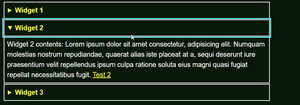
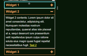
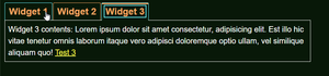
The no JS solution, using <details> & <summary>
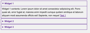
The smaller viewport solution: accordions
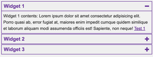
The larger viewport, showing the tabs
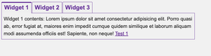
Windows High Contrast Mode
No JS <details> and <summary> solution
Accordions solution
Tabs solution
HTML full code
<div class="widget__wrapper">
  <details open>
    <summary>Widget 1</summary>
    <div>
      <p>
        Widget 1 contents: Lorem ipsum dolor sit amet consectetur adipisicing
        elit. Porro quasi ab, error fugiat at, maiores enim impedit cumque
        quidem similique et laborum aliquam modi assumenda officiis est!
        Sapiente, non neque! <a href="">Test 1</a>
      </p>
    </div>
  </details>
  <details>
    <summary>Widget 2</summary>
    <div>
      <p>
        Widget 2 contents: Lorem ipsum dolor sit amet consectetur, adipisicing
        elit. Numquam molestias nostrum repudiandae, quaerat alias iste placeat
        at a, sequi deserunt iure praesentium velit repellendus ipsum culpa
        ratione soluta eius magni quasi fugiat repellat necessitatibus fugit.
        <a href="">Test 2</a>
      </p>
    </div>
  </details>
  <details>
    <summary>Widget 3</summary>
    <div>
      <p>
        Widget 3 contents: Lorem ipsum dolor sit amet consectetur, adipisicing
        elit. Est illo hic vitae tenetur omnis laborum itaque vero adipisci
        doloremque optio ullam, vel similique aliquam quo! <a href="">Test 3</a>
      </p>
    </div>
  </details>
</div>
JavaScript full code
const widgetWrapper = document.querySelector('.widget__wrapper');
let baseHTML = '',
  open = 0;
const mq = window.matchMedia('(max-width: 767px)');
const navKeys = [
  'ArrowUp',
  'ArrowRight',
  'ArrowDown',
  'ArrowLeft',
  'Home',
  'End',
];

widgetWrapper.querySelectorAll('details').forEach((el, idx) => {
  baseHTML += `<h3 class="widget__heading">
    <button class="widget__btn" id="btn-${
      idx + 1
    }" data-btn-idx="${idx}" aria-controls="panel-${idx + 1}">${
    el.firstElementChild.textContent
  }</button></h3>
    <div class="widget__panel" id="panel-${
      idx + 1
    }" data-panel-idx="${idx}" aria-labelledby="btn-${idx + 1}">${
    el.lastElementChild.innerHTML
  }</div>`;
});
baseHTML = `<div class="widget__controls-wrapper">${baseHTML}</div>`;

widgetWrapper.innerHTML = '';
widgetWrapper.insertAdjacentHTML('afterbegin', baseHTML);
const widgetControlsWrapper = widgetWrapper.querySelector(
  '.widget__controls-wrapper'
);
const widgetBtns = Array.from(widgetWrapper.querySelectorAll('.widget__btn'));
const widgetPanels = Array.from(
  widgetWrapper.querySelectorAll('.widget__panel')
);

const createAccordions = () => {
  widgetControlsWrapper.removeAttribute('role');
  widgetBtns.forEach((btn, idx) => {
    idx === open
      ? btn.setAttribute('aria-expanded', 'true')
      : btn.setAttribute('aria-expanded', 'false');
    idx === open
      ? btn.parentElement.setAttribute('data-expanded', 'true')
      : btn.parentElement.setAttribute('data-expanded', 'false');
    btn.parentElement.removeAttribute('role');
    btn.removeAttribute('tabindex');
    btn.removeAttribute('role');
    btn.removeAttribute('aria-setsize');
    btn.removeAttribute('aria-posinset');
    btn.removeAttribute('aria-selected');
    btn.parentElement.after(
      widgetWrapper.querySelector(`[aria-labelledby="${btn.id}"]`)
    );
  });

  widgetPanels.forEach(panel => {
    panel.setAttribute('role', 'region');
    panel.removeAttribute('tabindex');
    panel.removeAttribute('hidden');
  });
};

const createTabs = () => {
  widgetControlsWrapper.setAttribute('role', 'tablist');
  widgetBtns.forEach((btn, idx) => {
    btn.parentElement.setAttribute('role', 'presentation');
    btn.setAttribute('role', 'tab');
    btn.setAttribute('aria-setsize', widgetBtns.length);
    btn.setAttribute('aria-posinset', idx + 1);
    idx === open
      ? btn.setAttribute('aria-selected', 'true')
      : btn.setAttribute('aria-selected', 'false');
    if (idx !== open) btn.setAttribute('tabindex', '-1');
    btn.removeAttribute('aria-expanded');
    btn.parentElement.removeAttribute('data-expanded');
  });

  widgetPanels.forEach((panel, idx) => {
    panel.setAttribute('role', 'tabpanel');
    idx === open
      ? panel.setAttribute('tabindex', '0')
      : panel.setAttribute('hidden', '');
  });
  widgetPanels.reverse().forEach(el => widgetControlsWrapper.after(el));
};

function handleClickOnBtns(evt) {
  if (evt.target.classList.contains('widget__btn')) {
    if (evt.target.getAttribute('aria-expanded') === 'false') {
      evt.target.setAttribute('aria-expanded', 'true');
      evt.target.parentElement.setAttribute('data-expanded', 'true');
    } else if (evt.target.getAttribute('aria-expanded') === 'true') {
      evt.target.setAttribute('aria-expanded', 'false');
      evt.target.parentElement.setAttribute('data-expanded', 'false');
    }
    if (evt.target.hasAttribute('role')) setActiveTab(evt.target);
  }
}

setActiveTab = activeTab => {
  widgetBtns.forEach(tab => {
    if (tab === activeTab) {
      tab.setAttribute('aria-selected', 'true');
      tab.removeAttribute('tabindex');
      widgetWrapper
        .querySelector(`[aria-labelledby="${tab.id}"]`)
        .setAttribute('tabindex', '0');
      widgetWrapper
        .querySelector(`[aria-labelledby="${tab.id}"]`)
        .removeAttribute('hidden');
    } else {
      tab.setAttribute('aria-selected', 'false');
      tab.setAttribute('tabindex', '-1');
      document
        .getElementById(tab.getAttribute('aria-controls'))
        .removeAttribute('tabindex');
      document
        .getElementById(tab.getAttribute('aria-controls'))
        .setAttribute('hidden', '');
    }
  });
};

function handleKeyboardInteraction(evt) {
  if (
    navKeys.includes(evt.key) &&
    evt.target.classList.contains('widget__btn')
  ) {
    evt.preventDefault();
    const currentIdx = Number(evt.target.getAttribute('data-btn-idx'));
    evt.target.hasAttribute('role')
      ? (next = 'ArrowRight')
      : (next = 'ArrowDown');
    evt.target.hasAttribute('role') ? (prev = 'ArrowLeft') : (prev = 'ArrowUp');

    if (evt.key === next && currentIdx < widgetBtns.length - 1) {
      evt.target.hasAttribute('role')
        ? setActiveTab(widgetBtns[currentIdx + 1])
        : widgetBtns[currentIdx + 1].focus();
      if (evt.target.hasAttribute('role')) widgetBtns[currentIdx + 1].focus();
    } else if (evt.key === prev && currentIdx > 0) {
      evt.target.hasAttribute('role')
        ? setActiveTab(widgetBtns[currentIdx - 1])
        : widgetBtns[currentIdx - 1].focus();
      if (evt.target.hasAttribute('role')) widgetBtns[currentIdx - 1].focus();
    }

    if (evt.key === 'Home' && evt.target.hasAttribute('role'))
      setActiveTab(widgetBtns[0]);
    if (evt.key === 'Home') widgetBtns[0].focus();
    if (evt.key === 'End' && evt.target.hasAttribute('role'))
      setActiveTab(widgetBtns[widgetBtns.length - 1]);
    if (evt.key === 'End') widgetBtns[widgetBtns.length - 1].focus();
  }
}

window.addEventListener('DOMContentLoaded', evt => {
  mq.matches ? createAccordions() : createTabs();
});

mq.addEventListener('change', evt => {
  let currentFocus = document.activeElement;

  if (currentFocus.closest('.widget__wrapper')) {
    if (currentFocus.classList.contains('widget__btn')) {
      open = Number(currentFocus.getAttribute('data-btn-idx'));
    } else if (currentFocus.classList.contains('widget__panel')) {
      open = Number(currentFocus.getAttribute('data-panel-idx'));
      currentFocus = widgetWrapper.querySelector(`[data-btn-idx="${open}"]`);
    } else if (currentFocus.closest('.widget__panel')) {
      open = Number(
        currentFocus.closest('.widget__panel').getAttribute('data-panel-idx')
      );
    }
  }
  mq.matches ? createAccordions() : createTabs();
  currentFocus.focus();
});

widgetWrapper.addEventListener('click', handleClickOnBtns);
widgetWrapper.addEventListener('keydown', handleKeyboardInteraction);
CSS full code (Basic styling)
:root {
  --colour-interactive: rebeccapurple;
  --colour-bg: #f1f1f1;
}

*,
*::before,
*::after {
  box-sizing: border-box;
  margin: 0;
}

body {
  padding: 0.5rem;
  max-width: 50rem;
  font-size: 1.25rem;
  line-height: 1.5;
  font-family: Arial, Helvetica, sans-serif;
  color: #202020;
  background-color: var(--colour-bg);
}

details {
  margin-bottom: 2px;
  border: 2px solid var(--colour-interactive);
}

details div {
  border-top: 2px solid var(--colour-interactive);
  padding: 8px;
}

summary {
  padding: 8px 10px;
  color: var(--colour-interactive);
  font-weight: bold;
}

summary:focus-visible {
  color: var(--colour-bg);
  background-color: var(--colour-interactive);
  outline: 2px solid transparent;
}

.widget__btn {
  position: relative;
  padding: 8px 10px;
  font-size: 1.5rem;
  font-weight: bold;
  color: var(--colour-interactive);
  background-color: var(--colour-bg);
  cursor: pointer;
}

.widget__btn[aria-expanded] {
  display: flex;
  align-items: center;
  margin-bottom: 2px;
  border: 2px solid var(--colour-interactive);
  width: 100%;
  text-align: left;
}

.widget__btn[aria-expanded]::before,
.widget__btn[aria-expanded]::after {
  content: '';
  position: absolute;
  background-color: var(--colour-interactive);
}

.widget__btn[aria-expanded]::before {
  right: 20px;
  height: 20px;
  width: 6px;
  transition: transform ease-in 200ms;
}

.widget__btn[aria-expanded]::after {
  right: 13px;
  height: 6px;
  width: 20px;
}

.widget__btn[aria-expanded='true']::before {
  transform: scaleY(0);
}

.widget__btn[aria-expanded]:focus-visible {
  color: var(--colour-bg);
  background-color: var(--colour-interactive);
  outline: 2px solid transparent;
}

.widget__btn[aria-expanded]:focus-visible::before,
.widget__btn[aria-expanded]:focus-visible::after {
  background-color: var(--colour-bg);
}

.widget__panel[role='region'] {
  position: relative;
  top: -2px;
  border: 2px solid var(--colour-interactive);
  border-top: none;
  padding: 8px;
}

[role='tablist'] {
  display: flex;
  gap: 2px;
}

[role='tab'] {
  border: 1px solid var(--colour-interactive);
  border-bottom: none;
  border-radius: 3px 3px 0 0;
}

[role='tab'][aria-selected='true']::before,
[role='tab'][aria-selected='true']::after {
  content: '';
  position: absolute;
  left: 0;
  width: 100%;
}

[role='tab'][aria-selected='true']::before {
  top: 0;
  height: 0;
  border-top: 3px solid var(--colour-interactive);
}

[role='tab'][aria-selected='true']::after {
  bottom: -1px;
  width: 100%;
  height: 3px;
  background-color: var(--colour-bg);
}

[role='tabpanel'] {
  padding: 8px;
  border: 1px solid var(--colour-interactive);
}

[role='tab']:focus-visible {
  outline: 2px solid var(--colour-interactive);
  outline-offset: -8px;
}

[role='tabpanel']:focus-visible {
  position: relative;
  outline: 2px solid var(--colour-interactive);
  z-index: 1;
}

[hidden],
[data-expanded='false'] + .widget__panel {
  display: none;
}

@media screen and (forced-colors: active) {
  .widget__btn[aria-expanded]::before,
  .widget__btn[aria-expanded]::after {
    background-color: ButtonText;
  }

  [role='tab'][aria-selected='true']::after {
    background-color: Window;
  }
}