
Once upon a time there was a really clever chap called Tim who created the web so we could all use it for the endless possibilities it brings. When Tim created the web, legend has it that he said "This is for everyone" and when he said everyone, he didn't mean just folks that use a mouse, he meant everyone - as in all people.
Back then, the web was quite basic, I believe it was just links and text, links were underlined and I'm guessing here, but there were focus indicators too. I can access the first web page, but I can't access the first browser, so I could be wrong, but that's not really important.
These focus indicators provided a solid visual cue to which element had keyboard focus, so users of keyboards and other non-pointing devices could make decisions on what to 'click' based upon what they could actually see, as opposed to pot luck or guesswork.
Some years later, some mutinous folks said "eww, the focus indicators look ugly" and many a willing developer across the web typed a little snippet similar to this: *:focus {outline: none !important} and just like that, the focus indicator became an endangered species, sigh.
Are they ugly?
Different strokes for different folks, I guess. Some folks will say they are, but you can be pretty sure none of those folks need them. It's basically a case of people who can use a mouse or touchscreen etc, deciding the people that can't use those devices don't really matter, which obviously doesn't say much about the folks that insist they are removed. We'll keep it clean and say no more.
I get aesthetics, some humans are creative and expressive and they want to create "stunning websites", which in itself is not a problem, but what they need to do, is create stunning "usable" websites, that can be used by everyone. Design a focus indicator that works with your design, one that is perceivable to users, if you don't do this, your design is broken.
There are a number of things in the real world that affect the aesthetic of an object or product that we just learned to accept, we don't even think of it anymore, here's a few examples:
- The numberplate on a car or motorcycle, the numberplate affects the aesthetics, right? But we all know they are required, so we just got used to them
- The raised camera on your phone, remember when smartphones were nice and flush on both sides, but we all wanted high resolution cameras, instead of potatoes? Yep, the camera part of the back of the phone needed to be deeper than the actual phone, we got used to that too
- The seatbelt, it creases your clothes and it can make reaching into your pockets more difficult (hopefully we only do this as a passenger), but as most of us don't fancy testing who would win in a fight between our face and the windscreen, we've learned to roll with it
Embrace focus indicators, they're a functional thing they serve an extremely important purpose and anyway, for the most part, only keyboard users will ever see them, but more on that later.
You may rely on focus indicators too
You may use them quite often, do you have a games console or a TV smart or otherwise? Chances are you have one of those things and you rely on focus indicators all of the time.
- On a games console, you may use the joysticks or directional pads to navigate through the settings or menus etc
- On a TV (or streaming device/set top box), you will likely be using the directional buttons on the remote control to pick which apps or show you want to watch or maybe just viewing the built-in TV guide
Imagine if Netflix, Apple, YouTube, Amazon, Sony etc just decided to not show you which item you had focused on and left you guessing, you'd be fuming, right? I would be, in those situations I need them, I rely upon them. Sure I could probably guess my way around by counting things and then pressing the keys the same number of times in the correct direction, but this would still be infuriating, right?
You want people to complete tasks on your "stunning website", you probably want them to come back, you want them to leave with positive experiences such as:
- The site was intuitive
- The interface was understandable
- I could easily find what I was looking for
- And maybe the site was really fresh looking
Why would we not want people who cannot use a mouse or a touchscreen to leave with those same positives? I mean, some folks that can't use a touchscreen or mouse will have a permanent disability and always need to use a keyboard, some may have a temporary disability and some may just have an Apple mouse that has just died and they can't use just now, as it is plugged in :D.
So, now we have the intro out of the way, which I probably waffled on for too long, let's get to the more technical stuff.
There are a couple of WCAG success criteria we need to be aware of which relates to focus indicators:
I've wrote them in that order for a reason, the first Focus Visible essentially means that when an interactive element receives keyboard focus, there is a visible change. It appears the definition of visible is way more flaky than it needs to be, in fact, I don't think it means visible to all humans at all (we don't all have the same visual acuity). Some folks who have been in this game way longer than me and are by extension way more experienced and knowledgable claim that the visual change would still technically pass, even if it were imperceptible to most humans, it could just be a single pixel, changing to off-white, over a white background. That obviously wasn't the intention when the requirement was written, but I guess there are people out there that will find loopholes in anything.
So, given that somebody found the loophole, in WCAG 2.1, Non-text Contrast was introduced and whilst this particular requirement is not just about focus indicators, it does include focus indicators and it requires that the contrast between the indicator and adjacent (touching) pixels is at least 3:1. This was obviously an improvement, as now the minimum requirement had a more perceivable contrast ratio to meet, but alas, it didn't set a minimum size, so technically a 1px indicator, with at least a 3:1 contrast ratio would still pass, which is obviously rubbish.
The folks working on WCAG 2.2 did try to put an end to all this confusion by creating a new requirement called 2.4.11 Focus Appearance - Level AA, which required a certain area the indicator must cover for an element. Sadly, this requirement was eventually bumped up to a AAA requirement, which means it likely won't be used that often. I believe it was moved to AAA as there was confusion with the wording and how evaluators interpreted it, still, it's a shame though as this would have been a welcome addition by users who don't use pointing devices.
So, the goal of digital accessibility is not to meet the required minimum, it's not a tax return where we don't want to pay a penny more than we have to, it's about actual people that use our sites and we should always favour something that is actually usable over something that "technically" passes.
In my job I often test websites that have no focus indicator at all and in all cases that took at least one human to decide that their preference to not display them was more important than the needs and rights of other humans that need them and of course, they were wrong. Sometimes, I test sites with fancy hover styles and those hover styles are often good enough to pass as a focus indicator, but they still decided to remove the focus indicator completely when they could have had it for focus too, make it make sense.
Browsers do add their own focus indicator for interactive elements, which is part of the User Agent Stylesheet. Technically, if you don't modify the focus indicator in any way at all, then this is enough to pass, but the moment you add just 1 line of CSS to the focus style of an element, you're on the hook to ensure it passes on all browsers and devices etc. Let's not get carried away though, just because it is enough to technically pass, doesn't necessarily mean it's the best.
I've made a basic CodePen, each has three links and each link is on a different coloured background. The link text passes against its background for all three links as it is higher than the 4.5:1 minimum for text of the size I used. I have not modified the focus styles in any way and the aim is to view the CodePen in each browser. For the purposes of this, I will just remain on the same device (MacOS) and I will use Safari, Chrome, Firefox and Edge, there are of course other browsers and operating systems that could also help us understand the problem further:
See the Pen Untitled by LDAWG-a11y (@LDAWG-a11y) on CodePen.
Just for transparency and as things always change:
- I'm using a Mac on MacOS 13.4
- Chrome version is: 114.0.5735.133
- Firefox version: 115.0b3
- Safari version: 16.5 (18615.2.9.11.4)
- Edge version: 114.0.1823.51
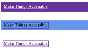
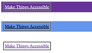
Firefox observations
- The focus indicator cannot be seen at all in the first (purple) container can it? That's because Firefox uses the colour rebeccapurple (#663399) for the focus indicator, I intentionally used that background, to demonstrate how this can be a problem.
- The second container which has a CSS background called cornflowerblue (#6495ED) does make it easier to see the focus indicator, but if we modified the focus style in any way; such as making the focus ring thicker, then we are immediately on the hook and the indicator could fail as the contrast between the focus ring and the container's background is only 2.82:1, which is pretty close to the required minimum, but there's no discretion here, it's pass or fail.
- The final container which uses the page's white background is absolutely fine, there's a strong contrast of 8.4:1 here.
Here is a screenshot to visually show the indicators:
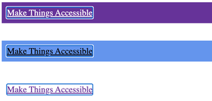
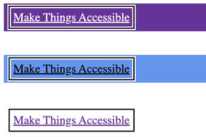
Chrome observations
Chrome uses a 2 colour ring, the colours of that ring are white (#FFF) and blue (#005FCC), this particular indicator has a greater chance of passing than the Firefox one, as if one colour fails, the other should be visible too. Would it pass if we modified our focus style in any way?
- We're good on our first link, as the white has an 8.4:1 contrast against the rebeccapurple background, so we don't need to worry about the blue part of the ring "passing".
- Here's where things get interesting: On the second link, with the cornflowerblue background, the blue ring fails against our background with a contrast of 2.01:1 and the white ring also fails with a contrast of 2.97:1, which is extremely close, but remember, no discretion here.
- On the third link, with the white background, we can't see the white ring at all, which is OK, as we can see the blue ring against our background and it has a 5.98:1 contrast, which is a good contrast.
A screenshot of all three links is below:
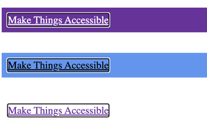
Edge observations
Much like Chrome, Edge uses a 2 colour ring, but the Edge team opted for black and white rings, which is the highest possible contrast 21:1. I think in most instances, it would be difficult to not be able to see one of the rings, but it's definitely not bulletproof. Does it pass in our little demo, if we don't modify it? yes and even if we do modify it, it will also pass using the existing 2 rings as long as the colours aren't changed:
- For the first link, the white ring comfortably passes against the rebeccapurple background.
- For the second link, the black ring comfortably passes against our cornflowerblue background.
- For the third link, we have maximum contrast between our white background and the black ring.
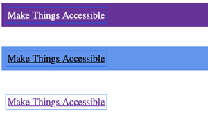
Safari observations
Safari uses a blue ring (#0067f4), the ring colour is quite light, so it's immediately clear we're going to run into low contrast issues against some of our backgrounds:
- On the first link with the rebeccapurple background the contrast is 1.69:1, which is very low and could easily be missed or difficult to see for some folks.
- On the second link with our cornflowerblue background, the contrast is 1.66:1, which is also very low.
- On the third link with the white background, the contrast is 4.94:1, which is is a good contrast ratio.
Here's the screenshot of the Safari focus indicators:
Summary of user agent focus indicators
The aim of the investigation above was to demonstrate that the default focus indicator isn't necessarily that great for users. This is because we may have sites that have different backgrounds in places, it may pass comfortably on one component and fall down on another. I didn't even create a test case here with dark mode enabled, which would likely introduce more interesting results.
I know that the default indicator does not fail if it is unmodified, but we just made the assumption we had a basic modification, just to demonstrate where the user agent indicators could fail. More importantly, if WCAG requires a minimum 3:1 contrast, a number they likely arrived at through user research, then the browser's own indicators often don't meet that on other than white backgrounds, so whilst "technically" compliant in their unmodified state, they may not always be that usable or even visible at all.
Given the importance of the focus indicator and how some folks rely on it to use our sites, I'm of the opinion that we should author our own highly-perceivable indicators. Browsers are smart, but they don't appear to use those smarts to intelligently create perceptible focus indicators, maybe its expensive from a performance viewpoint or maybe it's too complex to achieve? Engineering for browsers is way beyond my skillset, so I don't know the answer to that.
This is sadly a thing, you may work on a team where a colleague with more clout than you hates "ugly focus indicators" and it can be difficult to get any traction if they're likely to die on that hill.
First things first, try to educate them, explain how actual people need these, users of that site will need them and when they discover they don't exist, they may just go elsewhere. Quite often education is amongst the best weapons at our disposal, if we can educate somebody on how people rely on certain things, they often begin to understand the problem and end up onboard.
The second thing I'd try is compromise, we have the :focus-visible pseudo class now, which on most elements will only ever be seen by somebody using a keyboard. I believe the hatred for the :focus selector stemmed from the fact it momentarily displayed on a mouse click or a tap, so ultimately :focus-visible was created to provide that compromise and it is supported in all evergreen browsers. It would need a fallback for older browsers, but maybe your team don't care so much for older browsers, so you're free to just do that?
Let's look into a few different types of focus indicators for a few different UI elements, obviously this cannot be an exhaustive guide, as there are a seemingly endless number of UI elements and multiple ways of creating focus indicators
Applying what we learned from our investigation
In our investigation, we discovered that the 2 ring indicators typically fared better than the single ring indicators against a variety of backgrounds, but it could still fail in Chrome as blue and white was not so great against some shades of a blue background.
We also discovered that by having a very high contrast between the 2 rings, the likelihood of it falling down was further reduced, I'm inclined to think in most instances it would pass and you'd have to try to actually break it to actually break it.
An Oreo-type indicator
What if we could create an Oreo type indicator, by Oreo I mean 2 dark layers and 1 light layer sandwiched within (note, there are also lighter colour Oreos with a dark filling available)? We're not going for aesthetics right now, we're just brute-forcing something that may be as close to unbreakable as we can get, but obviously as it's not that pretty, it may be a hard sell.
We could probably achieve this with a couple of pseudo elements and an outline or some gradient magic, but for simplicity, I'm going to use a different approach.
If we get a little clever with a box-shadow and an outline, we can achieve the same effect, I'm not going to saturate the page with lots of CodePen embeds, so I'll just revert to code blocks and screenshots, which of course will be adequately explained: Just to note, I'm now just going to use 1 browser, as we are creating a custom ring using our own CSS (I'm using Chrome).
a {
  padding: .25rem;
}

a:focus {
  outline: 2px solid transparent;
}

a:focus-visible {
  outline: 2px solid black;
  outline-offset: 1px;
  box-shadow: 0 0 0 4px white
}
So, in the above code snippet I firstly added a small amount of padding to links, this is because my indicator was a bit too tight against the text of the link, on a production site I'd have some padding on links, along with a good line-height to help folks be able to read along and also to increase the "hit area" of the link, so it would require less precision to tap or click.
I set the outline to 2px thickness, a solid type and a colour of transparent, which may seem a little odd, but some browsers apply their own styling to :focus and some to :focus visible, so I'm kind of resetting the :focus state here, so it cannot be seen. I have used transparent as the colour for compatibility with Windows High Contrast Mode, I touch upon this towards the end of this guide. I'm also not really considering specificity too much, in reality, we'd likely need to increase our specificity to actually show one after somebody removed it, but that's beyond the scope of this guide.
So, let's discuss the actual styles, line-by-line:
We're setting our
outlineto2pxthickness, asolidring (as opposed to dotted etc) and the colour toblack, against all but dark backgrounds, this would have comfortably passed the new criterion that was initially proposed for WCAG 2.2: Focus Appearance Level AA (assuming the ring had at least a 3:1 contrast ratio).We're setting the
outline-offsetto1px, which in essence, just moves the whole indicator away from our element on all 4 sides by a single pixel, it increases the outline's size to allow for this additional 1px space on each side.Then we are using a
box-shadow,but not to create elevation, to create an additional ring, using the following techniques:- We set the first value (X offset) to
0, this positions the shadow centrally on the horizontal axis, with no offset in the left or right directions - We set the second value (Y offset) also to
0, this positions our shadow centrally on the vertical access - We set the third value (the blur) to
0, which prevents our shadow from having a fade-effect and forces it to be a solid colour - We set our fourth value (the spread) to
4px, which in essence is the thickness of our ring - Finally, we set the fifth value (the colour) to
white
- We set the first value (X offset) to
The combination of all of the above CSS for the
box-shadowproperty results in something that is similar to an additional border, it is perfectly centred both horizontally and vertically, it is a solid 4px thickness, white border.
When the box-shadow is combined with the outline and the outline-offset we get quite an interesting effect:
As the outline sits above our box-shadow and is pushed out on all 4 sides by a single pixel, visually we have a 3 ring effect, starting from the inner ring:
- We have a 1px thick white ring that surrounds the element
- We then have a 2px thick solid black ring
- Finally, we have another 1px solid white ring, on the outside of the element
Here's a screenshot against the 3 backgrounds we used earlier:
This effect does appear to ensure that our black ring always has a high contrast, as there is always what visually appears to be white rings both inside and outside of the black ring. This is a good start, as across all 3 links, even on the third link, where there is a white background, we still end up with a 2px solid black ring, which for many folks will be really helpful.
If you have a dark mode on your site, you could simply switch the the order of the dark and light rings, which may be more effective, you could even leave them as is. We don't actually need to use black here, as we know it will only ever touch white, so we could use a nicer colour. Remember, the minimum contrast of that colour must be 3:1, but I recommend aiming for something higher, perhaps 4:1 would be more comfortable for users to perceive, maybe more?
Is this good enough?
I think it is good, but it's unlikely that it is perfect for everybody, for instance, maybe the effect of the two 1px thick white rings is not enough for all users to be able to easily perceive the indicator. We could certainly make those thicker with relative ease:
/* Reset default :focus */

a:focus-visible {
  outline: 2px solid black;
  outline-offset: 2px;
  box-shadow: 0px 0px 0px 6px white;
}
We just need to change two values to adjust the thickness of the white rings:
- We adjust the
outline-offsetto2px, which is pushing it out on all four sides by another additional pixel. We do this as we want to ensure the inner ring is 2px thick, so we need to force our black ring to budge out another pixel. - We need to change the fourth value of the
box-shadowto6px, because the sum of two 2px white rings and a 2px black ring is 6px.
This more visible effect can be viewed in the following screenshot:
That looks much more perceivable, especially on the first link with the purple background, as the additional thickness of the white rings should make it easier to see the middle black ring. I'm not best placed to say whether that will be visible by all users, the only people who can do that are actual users that have actual vision disabilities. But nonetheless, if you manage to get some budget at your company for paid user-testing (always pay disabled users that test your products), then those folks could provide you with much better information than I can.
A colour inverted indicator
It can be useful to invert the colours of the control that receives focus, as in that instance, every single pixel will change colour and that contrast change will always be compliant (assuming the text had the correct contrast against its background in the first instance). In fact, that very effect is in use on this site, if you focus or hover over any text link, the background colour and the text colour invert, so what was previously purple link text on a light background, becomes light link text on a purple background.
In the light theme to this site we tend to use 2 different background colours, we use a shade of white (#FDFDFD) and a light yellowish colour (#FFFAF0), when I initially chose these colours, I did so knowing that we would typically have a specific colour for interactive elements, links and buttons etc and that colour is purple (#923AE4). It was my responsibility to ensure that the link text has sufficient contrast against all possible backgrounds and the purple colour I settled on has a 5.22:1 contrast against the white background and a 5.11:1 contrast against the light-yellowish background.
I knew because of the colours I'd chosen that the 2 backgrounds would always have a good contrast ratio for links and buttons etc, but also inverting the colours would be a strong indication of the element being focused, an example of that in CSS could be:
a {
  color: #923AE4;
  background-color: #FDFDFD;
}

a:focus,
a:focus-visible {
  outline: 3px solid transparent;
}

a:focus-visible {
  color: #FDFDFD;
  background-color: #923AE4;
}
In this instance, we are hiding the ring for both :focus and :focus-visible, as we are relying solely on colour inversion. Just because we use that here does not necessarily mean it is a perfect approach, but it is a strong indicator, as can be seen in the following screenshot:
The screenshot above shows this is a very strong indicator of which item is focused, but much of that perceptibility is due to the fact there are 4 links in a row and one of them looks significantly different. This is perhaps less true for a lone link in the middle of a paragraph, as without other close-by links, there would be no way of comparing a focused and unfocused link at the same time, so perhaps it could be improved further?
I opted for a slightly different approach for buttons and my reasoning for that was it's quite common to see buttons have bold coloured backgrounds, so it may be less clear it is the currently focused item, so I opted for both colour inversion and a focus ring, which is perhaps the best of both worlds?
But what about other UI elements?
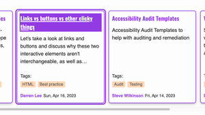
Card elements
Indeed, webpages contain more than just text links and buttons, I recently changed the Guide posts to cards and cards are typically large, errm card shaped interactive UI elements. These are a little different, but hopefully not so different they cannot be easily understood:
- The link text in the cards isn't underlined by default, our link text uses a distinct colour, for those that can perceive colour and for those that cannot our link text uses a bold font, in addition, as it is contained in a card shaped component, it's position and the shape of its parent element are also indicators this is an interactive thing. Cards are quite common, so most users would have encountered them somewhere.
- On hover, we underline the link text.
- On focus, the link text is underlined, the link text then uses the colour inversion technique and the whole card has a prominent additional border (when focusing on the card's primary link).
The combination of the 3 visual changes is a strong indicator of which card has keyboard focus, although I am not saying it is perfect, because a keyboard user with low-vision would be the best judge of that.
To save you navigating away, here's a screenshot of a focused card next to an unfocused card:
Accordion elements
We treat our accordions as buttons, as that's what they are, just big buttons, so we apply both colour inversion and a focus ring.
Input elements
We don't use inputs at present on this site, so it'll perhaps be best if I create one in a CodePen to demonstrate this. At this point, it's worth pointing out that inputs are where you may likely face trouble when trying to convince other team members that :focus-visible is the solution to all of their anti-focus indicator beliefs, as irrespective of how a user "focuses" on an input, most browsers will display the focus indicator for both mouse and keyboard, so this is likely to be the sticking point.
The best focus indicator for an input will always be one that surrounds the whole input and has good contrast, but sometimes this is sadly a hard sell.
Inputs don't consistently allow a pseudo elements (I think one browser does or did?), so if we want to get creative we need to add a wrapping element, which is a little annoying, but it's certainly not an extinction event.
The effect we are going to go for here is on a standard input and when it receives focus by any method, a thick underlines animates from the left to the right, which I think looks nice and may appeal to those folks that break out in sweats when you mention focus indicators, it's got to be worth a go, right?
So, as a compromise, maybe suggesting something like the following could work?
See the Pen Untitled by LDAWG-a11y (@LDAWG-a11y) on CodePen.
I'm not going to go over the whole CSS for this, as this guide has become longer than I intended, but what we are doing here is:
- Wrapping the input inside a
<div>and creating a::beforeelement for that<div> - We're setting this pseudo element to be a
6pxpurple border, positioned on the lower left corner of the<div>we created - We're then transforming this in the horizontal axis to have a
transform: scaleX(0), which essentially means we are squishing it down into nothing, on its horizontal axis - We then use the
:focus-withinselector on the parent<div>and target the::beforeelement and give it back its full horizontal scale withtransform: scaleX(1)
We have used a transition on this, so the effect can be seen animating, which may be useful for many. I don't believe this animated effect is enough to trigger any physical reactions in users who can be affected by animations and motion, but I cannot be 100% sure and it is always best to be overly cautious where this is concerned, so I would use the prefers-reduced-motion media query and just display an outline instead, as QAs and designers don't check that on "accessibility doesn't matter" projects, do they?
Also, before we move on, :focus-within does have great support, but older browsers may not support it and given that not everybody has the latest and greatest, don't forget to put a fallback in there, to display an outline where the :focus-within selector isn't supported.
We didn't discuss Windows High Contrast Mode (WHCM) in any depth. This is the reason that when "resetting" our focus indicators, I did this by setting the colour of the outline to transparent. WHCM ignores transparency, so it will always still display correctly if we use a property that is not supported by default in WHCM. As an example our Oreo focus indicator won't display the innermost and outermost rings, as the shadow property is typically ignored, this is unlikely to be an issue though, as WHCM also ignores the background colours we set, so if a user is viewing in WHCM and our site has multiple different backgrounds, they should only ever see one background colour, which will relate to the theme they use in WHCM and our focus indicator will also be set by that theme, so should be highly perceivable. Of course, we should always test with WHCM as it's best to not make assumptions and validate these things ourselves.
We only covered a small number of UI elements above, as there are of course far too many to go over in a single article. The aim of this article was not necessarily to state you should use one type of indicator over another, more to discuss a selection of different types of indicators and learn about some of the pros and cons of each.
Ultimately there are folks that do not use a mouse, trackpad or touchscreen and they need to see where their focus is at all times, it's as important to them as the cursor is to mouse users, so we should never take it away from them. Some of those users may also have low-vision, in which case they may only be able to use our sites if there is a highly-perceivable focus indicator, so we need to ensure that when an item receives focus, it is clear it is the currently focused item. On a side note, don't obscure the text label or icon of the element that has focus with your indicator, as it's probably super useful to actually see what has focus :).
Keep having these conversations with your team, keep testing with a keyboard and keep fighting the good fight.