
I am now writing a new guide in September 2026, following on from the original guide I wrote in September 2023. There have been some changes to the widget and the accessibility is better, but is it good enough? As a disclaimer, I have no idea if the folks responsible saw my previous guide, I do know they have not acted upon it, though
The DiscoverUni widget is an Office for Students (OfS) mandated component Higher Education Institutes in the UK must display on course pages.
Essentially the DiscoverUni widget is an embed, it may appear on course specific pages and within the embed it provides information such as:
- The percentage of students that passed the course
- The percentage of students that thought were happy with the course delivery
- The percentage of students that were in related employment within a certain amount of time after completing the course
The first thing to take note of is the domain for DiscoverUni, which is a .gov.uk domain, so as this domain is reserved for government and is part of the Office for Students, then it really is on them to make it accessible centrally rather than the responsibility lying with individual universities. Also, as the content is in an iFrame, it can be super difficult to fix the accessibility issues with DOM manipulation, as it exists on another site, but then why would a couple of hundred institutions be required to patch it up with JS, when it could simply be fixed at source and fixed once?
So what was the widget like?
Well, to give you an example, here is a screenshot of the widget in question, taken from our own site:

This iFrame is not static, on the page I am viewing, there is a transition occurring where the contents fade out and a new statistic is displayed, there are 3 separate statistics, each presented in their own slide and the animation is infinite.
What were the WCAG failures?
Whilst there were some positives, unfortunately there were some issues which should not be present, especially as it was created by/for a public sector organisation.
2.2.2 Pause, Stop, Hide (A)
The most obvious issue is the slide transition effect, the content changes between 3 different slides at an interval of approximately 3 or 4 seconds. This animation is infinite, in that it just loops continuously. There is no mechanism to pause, stop or hide this transition. This can be distracting for users, particularly some users that may have difficulty with focusing or those that can become easily distracted.
2.4.7 Focus Visible (AA)
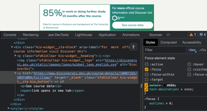
Tabbing to the link within the iFrame I can see there is no visible focus indicator present, so a user would not know where focus is. Inspecting the styles for the element I can identify the issue here when I add the :focus state in the Devtools, it has :focus {outline: 0;} set and no other form of visible focus indicator, in essence, they have removed the browser's default focus indicator, which would have been better than nothing.
1.3.1 Info and Relationships (A)
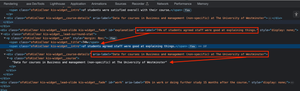
Within the source code I can identify several instances of aria-label being present on a <div> elements, which have no implicit or explicit role. Simply put, aria-label is not allowed on a <div>, <span> or several other generic elements, unless they have a role explicitly added. This is a misunderstanding of ARIA, the <div> elements here are simply wrapping elements, used for layout, they have "contents" contained in another node, the contents would be read anyway without adding aria-labels unnecessarily to unsupported nodes. I would have previously filed this under 4.1.1 Parsing (A), but as that is no longer a failure and this is not an interactive element so it cannot be 4.1.2 Name, Role, Value (A), 1.3.1 is the new Parsing for static content. The issue here is some screen readers will read the aria-label and then read the content, thus creating unnecessary verbosity.
Advisory
The current widget has visually hidden text that informs a screen reader user that the CTA link opens in a new tab, surely this information is useful to everybody? A voice user may see this if they instruct their software to "Show labels", but typically, only a screen reader user will benefit from this and accessibility is not just for screen reader users, it's for all people with disabilities. Even non-disabled people would benefit from knowing a link opens in a new tab.
Generally speaking, we should leave that choice up to users, there's multiple ways a user can open a link in a new tab:
- Cmd or Ctrl along with click or Enter
- Middle mouse button
- Right click and "Open in new Tab"
If we use target="_blank", we remove that choice for everybody, so everybody has to open in a new tab and they may not want to or it can become disorienting.
1.3.2 Meaningful Sequence (A)
The issue here is caused by the transition when a user of a screen reader is navigating with cursor keys, they can get into the iFrame to read the text within, the screen reader starts to read the text and then the slide they were on has display: none; applied, which can then alter the meaning and order of the information, in unexpected ways.
Using VoiceOver and Safari on MacOS (latest versions at the time of writing), when I use the VO key and cursors to get into the iFrame, it does start to read the statistic, however, as soon as the transition occurs, the virtual cursor position is then ejected from the iFrame and placed on the text node immediately above it.
This effects the sequence of reading, in that it would be difficult to hear the statistics in a sequence that made sense, as every time a transition occurred, the information they hear is interrupted by them being ejected out of the iFrame.
Using NVDA (2023.2) and Firefox (latest version, at the time of writing) on Windows 10 Education (20H2), I am not ejected from the iFrame when the transition occurs, however, what does happen is the screen reader starts to read the statistic (the percentage), then the transition occurs and then the slide changes, so it reads the text of the next statistic, as that is what is now present in the DOM. So to simplify what is happening, the process is as follows:
- Cursor into iFrame
- NVDA reads the percentage of the first statistic, the currently visible statistic
- The slide transition occurs
- NVDA reads the text of the 2nd slide (the new slide that is now visible)
This results in inaccurate information being presented to the user as they are hearing a combination of 2 statistics which could be misleading and therefore, alters the meaning of the text.
As the stats are both mandatory and help users in making informed decisions, it's absolutely vital that they are communicated to screen reader users in a comparable way and the current implementation is likely both incredibly confusing and frustrating for screen reader users as the sequence or meaning is different than what is supplied visually.
This would not be remedied by a pause button, as the sequence or meaning would still be incorrect. Consider a screen reader user entering the frame, they discover the first item, which I previously recommended to be a pause button. They pause the slides and then proceed to listen to the text, where they will hear a full statistic, but then what about the next statistic? the user would need to move back to the pause button and click it again to play the transition, they'd move into the slide to read the statistic, only the transition occurs and they are either ejected or hear a mismatch of 2 slides.
In this implementation, there is no announcement that anything has changed, I'd be averse to recommend that on the basis that it would get pretty noisy, pretty quickly.
There are no controls for a user to manually move to the next or previous slide, like those that would be present in a carousel, so that is not an option for our users, also, it would be overkill to create a full-blown carousel for what is in affect just a few small sentences.
It's fair to say that the widget has improved a little, there are now less issues, however, it is evident that there wasn't an accessibility specialist involved in the redesign as there are some issues that would absolutely be flagged or they should have been.
Widget variations
There are some variations of the widget, although they appear very limited when viewing the configuration docs. An organisation can choose either "responsive" or "vertical", vertical will always display a carousel, whereas "responsive" may do away with the carousel, although I have nor yet found a site that displays the widget without the carousel.
When the widget is configured in "responsive" layout, if the viewport and the host site allow the widget to display at 1280px and above, then the carousel is no more and each stat appears as a small card, all in a nice row, however, 1280px is something that is seldom displayed.
I have located the widget on several university sites and despite having an ultrawide monitor, I have yet to see the widget display all three stats at once. The reason for this is seldom do sites occupy the full horizontal width, they are often contained in custom site wrappers, which is a technique designers and devs will use to have more control over the layout. Whilst I am sure there are sites out in the wild where the site wrapper does exceed 1280px, the only one I found that did used the "vertical" widget, so it would never display all three stats at once, as that particular layout isn't designed to. Obviously the majority of users are viewing webpages on mobiles and tablets these days, so again, it's less likely a user will get the non-carousel option.Finally, as many of us know, many low vision users will set their page zoom higher than 100%, which of course will prevent the widget displaying the nice little row, even when the site's wrapper exceeds 1280px. So, in essence, the "responsive" layout will only ever display the nice row, in the rareset of circumstances. The Office for Students have zero control over each institution's site wrapper, users' devices or indeed their disabilities, but, it's not difficult to find that information out, better reasearch could have shown the problem.
If I take the <embed>'s source code and pop it in a code editor and look at the result, we get the following:

The above is much more accessible, as it completely does away with the carousel, but obviously it wouldn't display in a row on a smaller viewport.
It's also important to point out that when an item displays in its entirety on a larger screen, but then uses some form of disclosure pattern or even a carousel for smaller viewports, then they would need a way of changing the pattern to have supporting names, roles and properties when it does start hiding stuff, have they done any of that? Nope.
I do not like being critical, so publicly, however, it's vital to understand that that the majority of higher ed institutions have their own accessibility teams, they are all striving to make the numerous websites their respective institutions have - accessible. Many uni websites are in fact, pretty accessble, as far as I know, so, it stings a little that a government department, that must also legally have accessible and conformant sites, etc, build a widget that institutions are required to display, yet it's not accessible or conformant. I'm not for one moment implying that the DiscoverUni site is also non-compliant with WCAG, despite having an accessibility statement saying they are...
Anyway, let's take a look at what the widget issues are.
1.4.11 Non-text Contrast (AA) or advisory?
- The first thing I noticed was the choice of yellow for the donut chart. Now technically this does not fail, as the value is in the centre of the donut and presented in text, so the yellow meter bit isn't required for understanding the data. However, it's still a poor choice of colour for a chart, if you're going to display data or stats in a chart, then making it perceivable to more folk is obviously the right thing to do. The purpose of the chart element is for at-a-glance information, almost a circle = great, around three quarters = good, less than half a circle = probably not the best, etc.
- It doesn't fail WCAG, but it's yellow (#FCD833) against the white (#FFF) background, which has a very poor contrast ratio of 1.4:1
- The filled part of the donut is yellow (#FCD833) whilst the unfilled section is wispy grey (#EDEDED), which has a lower contrast ratio of 1.2:1
- The wispy grey (#EDEDED) communicates something, right? It's there to tell sighted folk (or at least those with good enough vision to perceive low contrast) that this unfilled part of the donut is where the filled part could have gone, I'm not saying that background is absolutely necessary, but by adding it, they're reinforcing visual information, so I absolutely would write up the track if the number wasn't present. wispy grey against the white background, which is the lowest contrast of our three tests at 1.17:1
Like I said, it doesn't fail, but that doesn't mean a great deal, it just means that whoever designed it didn't do so with all people in mind, as the combinations of colours are flaky, at best and as always, folks, WCAG is the bare minimum, not the gold standard.
Solution
It doesn't really need a solution and I'm not going to change it on my accessible example, as the text is easy to read. It's more of a niggle than anything and could have been designed to be more inclusive.
Looking at the DiscoverUni website, they appear to have two primary brand colours the previous yellow colour and a dark blue (#012554), they also use other shades of blue throughout the site.
The simplest solution would be to change the color of the filled section to the a darker colour, not every use of colour has to be brand colours, add a border to the unfilled section, then keep the wispy grey or use the yellow in the unfilled section. The colours could be flipped, of course, but personally, I think the darker more prominent colour should be used for the filled section and the lighter colour for the unfilled, otherwise, it looks like it is in reverse. As long as the border has adequate contrast against the background, then the two colours just need to have an adequate contrast gainst ech other, as the border itself would likely be "subsumed" by the darker colour of the filled in section.
We could of course faff around with both the yellow and grey, to get them to have an adequate contrast against each other, but, I'm not doing that, as firstly, we'd have a designer say "That yellow isn't on brand" and secondly, yellow is always going to be a struggle on light backgrounds and by the time you get something "compliant", it's no longer yellow.
1.4.11 Non-text Contrast (AA)
The pips for the slides have active and inactive colours, these communicate visual information. The widget I am looking at now has three slides, I can look at the pips as someone with relatively decent vision and determine that I am viewing slide 2 of three. This is a fail as a wispy grey colour (#D5D5DC) has been used for the inactive pips against the white (#FFF) background, and there is a contrast ratio of just 1.46:1. Again, at a minimum this must be 3:1
Solution
A darker border with a minimum contrast of 3:1 against both the white background and the wispy grey pip colour will be sufficient. This will create to visually distinctive shapes, a circle for the current slide and rings for the inactive slides.
1.1.1 Non-text Content (A)
The pips for the slides communicate visual information, that information is not available in text or as a text alternative, such as ARIA.
Solution
I would not necessarily expect the pips themselves to have a role and accessible name, as they are not interactive, but they are there, they do communicate something, so the slide number of number of slides should be available somewhere within the slides. We'll pick this up at the end, as most of the issues can be resolved by using an "acceptable" carousel pattern.
1.3.1 Info and Relationships (A)
There are a number of issues that fail this checkpoint, I'll list them, first:
- The pips are not programmatically associated to the main slider or there is no alternative that communicates the same information
- The main slider does not programmatically group the slides
- The Previous and Next buttons are not programmatically related to the slides
Solution
We'll pick this up at the end, as most of the issues can be resolved by using an "acceptable" carousel pattern.
1.3.2 Meaningful Sequence (A)
The visual reading order does not match the programmatic reading order. Looking at the main body of the slide, it is visually evident it is a "self-contained" widget, it has a chart, a heading, some text, some pips, some controls and its background is white against a significantly darker background outer container.
The expectation is that once I am in the "carousel" widget, the sequence of reading (using a screen reader) somewhat matches what is visually presented, it can of course be different, as long as it does not affect the meaning.
Navigating with a screen reader, using the virtual cursor the reading order is, as follows:
- Heading level 1 "Official student data from DiscoverUni"
- 82%
- Heading level 2 In work or doing further study 15 months after the course
- The Data displayed is...
- Discover Uni is an official source of information...
- DiscoverUni logo, image
- Link, see all course data, see all course data opens in a new window
- Previous question, button
- Next question, button
This is off, the actual carousel part are the stats, and the controls, the surrounding elements are static and do not change when a user advances a carousel, so, by extension, the controls should be inside the carousel and a user should not have to go through static content in search of those controls. I can imagine a universe where a blind screen user thinks that the static content will change, too, because the controls come after it. That is exacerbated by the fact that there is no accessibility information in the entire carousel, so it's likely super confusing.
This issue is not present when opting for the "vertical" widget in the configuration setup.
Reading the HTML I can see what is causing this issue. There is some duplication of HTML elements, namely the course name and then the logo with the following text and CTA. These appear in different positions, depending on whether the carousel or cards are displaying, but they do not only change positions visually, they are in completely different places in the DOM, so when the carousel is displayed the surrounding elements appear before the controls and affect the reading order.
There is no need to do this at all, there was no need to duplicate the elements, there's more than enough layout algorithms in CSS to easily shuffle stuff about.
Solution
We'll pick this up at the end, as most of the issues can be resolved by using an "acceptable" carousel pattern.
4.1.3 Status Messages (AA)
If a screen reader user were to change the slide, how would they know anything has happened? There is no announcement, just silence.
Solution
We'll pick this up at the end, as most of the issues can be resolved by using an "acceptable" carousel pattern.
4.1.2 Name, Role, Value (A)
A carousel or slider needs to communicate what it is, its accessible name and the roles and states of its parts so a user knows what it is, what to expect and how to interact with it. None of this information is present.
Solution
We'll pick this up at the end, as most of the issues can be resolved by using an "acceptable" carousel pattern.
Advisory
The controls for the slides have the AccNames as "Next question" and "Previous question", they're not even questions, they're statements or answers. They were undoubtedly questions at one point, but they're explicitly telling us students' responses, so those questions have been answered.
Solution
Language matters, combined with all the other aspects of accessible information that is lacking from the carousel, it matters that bit more, here. Perhaps I'm being pedantic, but ultimately, they're bot questions, so something like "Next stat", or words to that effect will be much clearer.
Initially I was going to demo how to recreate this widget without using a carousel, mostly because in every example I found, there was only ever three slides, so it's pretty easy to redesign the widget to show all three stats at once, irrespective of the size of the embedded iFrame. Carousels aren't really a favoured UI choice, especially in the accessibility community, but most of those complaints probably relate to rubbish carousels, which are by far, sadly more common.
Maybe I'm going against the grain, a little, but I don't think carousels as a concept should be banished to the graveyard of terrible UI, forever, because sometimes, they make sense. I'm not saying every implementation is the correct call, many appear to be carousels when they don't need to be, just like the DiscoverUni widget, but I don't think an accessible carousel is always a bad thing. Sometimes carousels can heavily reduce page clutter, cognitive load and condense multiple images into a discrete stack that doesn't require interaction or excessive scrolling to pass. Marketers are real, they may take 14 images of a new phone and request they are put on the product page, to show the phone from various angles and show the various colours, etc. Then it's somebody's job to make all of those promotional images be present on the page in a way that doesn't overwhelm the user, so, we end up with carousels.
We just have to accept carousels aren't going anywhere and not wish them out of existence, but push devs to make them better. Honestly, I feel like a hypocrite every time I ask "Does this need to be a carousel?" and link to Should I use a carousel?, because when I'm browsing things on my phone, I actually quite appreciate having the option of viewing the images or not, I'm sure that other users, disabled or otherwise also share a similar view, at least sometimes. I do caveat this with I know there is at least one issue with carousels that makes them a bit more cumbersome for screen reader users and that typically relates to the first slide or image, but we'll look into that, later. I don't really do that, that often, as most carousels are quite image heavy, but if it is only ever going to be for a few things and those things are important, I'd be inclined to recommend not using it, in our advisory comments.
Ultimately, my role is to explain to devs how to make things accessible, but devs seldom have the clout to just act upon what I say, there's a tonne of other stakeholders behind the scenes that are just going to say "No, the carousel is staying", so I could spend forver asking them nicely to remove it or I could take the path of least resistance by showing them how to make what they already have significantly better. Afterall, a dev isn't going to have to jump through many hoops to add a little ARIA, change a few HTML tags or improve focus order, because these are things that designers and product owners seldom care about as they're mechanics, not cosmetics. If I can produce a report that demonstrates to a developer where accessibilit information needs to be improved and they can just go ahead and fix that, then I may only need to convince a designer to tweak a bit of contrast, here and there, so, I stand a greater chance of getting meaningful progress.
So, I changed my mind, I'm now going to show how to make this carousel "accessible", because I believe the OfS will be significantly more likely to take my recommendations on board than they would if I just went and totally redsigned it.
Updating the code
In the official version, we want to look for a <div> element that has the stat__container class and we'll modify it.
<div class="stat__container">Just a generic element with a class, not interesting at all for assistive technology, so it'll be ignored, not good. We want to add a new <section> element below this and we will call it .stat__wrapper.
<section class="stat__wrapper" aria-roledescription="carousel" aria-labelledby="widgetTitle courseTitle">- We use a
<section>element, as once we give that an AccName, we have a region - I add
aria-roledescriptionbecause there is no ARIA role for a carousel and this attribute allows us provide a custom role, of sorts - I add an
aria-labelledbyproperty which points to two ID Refs, the elements these ID Refs point to already existed, they were both of the<h1>elements, neither had an ID, so I had to add one to each element. Just a note, here, the<h1>that currently appears at the bottom of the slides is actually duplicated, one appears to the side, the other to the bottom, I'm not going to attempt to fix that, despite it being completely unnecessary, but I just wanted to point out that we should not add an ID to both instances, because IDs must be unique and we don't want to faff around changing the values ofaria-labelledby, on the fly, because, it feels unnecessary. It's OK that the currently hidden<h1>is hidden withdisplay: none;and therefore not exposed, asaria-labelledbyignores that, by design. So just add the ID to whichever you find first, it doesn't matter. For our ID Ref values I just pretended there was a proper heading hierarchy, "Official student data..." is absolutely correct to be a<h1>, so logic dictates that the course name should be a<h2>, the order of myaria-labelledbyvalues reflects this
On to the next, then we want to add some slides, with decent accessibility info, so let's grab the parent element of each slide and work our magic, the element we want is again, a <div> with no accessible goodness and this one has a class of stat-box, so lets see how that started:
<div class="stat-box active" id="stat_1" data-id="1">Yep, sigh, nothing to share with the accessibility tree, a whole bunch of nothing, just a generic node, an ID and a data attribute, so let's fix that:
<div class="stat-box small-hidden" id="stat_3" data-id="3" role="group" aria-roledescription="slide" aria-label="">- I add
role="group",group is often used as it groups elements in the slide together, on a product page, there could be a call to action, controls to change the colour of a product, maybe even a description and group makes sense, there. I'd agree in our case it makes a little less sense, as once we ignore the yellow donut, we're just left with a string of text, but, if everybody uses groups, then that's what we should do, because consistency across platforms helps users to understand widgets and learn what to expect from them - I then add
aria-roledescriptionhere, too, this time I add a value ofslide, which in its basic form, is exactly what it is - Finally, I add an empty
aria-label, not because I intend to leave an incomplete ARIA property there, but because I have to make an assumption. The widget isn't going to work without JS, on smaller viewports, because the buttons won't move the slides along. I had a little look at the config and there isn't any scope on a university's end to build an AccName string, so I just thought I'd do this with JS. In reality, this could be handled with the API call, but for us, we just have JS. I'll show the buildings of that string, later. Obviously we repeat the above for all three slides
Somewhere, I add an empty aria-live region, as we'll need that, to announce stuff. for what it's worth, I add mine before the closing tag (ofs_widget) of the entire widget:
<div class="widget__announcements" aria-live="polite"></div>Just a class name and the aforementioned ARIA with the assertion level set to polite, because we don't need to be interupting anybody. the class is there to both hide it visually and also to use as a hook for injecting messages into it. Standard stuff, really. We do want to visually hide this, though:
.widget__announcements {
  position: absolute;
  left: -9999px;
  top: auto;
  width: 1px;
  height: 1px;
  overflow: hidden;
}
This is similar to what we may use on a visually hidden class.
That's all we need to do to the HTML, for now, we'll look at the headings and side content, a little later. So, a few bits of additional JS to make this come alive, everything "functionally works" already, just not accessibly, so we don't need to do a great deal, here:
Firstly I create a global variable for the slides in a node list:
const statBoxes = document.querySelectorAll('.stat-box');In essence, I'm just putting all elements with a class name of stat-box in a collection to use, later
Secondly, I create a new function buildStrings which like Ronseal fence paint, does exactly what it says on the tin, although my function is useless as a fence paint, but it does build strings:
const buildStrings = () => {
  statBoxes.forEach((box, idx) => {
    const slideOf = `Slide ${idx + 1} of ${statBoxes.length}`;
    box.setAttribute('aria-label', slideOf);
    const percent = box.querySelector('.progress-value').textContent;
    const title = box.querySelector('.stat-box__title').textContent;
    const subtitle = box.querySelector('.stat-box__subtitle').textContent;
    box.dataset.string = `${percent}, ${title} ${subtitle}, ${slideOf}`;
  });
}
I'll go through the function, line by line:
- We create a loop to get each of the slides, our individual element reference is
boxand then we want the index iterator, which I access withidx. - My first string is
slideOfwhich gets the current slide number and the total count of slides and produces a string 'Slide [n] of [n]', where [the first instance of [n] is the current iteration and the second instance being the length of the node list - On each
boxwe set thearia-label(which was previously empty) to that value, so the first slide would be 'Slide 1 of 3', and so forth. We needed to give the group a name, in reality, this isn't going to be announced, because our screen reader users shouldn't ever need to leave the Next and Previous buttons - The next three lines are just me getting references to the bits of text we need, the percentage, the slide title and the slide subtitle
- Finally, I build the string using the order percent, title subtitle and then I reuse the
slideOfvariable, to add this to the end (I also add a couple of commas). the reason I add theslideOfstring to the end, is because it is the only way it's going to be reliably announced. For a screen reader user that cannot see the widget or the wispy grey pips, how else are they going to know which slide they are on? I did mention the pips had no programmatic alternative, earlier, is this enough? I believe so, the pips pattern is ubiquitous enough that folk understand them, if they can see them, so the only users that were denied this info were screen reader users (if we pretend they had decent contrast). We could have made a list and used hidden text, but we'd potentially be repeating the same thing three times for screen reader users navigating with the virtual cursor and I don't believe that adds any value, for non-interactive pips. I'm aware that my approach could be wrong, I cannot speak for screen reader users, I can only tell you to do your own testing with paid users - I add those strings to a data attribute on each element, we could just store them in memory, but I think it can be useful to see stuff working in the DOM, the
data-stringattribute is present on the.stat-boxelement, which is of course, the slide
I need to call that function, so I just call it in the window's load listener, which was already present in the JS:
window.addEventListener("load", () => {
  setDonuts();
  arrowClicked();
  // I just added the below functiom call
  buildStrings();
})
Nothing else to say, here. I just call the function once the page loads.
Now we need to do something useful with that string of text. In the original JS there is a function called moveSlideAlong, which is pretty self-explanatory, it advances the slide. It has two function parameters which are passed from another function, we only need to concern ourselves with the new_active parameter, as that is the slide element that appears on screen as a result of activating either of the buttons and as we added a data atribute with a string of text, we can just grab that string and inject it into our live region, like so:
function moveScreenAlong(active, new_active) {
  // makes next screen visible
  active.classList.add("small-hidden")
  active.classList.remove("active")
  new_active.classList.remove("small-hidden")
  new_active.classList.add("active")
  // Read out the new slide for screen readers
  document.querySelector('.widget__announcements').textContent = new_active.dataset.string;
}
I have only added the final line in the above snippet, I'm simply getting the value of the data attribute on the new slide and sending it to our announcement node. Now, whenever a screen reader user activates the slide controls, they hear the contents of the new slide, without having to leave the buttons, which makes sense for small slides like this, if it were text heavy and contained important semantic info, controls or other stuff, more complex in nature, then it would likely not be the best call.
So, now this works, right? Well, we have a few tweaks to make, but, yeah, it kind of works, but not perfectly:
- We're currently attacking this for all viewports, viewports can change, so we'd need to monitor the viewport size and determine when the slides are displayed all at once, at which stage, we'd need to remove everything we have added, as it would no longer make sense
- The reading order is off
- Our Previous and Next controls aren't associated to the carousel and their AccNames don't make a great deal of sense, as they're not questions, they were, once, but not anymore, they're facts that are the result of students having answered questions
- We also need to change the heading level of the second heading, because there's already a
<h1> - The pips lack adequate contrast
So, with the above in mind, we could absolutely do better and of course, we will
Firstly let's ensure that our carousel only has the ARIA we added earlier, when it's actually a carousel. At 1280px it stops presenting as a carousel and shows three cards in a row. It's important to note this is in an iFrame, so width does not actually mean the width of the viewport, it's however much width the host site allows the iFrame. In reality, as I mentioned earlier, it's not very often anybody is going to experience the three cards in a row, as I did not find a single site that had a wide enough page wrapper. I'm sure there are definitely some out there, though and we cannot dismiss edge cases, in this game, every user and every case matters. Also, I did check about 20 universities and got bored, there are over 160 universities in the UK and many colleges that can teach degrees and the degrees are awarded from an "official" university, that number can seemingly exceed 300. I'm not looking through 300 education providers, it'll be quicker to just build the thing to accomodate for all scenarios.
Much of what I did above I'm either going to delete or remove. That was an end result, we just need that end result to only apply when the layout/functionality requires it. So let's get a reference to that 1280px media query:
let mq = window.matchMedia("(width < 1280px)");
const statBoxes = document.querySelectorAll('.stat-box');
We're using the matchMedia() method (which monitors the viewport width) and we set a width of less than 1280px, we then store this to an mq variable, in the global scope and we just pop that up at the top of our JS along with the statBoxes variable we created, earlier.
Then we need to ceate a function that will add and remove all of the ARIA based upon a condition and that condition will be if the viewport is less than 1280px else it is equal to or greater than 1280px
const modifyCarousel = () => {
  if (mq.matches) {
    statBoxes.forEach((box, idx) => {
      box.setAttribute('aria-roledescription', 'slide');
      box.setAttribute('role', 'group');
      box.setAttribute('aria-label', `Slide ${idx + 1} of ${statBoxes.length}`);
    })
    document.querySelector('.stat__wrapper').setAttribute('aria-roledescription', 'carousel');
    document.querySelector('.stat__wrapper').setAttribute('aria-labelledby', 'widgetTitle courseTitle');
  } else {
    statBoxes.forEach((box) => {
      box.removeAttribute('aria-label');
      box.removeAttribute('aria-roledescription');
      box.removeAttribute('role');
    })
    document.querySelector('.widget__announcements').textContent = '';
    document.querySelector('.stat__wrapper').removeAttribute('aria-roledescription');
    document.querySelector('.stat__wrapper').removeAttribute('aria-labelledby');
  }
}
Line by line walkthrough:
- We have a function called
modifyCarousel() - A conditional that determines if our stored
mqvariablematchesthe media query, thematchesproperty just returns atrueorfalsevalue, iftrue, we'll add stuff iffalse, we'll remove it - We loop through the slides with our
statBoxeselements list - If it does match the query we add the
aria-roledescription,roleandaria-labelthat we had hardcoded in the HTML, earlier, the value of thataria-labelis exactly the same string as what we previously stored in ourslideOfvariable. This gets of "slide 1 of 3", etc - Ouside of the loop we add the
aria-roledescriptionandaria-labelledbyproperties to thestat__wrapper, as we hardcoded those, earlier. Again, the values for thearia-labelledbyproperty are pointing at the same two nodes, the first<h1>and the second one - Then when our
mqvariable does not match, in theelseblock - We again loop through our slides
- We remove the three ARIA properties we added when the condition was
true - Outside of that loop we remove the two ARIA properties from the carousel's
.stat__containerelement - We empty the live region
Now, where we hardcode the ARIA on the carousels itself and each slide, we'll remove that:
<!-- Carousel element -->
<section class="stat__container">

<!-- On e example slide -->
 <div class="stat-box active" id="stat_1" data-id="1">
On our carousel element we keep the element as a <section>, we changed that, earlier, it used to be a <div>. A <div> and a <section> are fundamentally the same, if the <section> has no AccName, in that they are both role="generic", it's only when a <section> has an AccName it becomes a region. So, now, if the hosting page is large enough to display the row of cards, there's no ARIA present at all, which is exactly what we wanted.
Now we need to call our modifyCarousel() function:
mq.onchange = (event) => {
  modifyCarousel();
};

window.addEventListener("load", () => {
  setDonuts();
  arrowClicked();
  buildStrings();
  modifyCarousel();
})
Firstly we listen for an onchange event on our media query, which we stored as mq. This listens for a change in the truthiness of the media query. The best way I can explain this is when a user somehow changes the iFrame's size, be that through increasing or decreasing zoom or changing the width of the browser window, as the media query is always monitored, it will simply call our modifyCarousel() function, only if the change crosses our width threshold, in either direction. I'll give a couple of examples. The page allows a full width iFrame in both the scenarios:
- A user loads the page, the total width of the browser is 1200px, the user has a 1920px wide display, they decide to increase the browser window's size to fill their screen. As they are dragging the browser width out, there's a single point where that media query causes a change. That point, when enlarging the viewport is 1280px
- A user loads the site on their 1920px screen, the browser occupies the full width of the display. The user decides the text is a bit small, so they zoom the page. As they zoom whilst the physical dimensions of their monitor obviously stay the same, the CSS pixels do not. If our user zooms to 200% and their starting point was roughly 1900px, the new width is half of that, roughly 950px, because that's how zoom works, CSS and the browser makes the software pixels bigger, so 200% zoom is dividing the number of software pixels by 2. Because in essence, our user is decreasing the viewport's software pixel count, they will eventually hit the magic number or threshold and because it is decreasing, that magic number is actually 1279px, as that is 1px less than 1280px
Imagine that threshold is a tennis net. Only when the ball crosses the net, does a RADAR gun measure the speed of the ball. If I were on one side of the tennis court and I was just trying to learn to juggle with a single tennis ball and probably failing miserably, the ball is still moving, but it's not crossing that threshold (net) so the RADAR gun does not fire. Only when I throw or bat the ball over the net will the gun do its thing. Much like our onchange, it'll only actually fire when the viewport width crosses our pixel threshold. Hopefully that makes sense?
That will only call our modifyCarousel() function when there's a change, so we also need to call it when the page loads as we will need to add all of the ARIA if the user gets the carousel view:
We simply call the same modifyCarousel() function it the eventListener() that was already in the JS and runs when the page has completed loading. Now that function will run both on page load and when any chnge to the viewport size crosses our media query threshold.
I modified the buildStrings() function we created, earlier:
const buildStrings = () => {
  statBoxes.forEach((box, idx) => {
   statBoxes.forEach((box, idx) => {
    const percent = box.querySelector('.progress-value').textContent;
    const title = box.querySelector('.stat-box__title').textContent;
    const subtitle = box.querySelector('.stat-box__subtitle').textContent;
    box.dataset.string = `${percent}, ${title} ${subtitle}, Slide ${idx + 1} of ${statBoxes.length}`;
  });
}
In essence, I just removed the slideOf variable, which we were using twice, once to update the aria-label on each box and the other to append our data-string attribute. I still add the same text to the data-string, but I do so with a JS template string, as I'm only using it once in here, now. We actually moved that functionality out to put in our modifyCarousel() function, which you may have noticed.
The last piece of missing JS to get back to where we were (but responsive) is just the announcement:
function moveScreenAlong(active, new_active) {
  // makes next screen visible
  active.classList.add("small-hidden")
  active.classList.remove("active")
  new_active.classList.remove("small-hidden")
  new_active.classList.add("active")
  // call function to read out the new slide for screen readers
  announceChange(new_active)
}
Previously we were just updating the live region in the moveScreenAlong() function that was already doing the carousel sliding. I removed that bit of logic and just put a function call in, we call announceChange() and we pass in that new_active element, which is the new slide, just like before.
Now we need a function that for that:
announceChange = (new_active) => {
  if (mq.matches) {
    document.querySelector('.widget__announcements').textContent = new_active.dataset.string;
  }
}
Firstly, we just check that our media query matches our condition, in that the viewport will display below 1280px. We don't want to faff with the aria-live when it's not displaying the carousel, as there is no need, there's nothing to announce and we want to make sure nothing can go wrong and make the experience annnoying for screen reader users
Then, just the same as before, we grab the data-string attribute's text string and send it to the aria-live and now we have a fully functional carousel, that has the correct ARIA when needed, announces changes when needed and does nothing when no carousel behaviour is present. Magic, huh? Well, not quite. We'll fix a few of the low lying fruit bits, before we get on to the bit we need to think of. Let's fix that <h1> that shouldn't be a <h1>:
<h2 class="widget__footer bottom" id="courseTitle">Accounting and Business Management (Full-time), The University of Westminster</h2>Remember, there's actually two of these, so we need to change both. We've established it's definitely not a heading one, some content does come after it (The side content or bottom, depending on viewport), so we will just change it to a <h2>, nice and easy. remember one of those has an ID, we want to keep that.
Those buttons with the "Next question" AccNames, let's make those make sense:
<button id="left_button" class="left_button arrow_button" title="Previous slide" tabindex="1" aria-label="Previous slide">
<button id="right_button" class="right_button arrow_button" title="Next slide" tabindex="2" aria-label="Next slide">
Occam's razor, Next slide and previous slide, does exactly what it says on the tin
Let's fix those pips:
.circle {
  display: inline-block;
  background-color: #D5D5DC;
  border-radius: 100%;
  height: 10px;
  width: 10px;
  /* Changed from 'none' to the following: */
  border: 2px solid #858585;
}

.circle.circle-active {
  background-color: #0a1d42;
  /* Added the following */
  border-color: #0a1d42;
  height: 12px;
  width: 12px;
}

/* Added the following, to existing class name */
.dots {
  display: flex;
  justify-content: center;
  align-items: center;
  gap: 4px;
}
I'm not going through the above in any notable detail, but:
- I make a darker border for all pips
- I change the colour of the border to match the fill colour of the active pip, I also increase the size of just the active pip, to increase perceivability
- Because everything looked a little misaligned, I got the parent container for the pips and used flex to realign everything
I'm going to fix an annoyance in CSS here, too:
.arrow_button:focus {
  /* outline: none; */
  /* box-shadow: 0 0 0 2px #0A1D42; */
  outline: 2px solid #0A1D42;
}
They used outline: none; and then set a focus indicator using box-shadow: Obviously box-shadow completely disappears in High Contrast Mode, so I've done away with that and used the same colour for the outline. I'm not sure what their issue was with outline and why they opted for this, but it's visually identical and significantly more robust doing it properly.
We need to sort the reading order out, because it's off enough to be annoying. I did consider just rewriting the whole thing, which would absolutely be the best way, but, I kind of forgot and did all of the other stuff, first, which means I'd have to do a good bit extra rewiring, so to speak. So, I'll just fix it in situ.
As I mentioned earlier, most of this issue is a direct result of components being in the wrong place in the DOM, I can see in the HTML they have mitigated the focus order with positive tabindex values, which is obviously bad practice, but it has zero impact on reading order. In addition to the irregular placement of components in the DOM, some elements are duplicated for certain layouts and there is absolutely zero need to do that. The elements that appear outside of the slides have .info-box .side and .info-box .bottom for the side/bottom elements and the second heading has .widget__footer .bottom and .widget__footer .side. None of that business was necessary, there's about a zillion different layout algorithms that can shuffle stuff about in the DOM.
I'm not going to provide the code for this, it'll be in the Codepen, but in essence, I just had to move stuff about and create a new wrapper element. The controls are now actually inside the carousel, where they were supposed to be and this makes the reading order make sense and it's logical.
I had two choices, here:
- Do I put the controls as the first elements inside the carousel? That makes sense, as typically new stuff should come after the control?
- Do I put them after the slides, so somebody navigating with the virtual cursor actually navigates through the first slide, therefore, hearing it, before they get to the buttons, whereby the ARIA live will take over after every click?
There are pros and cons to each I guess and it's not a question I can answer because I'm not a screen reader user. Obviously as our slides are announced after pressing a button, the slide that is already showing doesn't get announced, which means a user will have to hear "slide 2 of 1..., slide 3 of 3..." and then click one more time to get to the first slide. Is that odd or is it just trivial?
I have put the controls first, just because that's the regular pattern. I don't want to break convention, but it's always worth questioning whether something is right. I'll provide a HTML skeleton for what I did:
<div class="stat__container">
  <section class="stat__wrapper">
    <div class="controls">
      <div class="dots"></div>
      <div class="arrows">
        <button id="left_button" class="left_button arrow_button" title="Previous slide" aria-label="Previous slide"></button>
        <button id="right_button" class="right_button arrow_button" title="Next slide" aria-label="Next slide"></button>
      </div>
    </div>
      <div class="stat-box active" id="stat_1" data-id="1"></div>
      <div class="stat-box small-hidden" id="stat_2" data-id="2"></div>
      <div class="stat-box small-hidden" id="stat_3" data-id="3"></div>
  </section>
</div>
As I stated, I just added the .controls to the top of our <section>, I left everything else alone.
We'll add aria-controls to our buttons, it does at least programmatically reinforce that relationship, although, in reality, the buttons and slides are in the same region, so they're siblings, anyway.
<div class="arrows">
  <button id="left_button" class="left_button arrow_button" aria-controls="carousel" title="Previous slide" aria-label="Previous slide">
  </button>
  <button id="right_button" class="right_button arrow_button" aria-controls="carousel" title="Next slide" aria-label="Next slide">
  </button>
</div>
I also removed all of the positive tabindex values, because we don't have any of those weird DOM order shenanigans going on, so the DOM handles that for us, as it should. I think that's it, we're done. Much quicker than looking through 300 HE provider websites to see if the cards in a row view ever appears.
We're in a much better place with this, now. Everything at least has some meaning, changes are announced, we have accounted for different viewports and the reading order makes sense. Overall, this should be much more understandable and usable to people.
The only visual change is the active pip is a little bigger and the inactive pips have a border, so we have taken an existing design, used our knowledge of ARIA patterns, status messages and reading order to make an accessible carousel, whilst only making the tiniest of visual changes. I'll send a link over to the folks at OfS, I can't imagine them putting up a fight, I haven't really changed the appearance and I'm sure they'll be happy to learn how to make their widget accessible.
The full code is available on CodePen, below:
DiscoverUni 2026 on CodePen.