
We know that the majority of websites are inaccessible, there are a limited amount of accessibility professionals and a limited amount of companies that care enough to hire one, which results in a web that barely usable for so many. As we cannot control the quality of the code and design aesthetics of companies we do not work for, we can help some users with a portable stylesheet.
Wait, what is a portable stylesheet?
Simply put, it's a CSS file that you can turn on or off at your leisure, you can keep it running on every site or just turn it on when you encounter a particularly bad site.
But I don't know CSS
You don't really need to know it, you can have it provided to you by somebody who does. In this particular guide, we're going to create a portable stylesheet and I'm going to walk you through every step, explaining each line of CSS and how you can change it to suit your own needs. We're primarily going to look at custom focus indicators, but we've added a few extra tips in too.
First we are going to install an extension into a supporting browser, this particular one is called Stylus and it is available on Chrome, Edge, Firefox and Opera. So all major modern browsers, with the exception of Safari, but I have another way for Safari users to have a portable stylesheet.
We will need to be on a desktop or laptop for this, as we need to install the extension or add-on if you prefer.
So, just follow these steps:
Visit this GitHub page, which should open at the "Releases" section
Click the link in the list for the browser you are using (please note, if you are using Edge or Brave, you will need to click the Chrome link, as they all use the same underlying technologies)
Install the extension in the usual way, the button will likely say "Add to Firefox/Opera/Chrome" depending on your browser
- If you are using Edge, Click the Settings or More button
- Navigate to Extensions, in the newly opened settings menu
- Locate the Manage extensions option
- At the time of writing, the Extensions panel is located on the left, at the bottom of that panel, there is a toggle Allow extensions from other stores, this will need to be set to on
- You will then see a dialog modal, where you will need to confirm your action
- Now, you're all set, so navigate back to the page we linked to at the beginning and select the Chrome option and install it
You may see a dialog, which informs you the extension or add-on can change data on all websites, that's exactly what we want, so click Add or whatever your browser displays to proceed
So, now we have it installed, we can go ahead and make things accessible, well some things anyway.
You should see a prompt that informs you it has been added to your extensions bar and the stylus icon button should also be visible (I'm using interchangably moving between Edge and Firefox in this guide, as I wanted to start fresh and I have some stylesheets saved in my usual browser, that I don't want to lose).

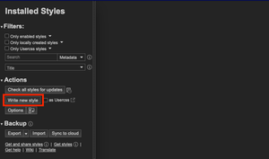
At this point, you may need to pin Stylus to your extensions bar (move on if the Stylus button is already there). There is a button called Extensions in the extensions bar, usually represented by a puzzle-piece icon. Navigate to any page on the web, this extension will not work if you're still on the extensions store, but it will work everywhere else. Clicking on the Stylus icon button on a webpage will open up a small popup, which has 2 checkboxes and 2 buttons, we want to click the Manage styles button, which will open in a new tab.
The Stylus interface
Within the Stylus interface, there is an Add style panel, which should be situated on the left, before the code editor, within that panel, there is a Write new style button, click this, but before doing so, ensure the adjacent checkbox asUsercss is unchecked, we don't need to worry about that.
The options should have now changed, at the top there should be an empty input, this is where we need to provide a name for our stylesheet, I'm going to call mine "my stylesheet", as later we may add to it.
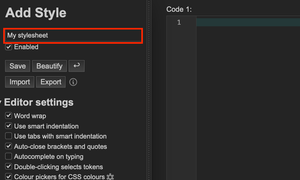
Don't worry about any of those other options, they're not important for what we are doing, they just format the code, but ultimately, you're just going to be copy and pasting, so there is no need to worry, keep that open in another tab, browser window or whatever, as we'll be adding some code very soon.
I know that many users rely on a good visual focus indicator so they can see where they have tabbed to on a webpage, I also know that many sites completely remove them, as the developers, designers or other stakeholders think they look unsightly or don't match the site's design. This is hostile towards many users that rely upon them, as without them navigation is pretty much impossible.
Not all designers and developers do this, there are some good folks out there, some I have worked with, who would never do this, but, sadly they're a minority.
How do developers remove the browser's default focus indicator?
The following code example shows how they do it, but this should never be done, so I am only showing it for illustrative purposes:
*:focus {
  outline: none !important;
}
This 1 little style declaration can do so much harm and make websites unusable, that's literally all it takes. I'll break that down, if you're interested:
- The asterisk * symbol, is the CSS universal selector, it means apply the following style to absolutely everything
- The
:focuspseudo selector, which follows the asterisk, without a space, means apply the following style only when an element (the selector) receives focus, by combining the asterisk and:focuswe're saying when anything on this page receives focus, apply the style that is between the curly brackets - The
outline:property is what browsers use to add a focus ring or dotted lines around the elements we can tab to - The
nonevalue, does exactly what it says on the tin, it removes that indicator completely - Finally, the
!importantkeyword, adds to what's called specificity in CSS, it gives the preceding rule more importance and it will override most other declarations, so in essence, it's a brute force trick - So, in just three lines of CSS, we're essentially saying "I don't care who uses my site, if they use a keyboard etc and focus on absolutely anything, don't show them where there focus is, no matter what" and that awful practice is typically why you may struggle to track focus across a website
Can we override it?
You bet we can, but sadly it takes third party extensions (unless using Safari), but, even though the developers have used !important, that's no match for what we are going to add, as we have more specificity by using a portable stylesheet.
Much the same I did with the anti-user CSS above, I'm just going to write the style and then explain what it is doing in text afterwards.
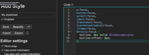
a:focus,
button:focus,
select:focus,
input:focus,
[tabindex]:focus,
[contenteditable]:focus,
iframe:focus,
details:focus {
  outline: 3px solid rebeccapurple !important;
  outline-offset: 2px !important;
}
So let's break that down, notice that each line except the last is separated by a comma, that allows us to list many selectors and apply whatever we put in the curly brackets to all of them, it'll break if you miss a comma though, also don't put a comma on the very last item, as again, it will break as it is expecting some other selector to follow.
Setting
a:focuswill apply a focus style to links, which use the<a>or anchor elementSetting
button:focuswill apply a focus style to buttons, which use the<button>elementSetting
select:focuswill apply a focus style to the dropdown inputs you often encounter, which use the<select>elementSetting
input:focuswill apply a focus style to text inputs, checkboxes, radios etc, which use the<input>elementSetting
[tabindex]:focus,for custom elements that can receive keyboard focus, as developers should be making these elements keyboard accessible and adding intabindex="0"to the element as an attribute, we target attributes in CSS with the square brackets[], so we can target that with CSS, we're going a little brute force and just using[tabindex]here, as there could be other valuesSetting
[contenteditable]:focus, for when we encounter inputs that do not use the default HTML inputs, which is fine if done correctly, but awful when they're not, to make an element that is not an input editable, we would add thecontenteditableattribute, so we can target that in CSS, by using the square bracketsSetting
iframe:focus, you may see Twitter or YouTube embeds on a website or indeed many others, an iFrame receives focus, as it is technically a part of another website embedded into another, we can apply focus indicators to iframes, which use the<iframe>elementSetting
details:focusfor the native HTML accordion-type element, called<details>which is paired with a<summary>element, the details being the trigger and the<summary>being the panel that will display the additional information when that trigger is clicked, we can apply a focus to details which use the<details>elementThe style declaration, so we want something that we can see, so I have done the following:
outline: 3px solid rebeccapurple;that gives us a 3 pixel solid purple line around all of those elementsoutline-offset: 2px;, that gives us a little space between the element that is focused and the focus indicator we created above, this is often useful, as it won't obscure the text within the element, it may overlay other surrounding text though- Also, I added
!important;to each, just to make sure our style beats theirs, always. It should always win due to the browser's and CSS's rules, but it doesn't hurt to add it
Why so many selectors?
It was easy to completely remove the focus outline, we just used one (the universal) selector and focus was completely gone, but to add it back we have to add all the individual selectors, couldn't we have just added it back with the universal selector? Yes and No. It would work just fine if you were exclusively using a keyboard or other non-pointing device, but if you were using a combination on mouse and keyboard, everytime you clicked on anything, it would add a focus indicator around it, this would make the focus indicator less useful for some people.
We could have used :focus-visible instead of :focus, which won't show on mouse/finger presses, but if some of us are using an older browser, it may not work at all, so I've used an approach that should work fine for all use cases.
Can I change any of this?
Of course you can, I'm going to show you how, right now.
I have chosen to use the outline: property as it doesn't take up any space, it surrounds an element, but won't move it to accommodate a border.
If you want a thinner or thicker outline (the outline width), just change the 3px value to something that works for you, ensure there are no spaces though.
I have provided a solid outline (the outline style), you can change value to other styles, some examples being: dotted, double, ridge, groove or dashed. it's important that the value is spelled correctly, as otherwise it won't work and don't delete the spaces between the width, style and colour
The colour can be set to anything that you want as long as it is valid value, CSS has many inbuilt named colours, it can also use hex codes, RGB and many others, to select a colour that works for you, this MDN resource is great, the colour I have chosen rebeccapurple is a special colour in CSS, you can read why here.
Finally, the outline-offset, this isn't necessary at all, I added that in to give you more control, if you don't want it, you can delete the whole line, alternatively, you can adjust the value to your liking, it can take negative and positive numbers. If you add a negative number, do so like this -2px that will inset the focus ring, it will appear inside the element and if you want more space, you just change the number to something of your choosing, remember, no space between the number and px.
Also, remember that the position of the colon and semi-colon are important. In my example, note the colon is immediately after the property like so outline: and at the end of the value we have a semi-colon, like so: rebeccapurple;.
You can add this to your Stylus stylesheet, by following these steps:
When we created a new stylesheet, I called mine My stylesheet, you may have named yours differently, locate that
From the code I provided (definitely not the first bit of code that removed all styles, the bit in the preceding section), copy that code and paste it into the big Code panel in Stylus
If you want to make any changes to the values, go ahead, taking note of the advice I provided if you aren't comfortable with CSS.
Now click the Save button in the Add style panel, it's important you save it.
That's it, we now have a basic stylesheet we can use across the web, there are a couple of considerations though. If an element has not been coded in such a way that it can receive keyboard focus, our style won't apply. Also, it may be useful for you to have more than one, simply create another and give it a different name. I say this as if you visit some sites that are dark and some that are light, your focus indicator may not be great on one of them. So perhaps create a My focus dark and a My focus light, where you adjust the colours accordingly.
Some sites will have a nice focus indicator and you may not to run your stylesheet on those, the Stylus button icon in the extensions bar will have a tiny little notification icon on it, showing you that a stylesheet is active. If you click the Stylus button, there will be a checked input that you can toggle to turn your stylesheet on or off.
We don't need a browser extension for Safari, as we can use any stylesheet stored on our Mac, which is a relatively straightforward process. Note: I just updated my Mac to Ventura a couple of days ago, so if you haven't done so yet or can't, my instructions may be slightly different, but hopefully noting too drastic has changed.
- Download this stylesheet and save to somewhere safe on your Mac (rename if you wish, but don't delete the .css file extension, that's super important)
- Open Safari
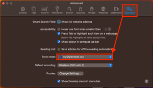
- In the Menu bar Click Safari > Settings (previously called Preferences) and then locate and open the Advanced tab
- Locate the drop down for Stylesheet, click it and select Other
- Locate the stylesheet you downloaded, in step 1, and open that so it becomes our selected option
That's essentially it, I don't think this is as user-friendly as the Stylus extension, in that you have to go through all the options to change stylesheets and it appears you can only have one running at any given time, whereas Stylus you could in theory have many running, which would give you more granular control over how webpages look, but if you were just looking to style a focus indicator so you had a consistent visual indicator across the web, this may be useful.